talk-data.com talk-data.com

Topic

data-science

72

tagged

Activity Trend

1 peak/qtr
2020-Q1 2026-Q1

Activities

Showing filtered results

Filtering by: O'Reilly Data Visualization Books ×
Data Visualization For Dummies

A straightforward, full-color guide to showcasing data so your audience can see what you mean, not just read about it Big data is big news! Every company, industry, not-for-profit, and government agency wants and needs to analyze and leverage datasets that can quickly become ponderously large. Data visualization software enables different industries to present information in ways that are memorable and relevant to their mission. This full-color guide introduces you to a variety of ways to handle and synthesize data in much more interesting ways than mere columns and rows of numbers. Learn meaningful ways to show trending and relationships, how to convey complex data in a clear, concise diagram, ways to create eye-catching visualizations, and much more! Effective data analysis involves learning how to synthesize data, especially big data, into a story and present that story in a way that resonates with the audience This full-color guide shows you how to analyze large amounts of data, communicate complex data in a meaningful way, and quickly slice data into various views Explains how to automate redundant reporting and analyses, create eye-catching visualizations, and use statistical graphics and thematic cartography Enables you to present vast amounts of data in ways that won't overwhelm your audience Part technical manual and part analytical guidebook, Data Visualization For Dummies is the perfect tool for transforming dull tables and charts into high-impact visuals your audience will notice...and remember.

Tableau Your Data!: Fast and Easy Visual Analysis with Tableau Software

Best practices and step-by-step instructions for using the Tableau Software toolset Although the Tableau Desktop interface is relatively intuitive, this book goes beyond the simple mechanics of the interface to show best practices for creating effective visualizations for specific business intelligence objectives. It illustrates little-known features and techniques for getting the most from the Tableau toolset, supporting the needs of the business analysts who use the product as well as the data and IT managers who support it. This comprehensive guide covers the core feature set for data analytics, illustrating best practices for creating and sharing specific types of dynamic data visualizations. Featuring a helpful full-color layout, the book covers analyzing data with Tableau Desktop, sharing information with Tableau Server, understanding Tableau functions and calculations, and Use Cases for Tableau Software. Includes little-known, as well as more advanced features and techniques, using detailed, real-world case studies that the author has developed as part of his consulting and training practice Explains why and how Tableau differs from traditional business information analysis tools Shows you how to deploy dashboards and visualizations throughout the enterprise Provides a detailed reference resource that is aimed at users of all skill levels Depicts ways to leverage Tableau across the value chain in the enterprise through case studies that target common business requirements Endorsed by Tableau Software Tableau Your Data shows you how to build dynamic, best-of-breed visualizations using the Tableau Software toolset.

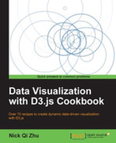
Data Visualization with D3.js Cookbook

Dive into the world of data visualization with 'Data Visualization with D3.js Cookbook'. This book provides a hands-on approach to mastering data visualization using D3.js, a powerful JavaScript library that brings data to life using HTML, SVG, and CSS. Through step-by-step recipes, you'll learn everything you need to create stunning, interactive, and effective visualizations. What this Book will help me do Develop expertise in functional JavaScript to create elegant D3 visualizations. Learn to work with HTML and SVG elements efficiently to design effective visuals. Master the use of D3 scales and interpolators to represent data accurately. Enhance your understanding of D3 layouts and force-directed visuals for complex data. Create interactive and responsive visualizations for web applications. Author(s) Nick Zhu is an experienced software engineer and data visualization enthusiast with extensive expertise in JavaScript and web development. Authoring 'Data Visualization with D3.js Cookbook', Nick adeptly shares his knowledge, making complex topics approachable. His passion for clear communication shines in his instructive writing style. Who is it for? This book is designed for developers who have some knowledge of HTML, CSS, and JavaScript and aim to excel in data visualization using D3.js. If you strive for deeper mastery of D3 and wish to enhance your ability to create compelling graphics, this book is ideal for you. It serves both as a learning resource for newcomers and a quick reference for experienced practitioners. Your goal to transform data into impactful visuals aligns perfectly with the insights offered.

Pro Data Visualization using R and JavaScript

Pro Data Visualization using R and JavaScript makes the R language approachable, and promotes the idea of data gathering and analysis. You'll see how to use R to interrogate and analyze your data, and then use the D3 JavaScript library to format and display that data in an elegant, informative, and interactive way. You will learn how to gather data effectively, and also how to understand the philosophy and implementation of each type of chart, so as to be able to represent the results visually. With the popularity of the R language, the art and practice of creating data visualizations is no longer the preserve of mathematicians, statisticians, or cartographers. As technology leaders, we can gather metrics around what we do and use data visualizations to communicate that information. Pro Data Visualization using R and JavaScript combines the power of the R language with the simplicity and familiarity of JavaScript to display clear and informative data visualizations. Gathering and analyzing empirical data is the key to truly understanding anything. We can track operational metrics to quantify the health of our products in production. We can track quality metrics of our projects, and even use our data to identify bad code. Visualizing this data allows anyone to read our analysis and easily get a deep understanding of the story the data tells. What you'll learn A rich understanding of how to gather, and analyze empirical data How to tell a story with data using data visualizations What types of data visualizations are best to use for the story that you want to tell with your data A comprehensive introduction to the R language, covering all the essentials Exploration of how to construct interactive data visualizations using JavaScript and JavaScript libraries Who this book is for Developers at all levels interested in data visualization, beginning to intermediate engineering managers, statisticians, mathematicians, economists and any others interested in data visualization.

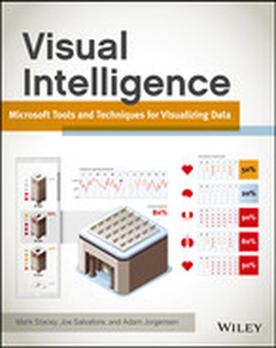
Visual Intelligence: Microsoft Tools and Techniques for Visualizing Data

Go beyond design concepts and learn to build state-of-the-art visualizations The visualization experts at Microsoft's Pragmatic Works have created a full-color, step-by-step guide to building specific types of visualizations. The book thoroughly covers the Microsoft toolset for data analysis and visualization, including Excel, and explores best practices for choosing a data visualization design, selecting tools from the Microsoft stack, and building a dynamic data visualization from start to finish. You'll examine different types of visualizations, their strengths and weaknesses, and when to use each one. Data visualization tools unlock the stories within the data, enabling you to present it in a way that is useful for making business decisions This full-color guide introduces data visualization design concepts, then explains the various Microsoft tools used to store and display data Features a detailed discussion of various classes of visualizations, their uses, and the appropriate tools for each Includes practical implementations of various visualizations and best practices for using them Covers out-of-the-box Microsoft tools, custom-developed illustrations and implementations, and code examples Visual Intelligence: Microsoft Tools and Techniques for Visualizing Data arms you with best practices and the knowledge to choose and build dynamic data visualizations.

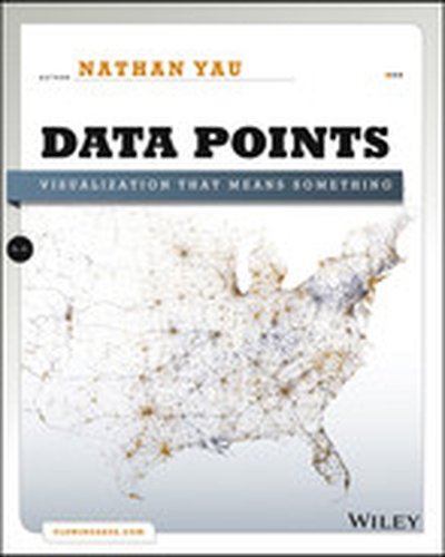
Data Points: Visualization That Means Something

A fresh look at visualization from the author of Visualize This Whether it's statistical charts, geographic maps, or the snappy graphical statistics you see on your favorite news sites, the art of data graphics or visualization is fast becoming a movement of its own. In Data Points: Visualization That Means Something, author Nathan Yau presents an intriguing complement to his bestseller Visualize This, this time focusing on the graphics side of data analysis. Using examples from art, design, business, statistics, cartography, and online media, he explores both standard-and not so standard-concepts and ideas about illustrating data. Shares intriguing ideas from Nathan Yau, author of Visualize This and creator of flowingdata.com, with over 66,000 subscribers Focuses on visualization, data graphics that help viewers see trends and patterns they might not otherwise see in a table Includes examples from the author's own illustrations, as well as from professionals in statistics, art, design, business, computer science, cartography, and more Examines standard rules across all visualization applications, then explores when and where you can break those rules Create visualizations that register at all levels, with Data Points: Visualization That Means Something.

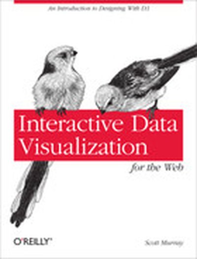
Interactive Data Visualization for the Web

Create and publish your own interactive data visualization projects on the Web—even if you have little or no experience with data visualization or web development. It’s easy and fun with this practical, hands-on introduction. Author Scott Murray teaches you the fundamental concepts and methods of D3, a JavaScript library that lets you express data visually in a web browser. Along the way, you’ll expand your web programming skills, using tools such as HTML and JavaScript. This step-by-step guide is ideal whether you’re a designer or visual artist with no programming experience, a reporter exploring the new frontier of data journalism, or anyone who wants to visualize and share data. Learn HTML, CSS, JavaScript, and SVG basics Dynamically generate web page elements from your data—and choose visual encoding rules to style them Create bar charts, scatter plots, pie charts, stacked bar charts, and force-directed layouts Use smooth, animated transitions to show changes in your data Introduce interactivity to help users explore data through different views Create customized geographic maps with data Explore hands-on with downloadable code and over 100 examples

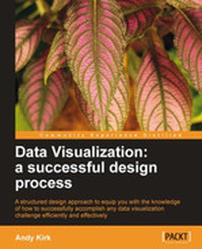
Data Visualization: a successful design process

Dive into the world of data visualization with 'Data Visualization: a Successful Design Process'. Learn to convert complex datasets into vivid, insightful visuals using proven design methodologies and tools. This resource equips you to craft visuals that not only engage your audience but also uncover critical trends and narratives hidden in data. What this Book will help me do Master the fundamentals of visualization taxonomy to choose the ideal design for your data. Develop analytical questions and identify key narratives to structure your data representation. Understand the human visual system and how it impacts effective visual communication. Apply critical thinking to select visualization techniques suited to different data types. Gain an in-depth knowledge of data visualization tools and contemporary practices. Author(s) The author of this book is a seasoned expert in the field of data visualization, known for their innovative approach to transforming data into impactful visuals. With years of experience navigating the intersection of data science and design, their method focuses on empowering professionals to communicate insights effectively. Their writing combines a deep understanding of technical skills with actionable, inspiring guidance. Who is it for? This book is perfect for professionals, analysts, and designers who aim to improve their data visualization skills. Whether you are a beginner or an experienced individual seeking to refine your approach, this book caters to all skill levels. If your goal includes communicating data insights clearly and effectively to varied audiences, this book is for you.

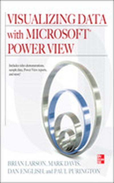
Visualizing Data with Microsoft Power View

Reveals how to build rich BI reports with just a few clicks using Crescent, Microsoft’s newest BI tool Technical review by Microsoft’s Crescent team and Foreword by Group Program Manager for Crescent Complete, practical examples are immediately usable to readers in a commercial environment CD-ROM contains 30+ reusable reports, all code samples, and supporting animations that walk thru each example

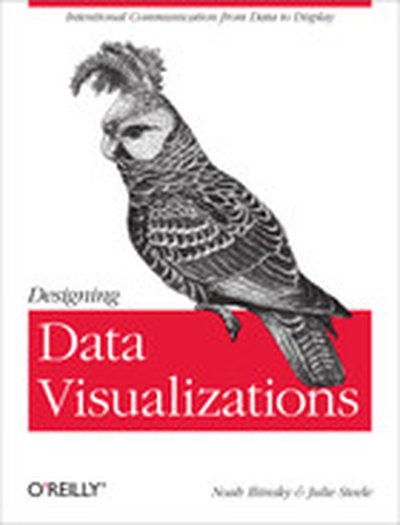
Designing Data Visualizations

Data visualization is an efficient and effective medium for communicating large amounts of information, but the design process can often seem like an unexplainable creative endeavor. This concise book aims to demystify the design process by showing you how to use a linear decision-making process to encode your information visually. Delve into different kinds of visualization, including infographics and visual art, and explore the influences at work in each one. Then learn how to apply these concepts to your design process. Learn data visualization classifications, including explanatory, exploratory, and hybrid Discover how three fundamental influences—the designer, the reader, and the data—shape what you create Learn how to describe the specific goal of your visualization and identify the supporting data Decide the spatial position of your visual entities with axes Encode the various dimensions of your data with appropriate visual properties, such as shape and color See visualization best practices and suggestions for encoding various specific data types

Making Sense of Data II: A Practical Guide to Data Visualization, Advanced Data Mining Methods, and Applications

A hands-on guide to making valuable decisions from data using advanced data mining methods and techniques This second installment in the Making Sense of Data series continues to explore a diverse range of commonly used approaches to making and communicating decisions from data. Delving into more technical topics, this book equips readers with advanced data mining methods that are needed to successfully translate raw data into smart decisions across various fields of research including business, engineering, finance, and the social sciences. Following a comprehensive introduction that details how to define a problem, perform an analysis, and deploy the results, Making Sense of Data II addresses the following key techniques for advanced data analysis: Data Visualization reviews principles and methods for understanding and communicating data through the use of visualization including single variables, the relationship between two or more variables, groupings in data, and dynamic approaches to interacting with data through graphical user interfaces. Clustering outlines common approaches to clustering data sets and provides detailed explanations of methods for determining the distance between observations and procedures for clustering observations. Agglomerative hierarchical clustering, partitioned-based clustering, and fuzzy clustering are also discussed. Predictive Analytics presents a discussion on how to build and assess models, along with a series of predictive analytics that can be used in a variety of situations including principal component analysis, multiple linear regression, discriminate analysis, logistic regression, and Naïve Bayes. Applications demonstrates the current uses of data mining across a wide range of industries and features case studies that illustrate the related applications in real-world scenarios. Each method is discussed within the context of a data mining process including defining the problem and deploying the results, and readers are provided with guidance on when and how each method should be used. The related Web site for the series ( www.makingsenseofdata.com) provides a hands-on data analysis and data mining experience. Readers wishing to gain more practical experience will benefit from the tutorial section of the book in conjunction with the TraceisTM software, which is freely available online. With its comprehensive collection of advanced data mining methods coupled with tutorials for applications in a range of fields, Making Sense of Data II is an indispensable book for courses on data analysis and data mining at the upper-undergraduate and graduate levels. It also serves as a valuable reference for researchers and professionals who are interested in learning how to accomplish effective decision making from data and understanding if data analysis and data mining methods could help their organization.

Visualizing Data

Enormous quantities of data go unused or underused today, simply because people can't visualize the quantities and relationships in it. Using a downloadable programming environment developed by the author, Visualizing Data demonstrates methods for representing data accurately on the Web and elsewhere, complete with user interaction, animation, and more. How do the 3.1 billion A, C, G and T letters of the human genome compare to those of a chimp or a mouse? What do the paths that millions of visitors take through a web site look like? With Visualizing Data, you learn how to answer complex questions like these with thoroughly interactive displays. We're not talking about cookie-cutter charts and graphs. This book teaches you how to design entire interfaces around large, complex data sets with the help of a powerful new design and prototyping tool called "Processing". Used by many researchers and companies to convey specific data in a clear and understandable manner, the Processing beta is available free. With this tool and Visualizing Data as a guide, you'll learn basic visualization principles, how to choose the right kind of display for your purposes, and how to provide interactive features that will bring users to your site over and over. This book teaches you: The book does not provide ready-made "visualizations" that can be plugged into any data set. Instead, with chapters divided by types of data rather than types of display, you'll learn how each visualization conveys the unique properties of the data it represents -- why the data was collected, what's interesting about it, and what stories it can tell. The seven stages of visualizing data -- acquire, parse, filter, mine, represent, refine, and interact How all data problems begin with a question and end with a narrative construct that provides a clear answer without extraneous details Several example projects with the code to make them work Positive and negative points of each representation discussed. The focus is on customization so that each one best suits what you want to convey about your data set Visualizing Data teaches you how to answer questions, not simply display information.