talk-data.com talk-data.com

Topic

DataViz

Data Visualization

bi charts dashboards

434

tagged

Activity Trend

43 peak/qtr
2020-Q1 2026-Q1

Activities

434 activities · Newest first

Learn D3.js - Second Edition

Master data visualization with D3.js v7 using modern web standards and real-world projects to build interactive charts, maps, and visual narratives Key Features Build dynamic, data-driven visualizations using D3.js v7 and ES2015+ Create bar, scatter, and network charts, geographic maps, and more Learn through step-by-step tutorials backed by hundreds of downloadable examples Purchase of the print or Kindle book includes a free PDF eBook Book Description Learn D3.js, Second Edition, is a fully updated guide to building interactive, standards-compliant web visualizations using D3.js v7 and modern JavaScript. Whether you're a developer, designer, data journalist, or analyst, this book will help you master the core techniques for transforming data into compelling, meaningful visuals. Starting with fundamentals like selections, data binding, and SVG, the book progressively covers scales, axes, animations, hierarchical data, and geographical maps. Each chapter includes short examples and a full hands-on project with downloadable code you can run, modify, and use in your own work. This new edition introduces improved chapter structure, updated code samples using ES2015 standards, and better formatting for readability. There’s also a dedicated chapter that focuses on integrating D3 with modern frameworks like React and Vue, along with performance, accessibility, and deployment strategies. For those migrating from older versions of D3, a detailed appendix is included at the end. With thoughtful pedagogy and a practical approach, this book remains one of the most thorough and respected resources for learning D3.js and help you truly leverage data visualisation. What you will learn Bind data to DOM elements and apply transitions and styles Build bar, line, pie, scatter, tree, and network charts Create animated, interactive behaviours with zoom, drag, and tooltips Visualize hierarchical data, flows, and maps using D3 layouts and projections Use D3 with HTML5 Canvas for high-performance rendering Develop accessible and responsive D3 apps for all screen sizes Integrate D3 with frameworks like React and Vue Migrate older D3 codebases to version 7 Who this book is for This book is for web developers, data journalists, designers, analysts, and anyone who wants to create interactive, web-based data visualizations. A basic understanding of HTML, CSS, and JavaScript is recommended. No prior knowledge of SVG or D3 is required.

Managing and Visualizing BIM Data with AI

Unlock the potential of your BIM workflows with artificial intelligence and data visualization tools. This book provides guided instruction on using software like Revit, Dynamo, Python, and Power BI to automate processes, derive insights, and craft tailored dashboards that empower data-driven decisions in AEC projects. What this Book will help me do Effectively preprocess and manage BIM data for analysis and visualization. Design interactive and insightful dashboards in Power BI for project stakeholders. Integrate real-time IoT data and advanced analytics into BIM projects. Automate repetitive tasks in Revit using Dynamo and Python scripting. Understand the ethical considerations and emerging trends in AI for BIM. Author(s) Bruno Martorelli, a seasoned BIM manager, specializes in integrating technology and data analytics into construction workflows. With a background in architecture and programming, he bridges the gap between traditional methods and modern innovations. Bruno is dedicated to sharing practical strategies for data automation and visualization. Who is it for? This book is tailored for architects, engineers, and construction managers interested in elevating their BIM practices. If you're familiar with Revit and possess a basic understanding of data management, you'll find this resource invaluable. Beginners in Python or Power BI will also find accessible guidance to start applying advanced techniques in their workflows.

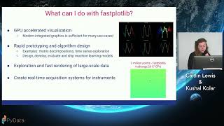
fastplotlib: driving scientific discovery through data visualization

Fast interactive visualization remains a considerable barrier in analysis pipelines for large neuronal datasets. Here, we present fastplotlib, a scientific plotting library featuring an expressive API for very fast visualization of scientific data. Fastplotlib is built upon pygfx, which utilizes the GPU via WGPU, allowing it to interface with modern graphics APIs such as Vulkan for fast rendering of objects. Fastplotlib is non-blocking, allowing for interactivity with data after plot generation. Ultimately, fastplotlib is a general-purpose scientific plotting library that is useful for fast and live visualization and analysis of complex datasets.

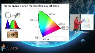
Understanding and using color for storytelling in data visualizations

The default color space for computers includes over 16 million colors—an embarrassment of riches that is also a potential quagmire to anyone considering how to best choose colors for visualizations. In this workshop, we will provide a practical framework for working with color. We will start by developing an understanding of color models and color theory, building from these to provide simple but powerful heuristics for color selection that will enable creators of data visualization to enhance the clarity, power, and storytelling of their visualizations. We will conclude with the introduction of tools for working with and selecting color, followed by hands-on activities using these tools. No prior knowledge is needed or assumed, and the only tools you will need is a computer with a web browser and an internet connection.

This talk showcases the versatility of interactive diagrams in modern data visualization - from process automation and agent orchestration to workflow systems, industrial operations, and even book writing (?). We’ll explore and compare open-source libraries and resources that make it easy to start building your own diagramming interfaces. Along the way, you’ll discover practical tips to enhance usability and visual appeal, making your data visualization solutions more intuitive and accessible to non-technical users. Whether you’re a data visualization enthusiast or a software engineer, you’ll learn why interactive diagrams are becoming one of the most exciting emerging trends in the field.

As datasets continue to grow in both size and complexity, CPU-based visualization pipelines often become bottlenecks, slowing down exploratory data analysis and interactive dashboards. In this session, we’ll demonstrate how GPU acceleration can transform Python-based interactive visualization workflows, delivering speedups of up to 50x with minimal code changes. Using libraries such as hvPlot, Datashader, cuxfilter, and Plotly Dash, we’ll walk through real-world examples of visualizing both tabular and unstructured data and demonstrate how RAPIDS, a suite of open-source GPU-accelerated data science libraries from NVIDIA, accelerates these workflows. Attendees will learn best practices for accelerating preprocessing, building scalable dashboards, and profiling pipelines to identify and resolve bottlenecks. Whether you are an experienced data scientist or developer, you’ll leave with practical techniques to instantly scale your interactive visualization workflows on GPUs.

CompTIA Data+ Study Guide, 2nd Edition

Prepare for the CompTIA Data+ exam, as well as a new career in data science, with this effective study guide In the newly revised second edition of CompTIA Data+ Study Guide: Exam DA0-002, veteran IT professionals Mike Chapple and Sharif Nijim provide a powerful, one-stop resource for anyone planning to pursue the CompTIA Data+ certification and go on to an exciting new career in data science. The authors walk you through the info you need to succeed on the exam and in your first day at a data science-focused job. Complete with two online practice tests, this book comprehensively covers every objective tested by the updated DA0-002 exam, including databases and data acquisition, data quality, data analysis and statistics, data visualization, and data governance. You'll also find: Efficient and comprehensive content, helping you get up-to-speed as quickly as possible Bite-size chapters that break down essential topics into manageable and accessible lessons Complimentary access to Sybex' famous online learning environment, with practice questions, a complete glossary of common industry terminology, hundreds of flashcards, and more A practical and hands-on pathway to the CompTIA Data+ certification, as well as a new career in data science, the CompTIA Data+ Study Guide, Second Edition, offers the foundational knowledge, skills, and abilities you need to get started in an exciting and rewarding new career.

This project explores the demographics of the characters who make the yearly rankings of the top 100 most popular pairings on wellknown fanfiction site AO3. Its aim is to raise awareness about the work of the highly female-dominated author base of fandom, explore how fans choose to interact with mainstream media, and to provide visualisation and statistical insight for and about a topic and community that does not have as many members who code as more male-dominated ones do and therefore is less well-documented.

Le groupe Egis conçoit et exploite des infrastructures complexes à l’échelle mondiale : autoroutes, aéroports, ferroviaire, bâtiments, services de mobilité, énergie, aménagement urbain et environnement. La diversité et le volume des données générées posent des défis majeurs en matière de gouvernance, d’industrialisation et de scalabilité.

Pour y répondre, Egis a déployé une infrastructure Data Mesh sur Azure, mise en place et opérée par une équipe dédiée. Cette équipe assure la conception, la gouvernance et la mise à disposition de l’architecture pour l’ensemble des Business Lines. L’infrastructure s’appuie sur :

• Stockage distribué avec ADLS Gen2,

• ETL et traitements big data avec Azure Data Factory et Databricks,

• Visualisation et partage sécurisé via Power BI Service et Delta Sharing,

• Des mécanismes de gouvernance avancés pour garantir interopérabilité et fiabilité.

Cette session présentera :

• Les choix d’architecture et patterns techniques pour mettre en place un Data Mesh distribué à l’échelle d’un grand groupe international

• Le rôle et l’organisation de l’équipe dédiée dans la mise à disposition et l’accompagnement des projets métiers

• Les enseignements pratiques tirés de cas d’usage concrets déjà en production


Une immersion au cœur de la mise en œuvre réelle du Data Mesh, pensée pour transformer la donnée en un actif accessible, fiable et exploitable à grande échelle par les équipes métiers et techniques.

• Les bases de données nationales de santé, telles que le SNDS, offrent une richesse unique au monde pour l’analyse et la compréhension des parcours de soins. La visualisation et l’exploration de ces données offrent des opportunités concrètes pour améliorer les soins.

• Ces approches posent des questions de recherche notamment pour le passage à l’échelle. Nous présentons le nouveau paradigme de visualisation progressive.

• Enfin, nous abordons les défis et opportunités de l’utilisation de l’intelligence artificielle pour ce type d’applications.

Découvrez comment GLS suit, analyse et optimise plus d’1 million de colis chaque jour grâce à une Modern Data Stack performante et une BI pensée pour l’efficacité.

Vous verrez concrètement comment transformer des flux complexes en décisions claires et rapides, au service de la performance opérationnelle.

Repartez avec des insights concrets sur :

- Les outils et méthodes pour fiabiliser vos données en temps réel

- Les bonnes pratiques de data visualisation pour piloter à grande échelle

- L’impact business d’une gouvernance data efficace

Une session inspirante et à ne pas manquer si vous voulez booster votre pilotage grâce à la data.

Toucan est la solution d’Embedded Analytics qui simplifie l’accès à la donnée et aide les entreprises à prendre de meilleures décisions grâce à des dashboards clairs, rapides à déployer et accessibles à tous.

GLS, acteur majeur du transport de colis en Europe, s’appuie sur la data pour garantir chaque jour fiabilité, performance et qualité de service à ses millions de clients.

Plongez dans l'univers DIGDASH, une entreprise 100 % française, et explorez les usages concrets de sa solution à travers plusieurs cas d’application :

- Le pilotage de votre activité au travers des tableaux de bord,

- L'exploration et la manipulation de données,

- La communication autour de ces données.

Multi-sectorielle, découvrez comment la plateforme DigDash Enterprise permet aux organisations d’améliorer significativement la visibilité et la maîtrise de leurs données.