talk-data.com talk-data.com

Event

O'Reilly Data Science Books

2013-08-09 – 2026-02-25 Oreilly Visit website ↗

Activities tracked

170

Collection of O'Reilly books on Data Science.

Filtering by: DataViz ×

Sessions & talks

Showing 76–100 of 170 · Newest first

Search within this event →
Learn Chart.js

This book, 'Learn Chart.js', serves as a comprehensive guide to mastering Chart.js for creating stunning web-based data visualizations. By combining JavaScript, HTML5 Canvas, and Chart.js, you will understand how to turn raw data into interactive visual stories. What this Book will help me do Develop skills to create interactive and engaging data visualizations using the Chart.js library. Learn to efficiently load, parse, and handle data from external formats like CSV and JSON. Understand different chart types offered by Chart.js and learn when to best use each one. Gain the ability to customize Chart.js charts, such as adjusting properties for styling or animations. Acquire hands-on experience with practical examples, equipping you to apply what you learn in real-world scenarios. Author(s) Helder da Rocha brings his extensive experience in programming and software development to this book, offering readers a clear and practical approach to mastering Chart.js. With a deep understanding of data visualization and web technologies, he conveys complex concepts in a straightforward way. Who is it for? This book is ideal for web developers, data analysts, and designers who have basic proficiency in HTML, CSS, and JavaScript. It is particularly suited for professionals looking to create impactful web-based data visualizations using open-source tools. Additionally, the book assumes no prior knowledge of the Canvas element, making it accessible for Chart.js beginners.

Mastering Tableau 2019.1 - Second Edition

Mastering Tableau 2019.1 is your essential guide for becoming an expert in Tableau's advanced features and functionalities. This book will teach you how to use Tableau Prep for data preparation, create complex visualizations and dashboards, and leverage Tableau's integration with R, Python, and MATLAB. You'll be equipped with the skills to solve both common and advanced BI challenges. What this Book will help me do Gain expertise in preparing and blending data using Tableau Prep and other data handling tools. Create advanced data visualizations and designs that effectively communicate insights. Implement narrative storytelling in BI with advanced presentation designs in Tableau. Integrate Tableau with programming tools like R, Python, and MATLAB for extended functionalities. Optimize performance and improve dashboard interactivity for user-friendly analytics solutions. Author(s) Marleen Meier, with extensive experience in business intelligence and analytics, and None Baldwin, an expert in data visualization, collaboratively bring this advanced Tableau guide to life. Their passion for empowering users with practical BI solutions reflects in the hands-on approach employed throughout the book. Who is it for? This book is perfectly suited for business analysts, BI professionals, and data analysts who already have foundational knowledge of Tableau and seek to advance their skills for tackling more complex BI challenges. It's ideal for individuals aiming to master Tableau's premium features for impactful analytics solutions.

Advanced R Statistical Programming and Data Models: Analysis, Machine Learning, and Visualization

Carry out a variety of advanced statistical analyses including generalized additive models, mixed effects models, multiple imputation, machine learning, and missing data techniques using R. Each chapter starts with conceptual background information about the techniques, includes multiple examples using R to achieve results, and concludes with a case study. Written by Matt and Joshua F. Wiley, Advanced R Statistical Programming and Data Models shows you how to conduct data analysis using the popular R language. You’ll delve into the preconditions or hypothesis for various statistical tests and techniques and work through concrete examples using R for a variety of these next-level analytics. This is a must-have guide and reference on using and programming with the R language. What You’ll Learn Conduct advanced analyses in R including: generalized linear models, generalized additive models, mixedeffects models, machine learning, and parallel processing Carry out regression modeling using R data visualization, linear and advanced regression, additive models, survival / time to event analysis Handle machine learning using R including parallel processing, dimension reduction, and feature selection and classification Address missing data using multiple imputation in R Work on factor analysis, generalized linear mixed models, and modeling intraindividual variability Who This Book Is For Working professionals, researchers, or students who are familiar with R and basic statistical techniques such as linear regression and who want to learn how to use R to perform more advanced analytics. Particularly, researchers and data analysts in the social sciences may benefit from these techniques. Additionally, analysts who need parallel processing to speed up analytics are givenproven code to reduce time to result(s).

Kibana 7 Quick Start Guide

Dive into the world of Kibana 7 with this hands-on guide that simplifies the process of visualizing and analyzing data using Elasticsearch. From fundamental concepts to advanced tools, this book enables you to create intuitive dashboards and leverage powerful machine learning capabilities effectively. Discover how to transform your data into actionable insights with ease. What this Book will help me do Configure Logstash to fetch and process CSV data for visualization. Master creating and managing index patterns within Kibana for efficient data navigation. Effectively apply filters to refine data presentations and insights. Develop and utilize machine learning jobs in Kibana to identify trends and anomalies. Create, customize, and share impactful visualizations and dashboards to drive data-driven decisions. Author(s) None Srivastava is a technical expert in data visualization and Elasticsearch tools, with practical experience implementing and teaching about the Elastic Stack. The author brings a hands-on approach to this book, simplifying complex concepts for ease of understanding. Their expertise ensures that the book serves both as a learning guide and a practical reference. Who is it for? This book is ideal for developers and IT professionals who are either new to Kibana or looking to deepen their understanding of its visualization capabilities. It is suitable for individuals working with the Elastic Stack or seeking to leverage Kibana for data analysis purposes. Even if you are progressing from a novice to an intermediate level, this guide will provide future-proof skills to optimize your workflow.

The Harvard Business Review Good Charts Collection

A good visualization can communicate the nature and potential impact of ideas more powerfully than any other form of communication. For a long time, "dataviz" was left to specialists--data scientists and professional designers. No longer. A new generation of tools and massive amounts of available data make it easy for anyone to create visualizations that communicate ideas far more effectively than generic spreadsheet charts ever could. The Harvard Business Review Good Charts Collection brings together two popular books to help you become more sophisticated in understanding and using dataviz to communicate your ideas and advance your career. In Good Charts, dataviz maven and Harvard Business Review editor Scott Berinato provides an essential guide to how visualization works and how to use this new language to impress and persuade. He lays out a system for thinking visually and building better charts through a process of talking, sketching, and prototyping. In Good Charts Workbook, Berinato extends the usefulness of Good Charts by putting theory into practice. He leads readers step-by-step through several example datasets and basic charts, providing space to practice the Good Charts talk-sketch-prototype process for improving those charts. Examples include a "Discussion Key" showing how to approach the challenge and why. Each challenge focuses on a different, common visualization problem such as simplification, storytelling, creating conceptual charts, and many others. The Harvard Business Review Good Charts Collection is your go-to resource for turning plain, uninspiring charts that merely present information into smart, effective visualizations that powerfully convey ideas.

Get Your Venture Backed with Persuasive Data Viz

Communicating your idea in a clear, compelling, and persuasive manner is critical when trying to launch a new venture. This Harvard Business Review collection brings together two popular books to help you craft your story, design better visualizations, impress your audience, and turn your idea into reality. Understanding and using data viz to persuade is a must-have skill for anyone in business today--especially if you're launching a new venture. In Good Charts, dataviz maven Scott Berinato provides an essential guide to how visualization works. Berinato lays out a system for thinking visually and building better charts through a process of talking, sketching, and prototyping. How do you launch the venture of your dreams? In Get Backed, entrepreneurs Evan Baehr and Evan Loomis argue that it's not just about securing startup funding. It's about building the right relationships, crafting a compelling story, and creating the perfect pitch deck. Filled with proven tips, exercises, and templates, this book shows the process for how to successfully communicate your vision. Good Charts will help you turn plain, uninspiring charts that merely present information into smart, effective visualizations that powerfully convey ideas. Get Backed will show you exactly what it takes to get funded and will give you the tools to launch a new venture. Together, these books will help you bring your idea to life.

Good Charts Workbook

Talk. Sketch. Prototype. Repeat. You know right away when you see an effective chart or graphic. It hits you with an immediate sense of its meaning and impact. But what actually makes it clearer, sharper, and more effective? If you're ready to create your own "good charts"--data visualizations that powerfully communicate your ideas and research and that advance your career—the Good Charts Workbook is the hands-on guide you've been looking for. The original Good Charts changed the landscape by helping readers understand how to think visually and by laying out a process for creating powerful data visualizations. Now, the Good Charts Workbook provides tools, exercises, and practical insights to help people in all kinds of enterprises gain the skills they need to get started. Harvard Business Review Senior Editor and dataviz expert Scott Berinato leads you, step-by-step, through the key challenges in creating good charts—controlling color, crafting for clarity, choosing chart types, practicing persuasion, capturing concepts—with warm-up exercises and mini-challenges for each. The Workbook includes helpful prompts and reminders throughout, as well as white space for users to practice the Good Charts talk-sketch-prototype process. Good Charts Workbook is the must-have manual for better understanding the dataviz around you and for creating better charts to make your case more effectively.

Tableau 10 Complete Reference

Explore and understand data with the powerful data visualization techniques of Tableau, and then communicate insights in powerful ways Key Features Apply best practices in data visualization and chart types exploration Explore the latest version of Tableau Desktop with hands-on examples Understand the fundamentals of Tableau storytelling Book Description Graphical presentation of data enables us to easily understand complex data sets. Tableau 10 Complete Reference provides easy-to-follow recipes with several use cases and real-world business scenarios to get you up and running with Tableau 10. This Learning Path begins with the history of data visualization and its importance in today's businesses. You'll also be introduced to Tableau - how to connect, clean, and analyze data in this visual analytics software. Then, you'll learn how to apply what you've learned by creating some simple calculations in Tableau and using Table Calculations to help drive greater analysis from your data. Next, you'll explore different advanced chart types in Tableau. These chart types require you to have some understanding of the Tableau interface and understand basic calculations. You'll study in detail all dashboard techniques and best practices. A number of recipes specifically for geospatial visualization, analytics, and data preparation are also covered. Last but not least, you'll learn about the power of storytelling through the creation of interactive dashboards in Tableau. Through this Learning Path, you will gain confidence and competence to analyze and communicate data and insights more efficiently and effectively by creating compelling interactive charts, dashboards, and stories in Tableau. This Learning Path includes content from the following Packt products: Learning Tableau 10 - Second Edition by Joshua N. Milligan Getting Started with Tableau 2018.x by Tristan Guillevin What you will learn Build effective visualizations, dashboards, and story points Build basic to more advanced charts with step-by-step recipes Become familiar row-level, aggregate, and table calculations Dig deep into data with clustering and distribution models Prepare and transform data for analysis Leverage Tableau's mapping capabilities to visualize data Use data storytelling techniques to aid decision making strategy Who this book is for Tableau 10 Complete Reference is designed for anyone who wants to understand their data better and represent it in an effective manner. It is also used for BI professionals and data analysts who want to do better at their jobs. Downloading the example code for this book You can download the example code files for all Packt books you have purchased from your account at http://www.PacktPub.com. If you purchased this book elsewhere, you can visit http://www.PacktPub.com/support and register to have the files e-mailed directly to you.

Bioinformatics with Python Cookbook - Second Edition

"Bioinformatics with Python Cookbook" offers a detailed exploration into the modern approaches to computational biology using the Python programming language. Through hands-on recipes, you will master the practical applications of bioinformatics, enabling you to analyze vast biological data effectively using Python libraries and tools. What this Book will help me do Master processing and analyzing genomic datasets in Python to enable accurate bioinformatics discoveries. Understand and apply next-generation sequencing techniques for advanced biological research. Learn to utilize machine learning approaches such as PCA and decision trees for insightful data analysis in biology. Gain proficiency in using high-performance computing frameworks like Dask and Spark for scalable bioinformatics workflows. Develop capabilities to visually represent biological data interactions and insights for presentation and analysis. Author(s) Tiago Antao is a computational scientist specializing in bioinformatics with extensive experience in Python programming applied to biological sciences. He has worked on numerous bioinformatics projects and has a special interest in using Python to bridge biology and data science. Tiago's approachable writing style ensures that both newcomers and experts benefit from his insights. Who is it for? This book is designed for bioinformatics professionals, researchers, and data scientists who are eager to harness the power of Python programming for their biological data analysis needs. If you are familiar with Python and are looking to tackle intermediate to advanced bioinformatics challenges using practical recipes, this book is ideal for you. It is suitable for those seeking to expand their knowledge in computational biology and data visualization techniques. Whether you are working on next-generation sequencing or population genetics, this resource will guide you effectively.

Mastering Matplotlib 2.x

Mastering Matplotlib 2.x guides you through the art and science of creating sophisticated data visualizations with Python's powerful Matplotlib library. You will start by learning the basics of plotting and customizing your charts, progressing to more advanced topics such as 3D visualization, geospatial data display, and creating interactive plots using Jupyter Notebook. What this Book will help me do Create complex and highly customizable data plots using Matplotlib. Effectively visualize data in three dimensions, including geospatial data. Use advanced matplotlib features to represent non-Cartesian and vector data. Build interactive visualizations using Jupyter Notebook and Python. Develop special-purpose and movie-style plots to enhance data representation. Author(s) None Keller is a seasoned software engineer and data visualization enthusiast with years of experience using Python for data analysis. Their practical and hands-on approach ensures that readers can directly apply the concepts taught in their projects. None aims to make advanced visualization techniques accessible to all. Who is it for? This book is perfect for developers, scientists, and analysts who need sophisticated visualization tools for their projects. Prior experience with Python and basic familiarity with Matplotlib will help you get the most out of the book. If you're looking to deepen your understanding of data visualization or to create interactive and advanced visualizations, this book is for you.

Pharmaceutical Quality by Design Using JMP

Solve your pharmaceutical product development and manufacturing problems using JMP . Pharmaceutical Quality by Design Using JMP : Solving Product Development and Manufacturing Problems provides broad-based techniques available in JMP to visualize data and run statistical analyses for areas common in healthcare product manufacturing. As international regulatory agencies push the concept of Quality by Design (QbD), there is a growing emphasis to optimize the processing of products. This book uses practical examples from the pharmaceutical and medical device industries to illustrate easy-to-understand ways of incorporating QbD elements using JMP. Pharmaceutical Quality by Design Using JMP opens by demonstrating the easy navigation of JMP to visualize data through the distribution function and the graph builder and then highlights the following: the powerful dynamic nature of data visualization that enables users to be able to quickly extract meaningful information tools and techniques designed for the use of structured, multivariate sets of experiments examples of complex analysis unique to healthcare products such as particle size distributions/drug dissolution, stability of drug products over time, and blend uniformity/content uniformity. Scientists, engineers, and technicians involved throughout the pharmaceutical and medical device product life cycles will find this book invaluable. This book is part of the SAS Press program.

Getting Started with Tableau 2018.x

Dive into the world of data visualization with "Getting Started with Tableau 2018.x." This comprehensive guide introduces you to both the fundamental and advanced functionalities of Tableau 2018.x, making it easier to create impactful data visualizations. Learn to unlock Tableau's full potential through practical examples and clear explanations. What this Book will help me do Understand the new Tableau 2018.x features like density, extensions, and transparency and how to leverage them. Learn how to connect to data sources, perform transformations, and build efficient data models to support your analysis. Master visualization techniques to design effective and insightful dashboards tailored to business needs. Explore advanced concepts such as calculations, cross-database joins, and data blending to handle complex scenarios. Develop the confidence to publish and interact with content on Tableau Server and share your insights effectively. Author(s) None Guillevin and None Pires are data visualization experts with extensive experience using Tableau. They aim to make data analysis accessible through hands-on examples and easy-to-follow explanations. Their writing balances clear instruction with practical application, making advanced concepts understandable for all readers. Who is it for? This book is ideal for beginners or experienced BI professionals who wish to gain expertise in Tableau 2018.x. It caters to aspiring analysts and business professionals looking to answer complex business-specific questions through data visualization. Regardless of prior experience in Tableau or other BI tools, this book provides value through a structured learning approach.

MicroStrategy Quick Start Guide

In 'MicroStrategy Quick Start Guide,' you'll learn how to transform your raw business data into actionable insights using MicroStrategy. The book covers everything from setting up and configuring MicroStrategy tools to creating insightful dashboards and managing BI solutions from start to finish. What this Book will help me do Configure the MicroStrategy Intelligence Server and essential tools. Create and utilize MicroStrategy Projects and manage metadata repositories. Design effective MicroStrategy Reports to retrieve key business insights. Develop engaging dashboards for advanced data visualization and storytelling. Administer and secure your MicroStrategy BI solutions for stable operation. Author(s) None Rivero Esqueda brings their extensive experience in Business Intelligence solutions to this practical guide. Known for their expertise in MicroStrategy, they are passionate about empowering data analysts and BI professionals to leverage data for better decisions. Their professional insight and accessible approach make this book a valuable resource for readers at all levels. Who is it for? This book is ideal for Business Intelligence professionals or data analysts looking to explore MicroStrategy as their primary BI tool. Readers should have a basic understanding of BI concepts and data analysis. It is tailored to suit beginners as well as professionals transitioning to MicroStrategy. If you are eager to create impactful visualizations and dashboards while mastering MicroStrategy, this is the perfect guide for you.

D3.js Quick Start Guide

D3.js Quick Start Guide is your go-to resource for mastering D3.js, a powerful JavaScript library for creating interactive visualizations in the browser. This book walks you through core concepts, from building scatter plots to creating force-directed graphs, helping you go from beginner to creating stunning visual data representations. What this Book will help me do Create interactive scatter plots showcasing data relationships. Implement bar graphs that dynamically update from API data. Design animated pie charts for visually appealing representations. Develop force-directed graphs to represent networked data. Leverage GeoJSON data for building informative interactive maps. Author(s) None Huntington is an experienced web developer with a clear knack for turning complex topics into understandable concepts. With expertise in data visualization and web technologies, Huntington explains technical subject matter in a friendly and approachable manner, ensuring learners grasp both theoretical and practical aspects effectively. Who is it for? This book is ideal for web developers and data enthusiasts eager to learn how to represent data via interactive visualizations using D3.js. If you have a basic understanding of JavaScript and are looking to enhance your web development skillset with dynamic visualization techniques, this guide is perfect for you. Through easy-to-follow examples, you'll get up to speed quickly and start building professional-looking visualizations right away. Whether you're a data scientist, interactive news developer, or just interested in bringing data to life, this book is your key to mastering D3.js.

Python Data Analytics: With Pandas, NumPy, and Matplotlib

Explore the latest Python tools and techniques to help you tackle the world of data acquisition and analysis. You'll review scientific computing with NumPy, visualization with matplotlib, and machine learning with scikit-learn. This revision is fully updated with new content on social media data analysis, image analysis with OpenCV, and deep learning libraries. Each chapter includes multiple examples demonstrating how to work with each library. At its heart lies the coverage of pandas, for high-performance, easy-to-use data structures and tools for data manipulation Author Fabio Nelli expertly demonstrates using Python for data processing, management, and information retrieval. Later chapters apply what you've learned to handwriting recognition and extending graphical capabilities with the JavaScript D3 library. Whether you are dealing with sales data, investment data, medical data, web page usage, or other data sets, Python Data Analytics, Second Edition is an invaluable reference with its examples of storing, accessing, and analyzing data. What You'll Learn Understand the core concepts of data analysis and the Python ecosystem Go in depth with pandas for reading, writing, and processing data Use tools and techniques for data visualization and image analysis Examine popular deep learning libraries Keras, Theano,TensorFlow, and PyTorch Who This Book Is For Experienced Python developers who need to learn about Pythonic tools for data analysis

R Programming Fundamentals

Master the essentials of programming with R and streamline your data analysis workflow with 'R Programming Fundamentals'. This book introduces key R concepts like data structures and control flow, and guides you through practical applications such as data visualization with ggplot2. By the end, you will progress to completing a full data science project for practical hands-on experience. What this Book will help me do Learn to use R's core features, including package management, data structures, and control flow. Process and clean datasets effectively within R, handling missing values and variable transformation. Master data visualization techniques with ggplot2 to create insightful plots and charts. Develop skills to import diverse datasets such as CSVs, Excel spreadsheets, and SQL databases into R. Construct a data science project end-to-end, applying skills in analysis, visualization, and reporting. Author(s) Kaelen Medeiros is a dedicated teacher with a passion for making complex concepts accessible. Bringing years of experience in data science and statistical computing, Kaelen excels at helping learners understand and leverage R for their data analysis needs. With a focus on practical learning, Kaelen has designed this book to give you the hands-on experience and foundational knowledge you need. Who is it for? This book is perfect for analysts looking to enhance their data science toolkit by learning R. It's especially suited for those with little R programming experience looking to start with foundational concepts. Whether you're an aspiring data scientist or a seasoned professional seeking a refresher, this book offers a structured approach to mastering R effectively.

Web Application Development with R Using Shiny - Third Edition

Transform your R programming into interactive web applications with "Web Application Development with R Using Shiny." This book takes you step-by-step through creating dynamic user interfaces and web solutions with the R Shiny package, empowering you to build impactful tools that showcase your data. What this Book will help me do Create interactive web applications using R Shiny. Apply JavaScript for added functionality and customization in Shiny apps. Effortlessly deploy Shiny apps online for accessibility. Understand Shiny UI functions to design effective user interfaces. Leverage data visualization techniques for insightful analytics in apps. Author(s) Chris Beeley and Shitalkumar R. Sukhdeve bring their profound expertise in R programming and Shiny development to this book. Chris is an experienced data scientist passionate about interactive data solutions, while Shitalkumar, with a strong computing background, shares his hands-on insights. Their collaborative and tutorial approach ensures learners grasp each concept smoothly. Who is it for? This book is ideal for R programmers eager to transition from static data evaluation to engaging, interactive web applications. It caters to professionals and enthusiasts seeking practical, hands-on coding guidance. Readers should have foundational R programming knowledge, ensuring a smooth transition into Shiny concepts.

Malware Data Science

"Security has become a ""big data"" problem. The growth rate of malware has accelerated to tens of millions of new files per year while our networks generate an ever-larger flood of security-relevant data each day. In order to defend against these advanced attacks, you'll need to know how to think like a data scientist. In Malware Data Science, security data scientist Joshua Saxe introduces machine learning, statistics, social network analysis, and data visualization, and shows you how to apply these methods to malware detection and analysis. You'll learn how to: • Analyze malware using static analysis• Observe malware behavior using dynamic analysis• Identify adversary groups through shared code analysis• Catch 0-day vulnerabilities by building your own machine learning detector• Measure malware detector accuracy• Identify malware campaigns, trends, and relationships through data visualization Whether you're a malware analyst looking to add skills to your existing arsenal, or a data scientist interested in attack detection and threat intelligence, Malware Data Science will help you stay ahead of the curve."

Hands-On Dashboard Development with Shiny

"Hands-On Dashboard Development with Shiny" provides a focused and practical guide for developing polished and professional dashboards using R and the Shiny framework. Through applied examples, you'll explore techniques in HTML, CSS, and Bootstrap to elevate your Shiny apps' interface and functionality. The book ensures a comprehensive learning experience by focusing on creating custom interfaces and layouts. What this Book will help me do Create Shiny interfaces using pure HTML to achieve full customization Enhance your R Shiny dashboards with powerful layout functions for professional designs Utilize Bootstrap themes in Shiny for consistent and aesthetically pleasing interfaces Generate interactive dashboards complete with icons and notification elements Develop and distribute R Markdown reports directly from Shiny applications Author(s) Chris Beeley is an experienced data scientist and a frequent R Shiny practitioner. With years of experience building Shiny applications and working on data visualization in professional settings, Chris brings practical and precise teaching to this book. He is passionate about making knowledge accessible and guiding learners through hands-on and engaging content. Who is it for? This book is ideally suited for developers and data analysts who have prior experience with Shiny and wish to delve deeper into customizing their applications' design. If you want to extend your Shiny apps using HTML, CSS, and layouts via Bootstrap, this book is perfect for you. It equips you with the skills to build advanced dashboards efficiently. Whether you're looking to create more visually appealing apps or enhance your UI skills, this resource caters to your needs.

Business Analytics, Volume I

Business Analytics: A Data-Driven Decision Making Approach for Business-Part I,/i> provides an overview of business analytics (BA), business intelligence (BI), and the role and importance of these in the modern business decision-making. The book discusses all these areas along with three main analytics categories: (1) descriptive, (2) predictive, and (3) prescriptive analytics with their tools and applications in business. This volume focuses on descriptive analytics that involves the use of descriptive and visual or graphical methods, numerical methods, as well as data analysis tools, big data applications, and the use of data dashboards to understand business performance. The highlights of this volume are: Business analytics at a glance; Business intelligence (BI), data analytics; Data, data types, descriptive analytics; Data visualization tools; Data visualization with big data; Descriptive analytics-numerical methods; Case analysis with computer applications.

Hands-On Data Analysis with NumPy and pandas

Dive into 'Hands-On Data Analysis with NumPy and pandas' to explore the world of Python for data analysis. This book guides you through using these powerful Python libraries to handle and manipulate data efficiently. You will learn hands-on techniques to read, sort, group, and visualize data for impactful analysis. What this Book will help me do Learn to set up a Python environment for data analysis with tools like Jupyter notebooks. Master data handling using NumPy, focusing on array creation, slicing, and operations. Understand the functionalities of pandas for managing datasets, including DataFrame operations. Discover techniques for data preparation, such as handling missing data and hierarchical indexing. Explore data visualization using pandas and create impactful plots for data insights. Author(s) The book is authored by None Miller, a seasoned Python developer and data analyst. With a strong background in leveraging Python for data processing, None focuses on creating content that is practical and accessible. The author's teaching approach emphasizes hands-on practice and understanding, making technical topics approachable and engaging. Who is it for? This book is ideal for Python developers at a beginner to intermediate level looking to venture into data analysis. If you are transitioning from general programming to data-focused work or need to enhance your skills in data manipulation and processing, this book will be a strong foundation. It requires no prior experience with data analysis, so it is accessible to many learners.

Python Graphics: A Reference for Creating 2D and 3D Images

This book will show you how to use Python to create graphic objects for technical illustrations and data visualization. Often, the function you need to produce the image you want cannot be found in a standard Python library. Knowing how to create your own graphics will free you from the chore of looking for a function that may not exist or be difficult to use. This book will give you the tools to eliminate that process and create and customize your own graphics to satisfy your own unique requirements. Using basic geometry and trigonometry, you will learn how to create math models of 2D and 3D shapes. Using Python, you will then learn how to project these objects onto the screen of your monitor, translate and rotate them in 2D and 3D, remove hidden lines, add shading, view in perspective, view intersections between surfaces, and display shadows cast from one object onto another. You will also learn how to visualize and analyze 2D and 3D data sets, fit lines, splines and functions. The final chapter includes demonstrations from quantum mechanics, astronomy and climate science. Includes Python programs written in a clear and open style with detailed explanation of the code. What You Will Learn How to create math and Python models of 2D and 3D shapes. How to rotate, view in perspective, shade, remove hidden lines, display projected shadows, and more. How to analyze and display data sets as curves and surfaces, fit lines and functions. Who This Book Is For Python developers, scientists, engineers, and students using Python to produce technical illustrations, display and analyze data sets. Assumes familiarity with vectors, matrices, geometry and trigonometry.

Infographics Powered by SAS

Create compelling business infographics with SAS and familiar office productivity tools. A picture is worth a thousand words, but what if there are a billion words? When analyzing big data, you need a picture that cuts through the noise. This is where infographics come in. Infographics are a representation of information in a graphic format designed to make the data easily understandable. With infographics, you don’t need deep knowledge of the data. The infographic combines story telling with data and provides the user with an approachable entry point into business data. Infographics Powered by SAS : Data Visualization Techniques for Business Reporting shows you how to create graphics to communicate information and insight from big data in the boardroom and on social media. Learn how to create business infographics for all occasions with SAS and learn how to build a workflow that lets you get the most from your SAS system without having to code anything, unless you want to! This book combines the perfect blend of creative freedom and data governance that comes from leveraging the power of SAS and the familiarity of Microsoft Office. Topics covered in this book include: SAS Visual Analytics SAS Office Analytics SAS/GRAPH software (SAS code examples) Data visualization with SAS Creating reports with SAS Using reports and graphs from SAS to create business presentations Using SAS within Microsoft Office

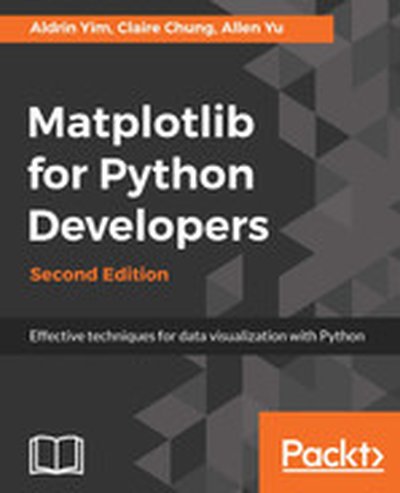
Matplotlib for Python Developers - Second Edition

"Matplotlib for Python Developers" is your comprehensive guide to creating interactive and informative data visualizations using the Matplotlib library in Python. This book covers all the essentials-from building static plots to integrating dynamic graphics with web applications. What this Book will help me do Design and customize stunning data visualizations including heatmaps and scatter plots. Integrate Matplotlib visualization seamlessly into GUI applications using GTK3 or Qt. Utilize advanced plotting libraries like Seaborn and GeoPandas for enhanced visual representation. Develop web-based dashboards and plots that dynamically update using Django. Master techniques to prepare your Matplotlib projects for deployment in a cloud-based environment. Author(s) Authors Aldrin Yim, Claire Chung, and Allen Yu are seasoned developers and data scientists with extensive experience in Python and data visualization. They bring a practical touch to technical concepts, aiming to bridge theory with hands-on applications. With such a skilled team behind this book, you'll gain both foundational knowledge and advanced insights into Matplotlib. Who is it for? This book is the ideal resource for Python developers and data analysts looking to enhance their data visualization skills. If you're familiar with Python and want to create engaging, clear, and dynamic visualizations, this book will give you the tools to achieve that. Designed for a range of expertise, from beginners understanding the basics to experienced users diving into complex integrations, this book has something for everyone. You'll be guided through every step, ensuring you build the confidence and skills needed to thrive in this area.

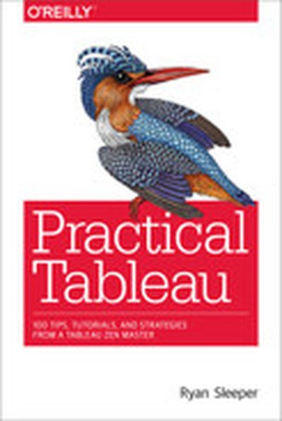
Practical Tableau

Whether you have some experience with Tableau software or are just getting started, this manual goes beyond the basics to help you build compelling, interactive data visualization applications. Author Ryan Sleeper, one of the worldâ??s most qualified Tableau consultants, complements his web posts and instructional videos with this guide to give you a firm understanding of how to use Tableau to find valuable insights in data. Over five sections, Sleeperâ??recognized as a Tableau Zen Master, Tableau Public Visualization of the Year author, and Tableau Iron Viz Championâ??provides visualization tips, tutorials, and strategies to help you avoid the pitfalls and take your Tableau knowledge to the next level. Practical Tableau sections include: Fundamentals: get started with Tableau from the beginning Chart types: use step-by-step tutorials to build a variety of charts in Tableau Tips and tricks: learn innovative uses of parameters, color theory, how to make your Tableau workbooks run efficiently, and more Framework: explore the INSIGHT framework, a proprietary process for building Tableau dashboards Storytelling: learn tangible tactics for storytelling with data, including specific and actionable tips you can implement immediately