talk-data.com talk-data.com

Topic

data-visualization

212

tagged

Activity Trend

1 peak/qtr
2020-Q1 2026-Q1

Activities

212 activities · Newest first

Data Visualization with D3.js Cookbook

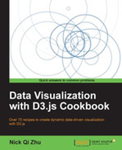
Dive into the world of data visualization with 'Data Visualization with D3.js Cookbook'. This book provides a hands-on approach to mastering data visualization using D3.js, a powerful JavaScript library that brings data to life using HTML, SVG, and CSS. Through step-by-step recipes, you'll learn everything you need to create stunning, interactive, and effective visualizations. What this Book will help me do Develop expertise in functional JavaScript to create elegant D3 visualizations. Learn to work with HTML and SVG elements efficiently to design effective visuals. Master the use of D3 scales and interpolators to represent data accurately. Enhance your understanding of D3 layouts and force-directed visuals for complex data. Create interactive and responsive visualizations for web applications. Author(s) Nick Zhu is an experienced software engineer and data visualization enthusiast with extensive expertise in JavaScript and web development. Authoring 'Data Visualization with D3.js Cookbook', Nick adeptly shares his knowledge, making complex topics approachable. His passion for clear communication shines in his instructive writing style. Who is it for? This book is designed for developers who have some knowledge of HTML, CSS, and JavaScript and aim to excel in data visualization using D3.js. If you strive for deeper mastery of D3 and wish to enhance your ability to create compelling graphics, this book is ideal for you. It serves both as a learning resource for newcomers and a quick reference for experienced practitioners. Your goal to transform data into impactful visuals aligns perfectly with the insights offered.

Mondrian in Action

Mondrian in Action teaches business users and developers how to use Mondrian and related tools for strategic business analysis. You'll learn how to design and populate a data warehouse and present the data via a multidimensional model. You'll follow examples showing how to create a Mondrian schema and then expand it to add basic security based on the users' roles. About the Technology Mondrian is an open source, lightning-fast data analysis engine designed to help you explore your business data and perform speed-of-thought analysis. Mondrian can be integrated into a wide variety of business analysis applications and learning it requires no specialized technical knowledge. About the Book Mondrian in Action teaches you to use Mondrian for strategic business analysis. In it, you'll learn how to organize and present data in a multidimensional manner. You'll follow apt and thoroughly explained examples showing how to create a Mondrian schema and then expand it to add basic security based on users' roles. Developers will discover how to integrate Mondrian using its olap4j Java API and web service calls via XML for Analysis. What's Inside Mondrian from the ground up -- no experience required A primer on business analytics Using Mondrian with a variety of leading applications Optimizing and restricting business data for fast, secure analysis About the Reader Written for developers building data analysis solutions. Appropriate for tech-savvy business users and DBAs needing to query and report on data. About the Authors William D. Back is an Enterprise Architect and Director of Pentaho Services. Nicholas Goodman is a Business Intelligence pro who has authored training courses on OLAP and Mondrian. Julian Hyde founded Mondrian and is the project's lead developer. Quotes A wonderful introduction to Business Intelligence and Analytics. - Lorenzo De Leon, Authentify, Inc. A great overview of the Mondrian engine that guided me through all the technical details. - Alexander Helf, veenion GmbH A significant complement to the online documentation, and an excellent introduction to how to think about designing a data warehouse. - Mark Newman, Heads Up Analytics Comprehensive ... highly recommended. - Najib Coutya, IMD Group

Tableau 8: The Official Guide

Present a unified view of complex BI using the entire Tableau 8 toolkit Create and distribute dynamic, feature-rich data visualizations and highly interactive BI dashboards—quickly and easily! Tableau 8: The Official Guide provides the hands-on instruction and best practices you need to meet your business intelligence objectives and drive better decision making. Discover how to work from the Tableau GUI, load BI from disparate sources, drag and drop to analyze data, set up custom visualizations, and build robust dashboards. This practical guide shows you, step by step, how to design and publish meaningful business communications to end users across your enterprise. Navigate the Tableau user interface and data window Connect to spreadsheets, databases, and other sources Select data fields and drag them to desired screen locations Work with pre-defined visualizations and sample workbooks Display background maps and perform geographic analysis Add calculated fields, graphs, charts, tables, and statistics Combine multiple data sources into real-time dashboards Export your visualizations to the Web or in various file formats Electronic content includes: Videos that demonstrate the techniques presented in the book Sample Tableau workbooks

Visio® 2013 Absolute Beginner’s Guide

Make the most of Visio 2013– without becoming a technical expert! This book is the fastest way to master Visio and use it to build powerful, useful diagrams, org charts, and flowcharts of all kinds! Even if you’ve never used Visio before, you’ll learn how to do what you want, one incredibly clear and easy step at a time. Visio has never, ever been this simple! Who knew how simple Visio 2013 could be? This is the easiest, most practical beginner’s guide to using Microsoft Visio 2013...simple, reliable instructions for doing everything you really want to do! Here’s a small sample of what you’ll learn: Master new tools for creating intuitive, visually appealing diagrams Learn high-efficiency touch features for Windows 8 and tablets Create business and engineering diagrams, flowcharts, maps, floor plans, network diagrams, schedules, and more Instantly set or change diagram designs with enhanced templates and themes Simplify diagramming with built-in shapes and stencils–or create your own Craft more sophisticated diagrams with containers, callouts, screentips, and layers Import external images, from SVG graphics to AutoCAD drawings Visually present Excel spreadsheet data in Visio drawings Dynamically update diagrams with real-time data to support better decision-making Share diagrams to improve team collaboration

Excel Dashboards and Reports, 2nd Edition

Learn to use Excel dashboards and reports to better conceptualize data Updated for all the latest features and capabilities of Excel 2013, this go-to resource provides you with in-depth coverage of the individual functions and tools that can be used to create compelling Excel reports. Veteran author Michael Alexander walks you through the most effective ways to present and report data. Featuring a comprehensive review of a wide array of technical and analytical concepts, this essential guide helps you go from reporting data with simple tables full of dull numbers to presenting key information through the use of high-impact, meaningful reports and dashboards that will wow management both visually and substantively. Details how to analyze large amounts of data and report the results in a way that is both visually attractive and effective Describes how to use different perspectives to achieve better visibility into data, as well as how to slice data into various views on the fly Shows how to automate redundant reporting and analysis processes Walks you through creating impressive dashboards, eye-catching visualizations, and real-world What-If analyses Excel Dashboards and Reports, Second Edition is part technical manual, part analytical guidebook, and exactly what you need to become your organization's dashboard dynamo!

Microsoft Visio 2013 Step by Step

The smart way to learn Microsoft Visio 2013—one step at a time! Experience learning made easy—and quickly teach yourself how to create professional-looking business and technical diagrams with Visio 2013. With Step by Step, you set the pace—building and practicing the skills you need, just when you need them! Create dynamic organization charts with Visio Make charts with wizards or build them by hand Build drawings using Visio themes and effects Use data-driven drawings in Microsoft SharePoint Import, manipulate, and visualize business data Draw and then execute SharePoint 2013 workflows

Visual Intelligence: Microsoft Tools and Techniques for Visualizing Data

Go beyond design concepts and learn to build state-of-the-art visualizations The visualization experts at Microsoft's Pragmatic Works have created a full-color, step-by-step guide to building specific types of visualizations. The book thoroughly covers the Microsoft toolset for data analysis and visualization, including Excel, and explores best practices for choosing a data visualization design, selecting tools from the Microsoft stack, and building a dynamic data visualization from start to finish. You'll examine different types of visualizations, their strengths and weaknesses, and when to use each one. Data visualization tools unlock the stories within the data, enabling you to present it in a way that is useful for making business decisions This full-color guide introduces data visualization design concepts, then explains the various Microsoft tools used to store and display data Features a detailed discussion of various classes of visualizations, their uses, and the appropriate tools for each Includes practical implementations of various visualizations and best practices for using them Covers out-of-the-box Microsoft tools, custom-developed illustrations and implementations, and code examples Visual Intelligence: Microsoft Tools and Techniques for Visualizing Data arms you with best practices and the knowledge to choose and build dynamic data visualizations.

Data Points: Visualization That Means Something

A fresh look at visualization from the author of Visualize This Whether it's statistical charts, geographic maps, or the snappy graphical statistics you see on your favorite news sites, the art of data graphics or visualization is fast becoming a movement of its own. In Data Points: Visualization That Means Something, author Nathan Yau presents an intriguing complement to his bestseller Visualize This, this time focusing on the graphics side of data analysis. Using examples from art, design, business, statistics, cartography, and online media, he explores both standard-and not so standard-concepts and ideas about illustrating data. Shares intriguing ideas from Nathan Yau, author of Visualize This and creator of flowingdata.com, with over 66,000 subscribers Focuses on visualization, data graphics that help viewers see trends and patterns they might not otherwise see in a table Includes examples from the author's own illustrations, as well as from professionals in statistics, art, design, business, computer science, cartography, and more Examines standard rules across all visualization applications, then explores when and where you can break those rules Create visualizations that register at all levels, with Data Points: Visualization That Means Something.

Interactive Data Visualization for the Web

Create and publish your own interactive data visualization projects on the Web—even if you have little or no experience with data visualization or web development. It’s easy and fun with this practical, hands-on introduction. Author Scott Murray teaches you the fundamental concepts and methods of D3, a JavaScript library that lets you express data visually in a web browser. Along the way, you’ll expand your web programming skills, using tools such as HTML and JavaScript. This step-by-step guide is ideal whether you’re a designer or visual artist with no programming experience, a reporter exploring the new frontier of data journalism, or anyone who wants to visualize and share data. Learn HTML, CSS, JavaScript, and SVG basics Dynamically generate web page elements from your data—and choose visual encoding rules to style them Create bar charts, scatter plots, pie charts, stacked bar charts, and force-directed layouts Use smooth, animated transitions to show changes in your data Introduce interactivity to help users explore data through different views Create customized geographic maps with data Explore hands-on with downloadable code and over 100 examples

Balanced Scorecards and Operational Dashboards with Microsoft Excel, 2nd Edition

Learn to maintain and update scorecards and dashboards with Excel Balanced Scorecards and operational dashboards measure organizational performance and Microsoft Excel is the tool used worldwide to create these scorecards and dashboards. This book covers time-proven step-by-step processes on how to guide executive teams and managers in creating scorecards and dashboards. It then shows Excel developers how to create those scorecards and dashboards. This is the only book that converts theory into practice. The author addresses the people and processes you need to identify strategy and operational metrics and then implement them in dashboards in three versions of Excel. You'll learn how balanced scorecards help organizations translate strategy into action and the ways that performance dashboards enable managers monitor operations. Covers Excel 2010 back to Excel 2003 Shows how to develop consensus on strategy and operational plans with the executive teams Details steps in creating tactical action plans Gives step-by-step guidance in creating the most powerful management dashboards Puts over ten years of experience in one book Balanced Scorecards & Operational Dashboards with Microsoft Excel, Second Edition is the ultimate resource for enhancing your strategic and operational performance.

Data Visualization: a successful design process

Dive into the world of data visualization with 'Data Visualization: a Successful Design Process'. Learn to convert complex datasets into vivid, insightful visuals using proven design methodologies and tools. This resource equips you to craft visuals that not only engage your audience but also uncover critical trends and narratives hidden in data. What this Book will help me do Master the fundamentals of visualization taxonomy to choose the ideal design for your data. Develop analytical questions and identify key narratives to structure your data representation. Understand the human visual system and how it impacts effective visual communication. Apply critical thinking to select visualization techniques suited to different data types. Gain an in-depth knowledge of data visualization tools and contemporary practices. Author(s) The author of this book is a seasoned expert in the field of data visualization, known for their innovative approach to transforming data into impactful visuals. With years of experience navigating the intersection of data science and design, their method focuses on empowering professionals to communicate insights effectively. Their writing combines a deep understanding of technical skills with actionable, inspiring guidance. Who is it for? This book is perfect for professionals, analysts, and designers who aim to improve their data visualization skills. Whether you are a beginner or an experienced individual seeking to refine your approach, this book caters to all skill levels. If your goal includes communicating data insights clearly and effectively to varied audiences, this book is for you.

Data Insights

Data Insights: New Ways to Visualize and Make Sense of Data offers thought-provoking insights into how visualization can foster a clearer and more comprehensive understanding of data. The book offers perspectives from people with different backgrounds, including data scientists, statisticians, painters, and writers. It argues that all data is useless, or misleading, if we do not know what it means.Organized into seven chapters, the book explores some of the ways that data visualization and other emerging approaches can make data meaningful and therefore useful. It also discusses some fundamental ideas and basic questions in the data lifecycle; the process of interactions between people, data, and displays that lead to better questions and more useful answers; and the fundamentals, origins, and purposes of the basic building blocks that are used in data visualization. The reader is introduced to tried and true approaches to understanding users in the context of user interface design, how communications can get distorted, and how data visualization is related to thinking machines. Finally, the book looks at the future of data visualization by assessing its strengths and weaknesses. Case studies from business analytics, healthcare, network monitoring, security, and games, among others, as well as illustrations, thought-provoking quotes, and real-world examples are included.This book will prove useful to computer professionals, technical marketing professionals, content strategists, Web and product designers, and researchers. Demonstrates, with a variety of case studies, how visualizations can foster a clearer and more comprehensive understanding of data Answers the question, "How can data visualization help me?" with discussions of how it fits into a wide array of purposes and situations Makes the case that data visualization is not just about technology; it also involves a deeply human process

Visual Guide to Chart Patterns

The step-by-step visual guide to spotting potential price movements and improving returns Bloomberg Visual Guide to Chart Patterns is a concise and accessible visual guide to identifying, understanding, and using chart patterns to predict the direction and extent of price moves. Packed with visual learning enhancements and exercises, this innovative book helps savvy investors and professionals alike master the essential skills of chart pattern recognition. Follow along as chart pattern expert Thomas Bulkowski teaches you to recognize important peaks and valleys that form patterns—footprints of the smart money. Nearly 200 color charts assist in providing a step-by-step approach to finding those footprints, interpreting them, and following them. Popular patterns such as head-and-shoulders, double tops and bottoms, triangles, gaps, flags, and pennants are just a few of the many patterns explored throughout the book. For the sophisticated trader or investor, the book also provides statistical research to support the claims of pattern behavior, trading signals, and setups, in an easy to understand way. Discusses chart pattern identification guidelines, psychology, variations, failures, and buy and sell signals Covers the most popular and common chart patterns as well as lesser-known ones like throwbacks, pullbacks, and busted patterns Incorporates quizzes, step-by-step exercises, enhanced graphics and video tutorials to immerse the reader in the world of chart patterns Designed for use by investors and traders, from beginners to experts looking for a practical, easy-to-use guide, comprehensive reference, Bloomberg Visual Guide to Chart Patterns provides a sophisticated introduction to the world of chart patterns.

Infographics: The Power of Visual Storytelling

Transform your marketing efforts through the power of visual content In today's fast-paced environment, you must communicate your message in a concise and engaging way that sets it apart from the noise. Visual content—such as infographics and data visualization—can accomplish this. With DIY functionality, Infographics: The Power of Visual Storytelling will teach you how to find stories in your data, and how to visually communicate and share them with your audience for maximum impact. Infographics will show you the vast potential to using the communication medium as a marketing tool by creating informative and shareable infographic content. Learn how to explain an object, idea, or process using strong illustration that captures interest and provides instant clarity Discover how to unlock interesting stories (in previously buried or boring data) and turn them into visual communications that will help build brands and increase sales Use the power of visual content to communicate with and engage your audience, capture attention, and expand your market.

The Functional Art: An introduction to information graphics and visualization

Unlike any time before in our lives, we have access to vast amounts of free information. With the right tools, we can start to make sense of all this data to see patterns and trends that would otherwise be invisible to us. By transforming numbers into graphical shapes, we allow readers to understand the stories those numbers hide. In this practical introduction to understanding and using information graphics, you’ll learn how to use data visualizations as tools to see beyond lists of numbers and variables and achieve new insights into the complex world around us. Regardless of the kind of data you’re working with–business, science, politics, sports, or even your own personal finances–this book will show you how to use statistical charts, maps, and explanation diagrams to spot the stories in the data and learn new things from it. Condé Nast Traveler’s John Grimwade , National Geographic Magazine’s Fernando Baptista, The New York Times’ Steve Duenes, The Washington Post’s Hannah Fairfield, Hans Rosling of the Gapminder Foundation, Stanford’s Geoff McGhee, and European superstars Moritz Stefaner, Jan Willem Tulp, Stefanie Posavec, and Gregor Aisch. The Functional Art reveals: In this introductory course on information graphics, Alberto Cairo goes into greater detail with even more visual examples of how to create effective information graphics that function as practical tools for aiding perception. You’ll learn how to: incorporate basic design principles in your visualizations, create simple interfaces for interactive graphics, and choose the appropriate type of graphic forms for your data. Cairo also deconstructs successful information graphics from The New York Times and National Geographic magazine with sketches and images not shown in the book.

Getting Started with D3

Learn how to create beautiful, interactive, browser-based data visualizations with the D3 JavaScript library. This hands-on book shows you how to use a combination of JavaScript and SVG to build everything from simple bar charts to complex infographics. You’ll learn how to use basic D3 tools by building visualizations based on real data from the New York Metropolitan Transit Authority. Using historical tables, geographical information, and other data, you’ll graph bus breakdowns and accidents and the percentage of subway trains running on time, among other examples. By the end of the book, you’ll be prepared to build your own web-based data visualizations with D3. Join a dataset with elements of a webpage, and modify the elements based on the data Map data values onto pixels and colors with D3’s scale objects Apply axis and line generators to simplify aspects of building visualizations Create a simple UI that allows users to investigate and compare data Use D3 transitions in your UI to animate important aspects of the data Get an introduction to D3 layout tools for building more sophisticated visualizations If you can code and manipulate data, and know how to work with JavaScript and SVG, this book is for you.

Audiovisual Archives: Digital Text and Discourse Analysis

Today, audiovisual archives and libraries have become very popular especially in the field of collecting, preserving and transmitting cultural heritage. However, the data in these archives or libraries - videos, images, soundtracks, etc. - constitute as such only potential cognitive resources for a given public (or "target community"). One of the most crucial issues of digital audiovisual libraries is indeed to enable users to actively appropriate audiovisual resources for their own concern (in research, education or any other professional or non-professional context). This means, an adaptation of the audiovisual data to the specific needs of a user or user group can be represented by small and closed "communities" as well as by networks of open communities around the globe. "Active appropriation" is, basically speaking, the use of existing digital audiovisual resources by users or user communities according to their expectations, needs, interests or desires. This process presupposes: 1) the definition and development of models or "scenarios" of cognitive processing of videos by the user; 2) the availability of tools necessary for defining, developing, reusing and sharing meta-linguistic resources such as thesauruses, ontologies or description models by users or user communities. Both aspects are central to the so-called semiotic turn in dealing with digital (audiovisual) texts, corpora of texts or again entire (audiovisual) archives and libraries. They demonstrate practically and theoretically the well-known "from data to metadata" or "from (simple) information to (relevant) knowledge" problem, which obviously directly influences the effective use, social impact and relevancy, and therefore also the future, of digital knowledge archives. This book offers a systematic, comprehensive approach to these questions from a theoretical as well as practical point of view. Contents Part 1. The Practical, Technical and Theoretical Context 1. Analysis of an Audiovisual Resource. 2. The Audiovisual Semiotic Workshop (ASW) Studio - A Brief Presentation. 3. A Concrete Example of a Model for Describing Audiovisual Content. 4. Model of Description and Task of Analysis. Part 2. Tasks in Analyzing an Audiovisual Corpus 5. The Analytical Task of "Describing the Knowledge Object". 6. The Analytical Task of "Contextualizing the Domain of Knowledge". 7. The Analytical Task of "Analyzing the Discourse Production around a Subject". Part 3. Procedures of Description 8. Definition of the Domain of Knowledge and Configuration of the Topical Structure. 9. The Procedure of Free Description of an Audiovisual Corpus. 10. The Procedure of Controlled Description of an Audiovisual Corpus. Part 4. The ASW System of Metalinguistic Resources 11. An Overview of the ASW Metalinguistic Resources. 12. The Meta-lexicon Representing the ASW Universe of Discourse.

Mind Mapping For Dummies

Unlock your brain's potential using mind mapping Mind mapping is a popular technique that can be applied in a variety of situations and settings. Students can make sense of complex topics and structure their revision with mind mapping; business people can manage projects and collaborate with colleagues using mind maps, and any creative process can be supported by using a mind map to explore ideas and build upon them. Mind maps allow for greater creativity when recording ideas and information whatever the topic, and enable the note-taker to associate words with visual representations. Mind Mapping For Dummies explains how mind mapping works, why it's so successful, and the many ways it can be used. It takes you through the wide range of approaches to mind mapping, looks at the available mind mapping software options, and investigates advanced mind mapping techniques for a range of purposes, including studying for exams, improving memory, project management, and maximizing creativity. Suitable for students of all ages and study levels An excellent resource for people working on creative projects who wish to use mind mapping to develop their ideas Shows businesspeople how to maximize their efficiency, manage projects, and brainstorm effectively If you're a student, artist, writer, or businessperson, Mind Mapping For Dummies shows you how to unlock your brain's potential.

Information Visualization, 3rd Edition

Most designers know that yellow text presented against a blue background reads clearly and easily, but how many can explain why, and what really are the best ways to help others and ourselves clearly see key patterns in a bunch of data? When we use software, access a website, or view business or scientific graphics, our understanding is greatly enhanced or impeded by the way the information is presented. This book explores the art and science of why we see objects the way we do. Based on the science of perception and vision, the author presents the key principles at work for a wide range of applications--resulting in visualization of improved clarity, utility, and persuasiveness. The book offers practical guidelines that can be applied by anyone: interaction designers, graphic designers of all kinds (including web designers), data miners, and financial analysts. Complete update of the recognized source in industry, research, and academic for applicable guidance on information visualizing Includes the latest research and state of the art information on multimedia presentation More than 160 explicit design guidelines based on vision science A new final chapter that explains the process of visual thinking and how visualizations help us to think about problems Packed with over 400 informative full color illustrations, which are key to understanding of the subject

gnuplot Cookbook

Master the art of technical plotting with 'gnuplot Cookbook'. This book serves as an indispensable guide to utilizing gnuplot's full range of capabilities for creating stunning 2D and 3D plots, interactive graphs, and seamless visual integration into programming projects. What this Book will help me do Gain precise control over the aesthetics and presentation of your graphs. Understand how to create complex graphical illustrations from multiple data sources. Learn to integrate gnuplot effectively into your programming workflows and systems. Discover how to produce professional-grade technical documents with high-quality charts and illustrations. Master interactive graph creation for engaging web content. Author(s) Lee Phillips, a seasoned expert in scientific and technical visualization, has leveraged years of practical experience to provide this comprehensive guide to gnuplot. With a sharp focus on clarity and functionality, Lee brings a hands-on approach to teaching through meticulously crafted examples and detailed explanations. Who is it for? This book is ideal for scientists, engineers, and data analysts who are either just starting or looking to deepen their expertise with gnuplot. It's perfect for those with a foundational understanding of graph plotting, aspiring to produce high-quality visualizations and integrate them effectively into diverse projects.