talk-data.com talk-data.com

Event

O'Reilly Data Visualization Books

2007-12-18 – 2026-02-25 Oreilly Visit website ↗

Activities tracked

72

Collection of O'Reilly books on Data Visualization.

Filtering by: data-science ×

Sessions & talks

Showing 26–50 of 72 · Newest first

Search within this event →
Exam Ref 70-778 Analyzing and Visualizing Data by Using Microsoft Power BI

Prepare for Microsoft Exam 70-778-and help demonstrate your real-world mastery of Power BI data analysis and visualization. Designed for experienced BI professionals and data analysts ready to advance their status, Exam Ref focuses on the critical thinking and decision-making acumen needed for success at the MCSA level. Focus on the expertise measured by these objectives: Consume and transform data by using Power BI Desktop Model and visualize data Configure dashboards, reports, and apps in the Power BI Service This Microsoft Exam Ref: Organizes its coverage by exam objectives Features strategic, what-if scenarios to challenge you Assumes you have experience consuming and transforming data, modeling and visualizing data, and configuring dashboards using Excel and Power BI

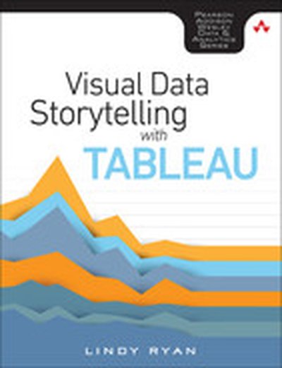
Visual Data Storytelling with Tableau, First edition

Tell Insightful, Actionable Business Stories with Tableau, the World’s Leading Data Visualization Tool! Visual Data Storytelling with Tableau brings together knowledge, context, and hands-on skills for telling powerful, actionable data stories with Tableau. This full-color guide shows how to organize data and structure analysis with storytelling in mind, embrace exploration and visual discovery, and articulate findings with rich data, carefully curated visualizations, and skillfully crafted narrative. You don’t need any visualization experience. Each chapter illuminates key aspects of design practice and data visualization, and guides you step-by-step through applying them in Tableau. Through realistic examples and classroom-tested exercises, Professor Lindy Ryan helps you use Tableau to analyze data, visualize it, and help people connect more intuitively and emotionally with it. Whether you’re an analyst, executive, student, instructor, or journalist, you won’t just master the tools: you’ll learn to craft data stories that make an immediate impact--and inspire action. Learn how to: Craft more powerful stories by blending data science, genre, and visual design Ask the right questions upfront to plan data collection and analysis Build storyboards and choose charts based on your message and audience Direct audience attention to the points that matter most Showcase your data stories in high-impact presentations Integrate Tableau storytelling throughout your business communication Explore case studies that show what to do--and what not to do Discover visualization best practices, tricks, and hacks you can use with any tool Includes coverage up through Tableau 10

Qlik Sense: Advanced Data Visualization for Your Organization

Perform Interactive Data Analysis with Smarter Visualizations and Support your Enterprise-wide Analytical Needs About This Book Get a practical demonstration of discovering data for sales, human resources, and more using Qlik Sense Create dynamic dashboards for business intelligence and predictive analytics Create and collaborate comprehensive analytical solutions using Rattle and Qlik Sense Who This Book Is For This course is for anyone who wishes to understand and utilize the various new approaches to business intelligence actively in their business practice. Knowing the basics of business intelligence concepts would be helpful when picking up this course, but is not mandatory. What You Will Learn Build simple visualization models with Rattle and Qlik Sense Desktop Get to grips with the life cycle and new visualization functions of a Qlik Sense application Discover simple ways to examine data and get it ready for analysis Visualize your data with Qlik Sense's engaging and informative graphs Build efficient and responsive Associative Models Optimize Qlik Sense for sales, human resources, and demographic data discovery Explore various tips and tricks of navigation for the Qlik Sense® front end Develop creative extensions for your Qlik Sense® dashboard In Detail Qlik Sense is powerful and creative visual analytics software that allows users to discover data, explore it, and dig out meaningful insights in order to make a profit and make decisions for your business. This course begins by introducing you to the features and functions of the most modern edition of Qlik Sense so you get to grips with the application. The course will teach you how to administer the data architecture in Qlik Sense, enabling you to customize your own Qlik Sense application for your business intelligence needs. It also contains numerous recipes to help you overcome challenging situations while creating fully featured desktop applications in Qlik Sense. It explains how to combine Rattle and Qlik Sense Desktop to apply predictive analytics to your data to develop real-world interactive data applications. The course includes premium content from three of our most popular books: Learning Qlik Sense: The Official Guide Second Edition Qlik Sense Cookbook Predictive Analytics using Rattle and Qlik Sense On completion of this course, you will be self-sufficient in improving your data analysis and will know how to apply predictive analytics to your datasets. Through this course, you will be able to create predictive models and data applications, allowing you to explore your data insights much deeper. Style and approach The course will follow a practical approach with rich set of examples through which it will demonstrate its concepts, features and its implementation. The course will also feature numerous solutions which will cover entire spectrum of BI use cases.

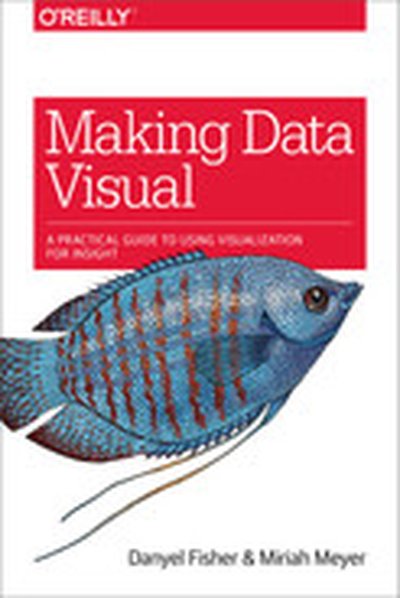
Making Data Visual

You have a mound of data front of you and a suite of computation tools at your disposal. Which parts of the data actually matter? Where is the insight hiding? If you’re a data scientist trying to navigate the murky space between data and insight, this practical book shows you how to make sense of your data through high-level questions, well-defined data analysis tasks, and visualizations to clarify understanding and gain insights along the way. When incorporated into the process early and often, iterative visualization can help you refine the questions you ask of your data. Authors Danyel Fisher and Miriah Meyer provide detailed case studies that demonstrate how this process can evolve in the real world. You’ll learn: The data counseling process for moving from general to more precise questions about your data, and arriving at a working visualization The role that visual representations play in data discovery Common visualization types by the tasks they fulfill and the data they use Visualization techniques that use multiple views and interaction to support analysis of large, complex data sets

R Data Visualization Recipes

"R Data Visualization Recipes" is a valuable resource for data professionals who want to create clear and effective data visualizations using R. Through a series of practical recipes, the book walks you through various techniques, from mastering the basics to creating advanced, interactive dashboards. By following these recipes, you'll be equipped to use R's visualization packages to their full potential. What this Book will help me do Understand and effectively use R's diverse data visualization libraries. Create polished and informative graphics with ggplot2, ggvis, and plotly. Enhance plots with interactive and animated elements to tell a compelling story. Develop expertise in creating three-dimensional and multivariate visualizations. Design custom interactive dashboards using the power of Shiny. Author(s) None Bianchi Lanzetta is an expert in data visualization and programming, bringing years of experience in using R for applications in data analysis and graphics. With a background in software development, data science, and teaching, the author shares practical insights and clear instructions. Lanzetta's approachable and methodical writing style makes even complex topics accessible. Who is it for? This book is perfect for data professionals, analysts, and scientists who know the basics of R and want to enhance their ability to communicate findings visually. Even if you are a beginner with some exposure to R's ggplot2 package or similar, you'll find the recipes approachable and methodical. The book is ideal for readers who want practical, directly applicable techniques. Whether you're looking to augment your reporting abilities or explore advanced data visualization, you'll gain valuable skills.

Interactive Data Visualization for the Web, 2nd Edition

Create and publish your own interactive data visualization projects on the webâ??even if you have little or no experience with data visualization or web development. Itâ??s inspiring and fun with this friendly, accessible, and practical hands-on introduction. This fully updated and expanded second edition takes you through the fundamental concepts and methods of D3, the most powerful JavaScript library for expressing data visually in a web browser. Ideal for designers with no coding experience, reporters exploring data journalism, and anyone who wants to visualize and share data, this step-by-step guide will also help you expand your web programming skills by teaching you the basics of HTML, CSS, JavaScript, and SVG. Learn D3 4.xâ??the latest D3 versionâ??with downloadable code and over 140 examples Create bar charts, scatter plots, pie charts, stacked bar charts, and force-directed graphs Use smooth, animated transitions to show changes in your data Introduce interactivity to help users explore your data Create custom geographic maps with panning, zooming, labels, and tooltips Walk through the creation of a complete visualization project, from start to finish Explore inspiring case studies with nine accomplished designers talking about their D3-based projects

SPSS Statistics for Data Analysis and Visualization

Dive deeper into SPSS Statistics for more efficient, accurate, and sophisticated data analysis and visualization SPSS Statistics for Data Analysis and Visualization goes beyond the basics of SPSS Statistics to show you advanced techniques that exploit the full capabilities of SPSS. The authors explain when and why to use each technique, and then walk you through the execution with a pragmatic, nuts and bolts example. Coverage includes extensive, in-depth discussion of advanced statistical techniques, data visualization, predictive analytics, and SPSS programming, including automation and integration with other languages like R and Python. You'll learn the best methods to power through an analysis, with more efficient, elegant, and accurate code. IBM SPSS Statistics is complex: true mastery requires a deep understanding of statistical theory, the user interface, and programming. Most users don't encounter all of the methods SPSS offers, leaving many little-known modules undiscovered. This book walks you through tools you may have never noticed, and shows you how they can be used to streamline your workflow and enable you to produce more accurate results. Conduct a more efficient and accurate analysis Display complex relationships and create better visualizations Model complex interactions and master predictive analytics Integrate R and Python with SPSS Statistics for more efficient, more powerful code These "hidden tools" can help you produce charts that simply wouldn't be possible any other way, and the support for other programming languages gives you better options for solving complex problems. If you're ready to take advantage of everything this powerful software package has to offer, SPSS Statistics for Data Analysis and Visualization is the expert-led training you need.

D3.js 4.x Data Visualization - Third Edition

Learn to build beautiful and interactive data visualizations with D3.js 4.x in this approachable and practical guide. From setting up the basics to mastering advanced techniques, this book empowers you to create engaging, sophisticated graphics and charts to communicate information effectively. What this Book will help me do Effectively map data sets to visual representations using D3.js scales. Generate dynamic and interactive SVG elements with D3's shape generators. Develop reusable D3 components for extensible and testing-friendly charts. Leverage advanced D3 layout patterns for large-scale data visualization. Write modern, efficient JavaScript for web-based data visualization systems. Author(s) Aendrew Rininsland, an experienced data visualization developer, and co-author bring a wealth of expertise to this book, drawing from years of implementing interactive solutions in professional contexts. Their engaging way of explaining concepts and demonstrating techniques with practical examples makes learning straightforward and impactful. Who is it for? This book is ideal for web developers, data analysts, and designers who are interested in enhancing their web-based data visualization skills with D3.js. Some familiarity with JavaScript is beneficial but not strictly required, as the book provides clear guidance to bring readers up to speed. If you aspire to effectively present data through captivating visuals and improve your technical proficiency, this book is a great fit for you.

D3.js: Cutting-edge Data Visualization

Turn your raw data into real knowledge by creating and deploying complex data visualizations with D3.js About This Book Understand how to best represent your data by developing the right kind of visualization Explore the concepts of D3.js through examples that enable you to quickly create visualizations including charts, network diagrams, and maps Get practical examples of visualizations using real-world data sets that show you how to use D3.js to visualize and interact with information to glean its underlying meaning Who This Book Is For Whether you are new to data and data visualization, a seasoned data scientist, or a computer graphics specialist, this Learning Path will provide you with the skills you need to create web-based and interactive data visualizations. Some basic JavaScript knowledge is expected, but no prior experience with data visualization or D3 is required What You Will Learn Gain a solid understanding of the common D3 development idioms Find out how to write basic D3 code for servers using Node.js Install and use D3.js to create HTML elements within a document Create and style graphical elements such as circles, ellipses, rectangles, lines, paths, and text using SVG Turn your data into bar and scatter charts, and add margins, axes, labels, and legends Use D3.js generators to perform the magic of creating complex visualizations from data Add interactivity to your visualizations, including tool-tips, sorting, hover-to-highlight, and grouping and dragging of visuals Write, test, and distribute a D3-based charting package Make a real-time application with Node and D3 In Detail D3 has emerged as one of the leading platforms to develop beautiful, interactive visualizations over the web. We begin the course by setting up a strong foundation, then build on this foundation as we take you through the entire world of reimagining data using interactive, animated visualizations created in D3.js. In the first module, we cover the various features of D3.js to build a wide range of visualizations. We also focus on the entire process of representing data through visualizations. By the end of this module, you will be ready to use D3 to transform any data into a more engaging and sophisticated visualization. In the next module, you will learn to master the creation of graphical elements from data. Using practical examples provided, you will quickly get to grips with the features of D3.js and use this learning to create your own spectacular data visualizations with D3.js. Over the last leg of this course, you will get acquainted with how to integrate D3 with mapping libraries to provide reverse geocoding and interactive maps among many other advanced features of D3. This module culminates by showing you how to create enterprise-level dashboards to display real-time data. This Learning Path combines some of the best that Packt has to offer in one complete, curated package. It includes content from the following Packt products: Learning D3.js Data Visualization, Second Edition by Andrew H. Rininsland D3.js By Example by Michael Heydt Mastering D3.js by Pablo Navarro Castillo Style and approach This course provides a comprehensive explanation of how to leverage the power of D3.js to create powerful and creative visualizations through step-by-step instructions in the form of modules. Each module help you skill up a level in creating meaningful visualizations. Downloading the example code for this book. You can download the example code files for all Packt books you have purchased from your account at http://www.PacktPub.com. If you purchased this book elsewhere, you can visit http://www.PacktPub.com/support and register to have the code file.

Data Visualization, Volume II

This book discusses data and information visualization techniques-the decision-making tools with applications in health care, finance, manufacturing engineering, process improvement, product design, and others. These tools are an excellent means of viewing the current state of the process and improving them. The initial chapters discuss data analysis, the current trends in visualization, the concepts of systems and processes from which data are collected. The second part is devoted to quality tools-a set of graphical and information visualization tools in data analysis, decision-making, and Lean Six-Sigma quality. The eight basic tools of quality discussed are the Process Maps, Check Sheets, Histograms, Scatter Diagrams, Run Charts, Control Charts, Cause-and-Effect Diagrams, and Pareto Charts. The new quality tools presented are the Affinity, Tree, and Matrix Diagrams, Interrelationship Digraph, Prioritizing Matrices, Process Decision Program Chart, and Activity Network Diagram along with Quality Function Deployment (QFD) and Multivari Charts.

Big Data Visualization

Dive into 'Big Data Visualization' and uncover how to tackle the challenges of visualizing vast quantities of complex data. With a focus on scalable and dynamic techniques, this guide explores the nuances of effective data analysis. You'll master tools and approaches to display, interpret, and communicate data in impactful ways. What this Book will help me do Understand the fundamentals of big data visualization, including unique challenges and solutions. Explore practical techniques for using D3 and Python to visualize and detect anomalies in big data. Learn to leverage dashboards like Tableau to present data insights effectively. Address and improve data quality issues to enhance analysis accuracy. Gain hands-on experience with real-world use cases for tools such as Hadoop and Splunk. Author(s) James D. Miller is an IBM-certified expert specializing in data analytics and visualization. With years of experience handling massive datasets and extracting actionable insights, he is dedicated to sharing his expertise. His practical approach is evident in how he combines tool mastery with a clear understanding of data complexities. Who is it for? This book is designed for data analysts, data scientists, and others involved in interpreting and presenting big datasets. Whether you are a beginner looking to understand big data visualization or an experienced professional seeking advanced tools and techniques, this guide suits your needs perfectly. A foundational knowledge in programming languages like R and big data platforms such as Hadoop is recommended to maximize your learning.

Data Visualization with D3 4.x Cookbook - Second Edition

This book, 'Data Visualization with D3 4.x Cookbook' by Nick Zhu, is your ultimate guide to mastering data visualization using D3.js. Through practical recipes, you'll learn to create dynamic, data-driven visualizations and tackle real-world visualization challenges. The book also introduces techniques to manage and present data powerfully. What this Book will help me do Master D3.js 4.x features to create efficient data visualizations. Utilize pre-built recipes to generate diverse charts and graphs. Acquire expertise in manipulating datasets for visualization. Develop interactive, dynamic web applications with D3. Overcome common visualization challenges with practical solutions. Author(s) Nick Zhu is a professional data engineer and an expert in creating data-driven applications. With years of experience using D3.js, Nick brings his wealth of knowledge to writing, making complex concepts accessible to learners. He creates resources to help others enhance their data visualization skills. Who is it for? This book is ideal for developers and data analysts familiar with web technologies like HTML, CSS, and JavaScript, aiming to expand their skills with D3.js. Whether you're new to D3 or experienced and looking for a comprehensive reference, this book will empower you to create professional-grade visualizations.

Data Visualization, Volume I

Data visualization involves graphical and visual tools used in data analysis and decision making. The emphasis in this book is on recent trends and applications of visualization tools using conventional and big data. These tools are widely used in data visualization and quality improvement to analyze, enhance, and improve the quality of products and services. Data visualization is an easy way to obtain a first look at the data visually. The book provides a collection of visual and graphical tools widely used to gain an insight into the data before applying more complex analysis. The focus is on the key application areas of these tools including business process improvement, business data analysis, health care, finance, manufacturing, engineering, process improvement, and Lean Six Sigma. The key areas of application include data and data analysis concepts, recent trends in data visualization and ÒBig Data,Ó widely used charts and graphs and their applications, analysis of the relationships between two or more variables graphically using scatterplots, bubble graphs, matrix plots, etc., data visualization with big data, computer applications and implementation of widely used graphical and visual tools, and computer instructions to create the graphics presented along with the data files.

Tableau Cookbook - Recipes for Data Visualization

"Tableau Cookbook - Recipes for Data Visualization" walks you through the features and tools of Tableau, one of the industry-leading platforms for building data visualizations. Using over 50 hands-on recipes, you'll learn to create professional dashboards and storyboards to effectively present data trends and patterns. What this Book will help me do Understand the Tableau interface and connect it to various data sources. Build basic and advanced charts, from bar graphs to histograms and maps. Design interactive dashboards that link multiple visual components. Utilize parameters and calculations for advanced data visualizations. Integrate multiple data sources and leverage Tableau's data blending features. Author(s) Shweta Savale brings years of experience in data visualization and analytics to her writing of this cookbook. As a Tableau expert, Shweta has taught and consulted with professionals across industries, empowering them to gain insights from data. Her step-by-step instructional style makes learning both engaging and approachable. Who is it for? This book caters to both beginners looking to learn Tableau from scratch and advanced users needing a quick reference guide. It's perfect for data professionals, analysts, and anyone seeking to visualize and interpret data effectively. If you're looking to simplify Tableau's functions or sharpen your visualization skills, this book is for you.

Visualizing Graph Data

Visualizing Graph Data teaches you not only how to build graph data structures, but also how to create your own dynamic and interactive visualizations using a variety of tools. This book is loaded with fascinating examples and case studies to show you the real-world value of graph visualizations. About the Technology Assume you are doing a great job collecting data about your customers and products. Are you able to turn your rich data into important insight? Complex relationships in large data sets can be difficult to recognize. Visualizing these connections as graphs makes it possible to see the patterns, so you can find meaning in an otherwise over-whelming sea of facts. About the Book Visualizing Graph Data teaches you how to understand graph data, build graph data structures, and create meaningful visualizations. This engaging book gently introduces graph data visualization through fascinating examples and compelling case studies. You'll discover simple, but effective, techniques to model your data, handle big data, and depict temporal and spatial data. By the end, you'll have a conceptual foundation as well as the practical skills to explore your own data with confidence. What's Inside Techniques for creating effective visualizations Examples using the Gephi and KeyLines visualization packages Real-world case studies About the Reader No prior experience with graph data is required. About the Author Corey Lanum has decades of experience building visualization and analysis applications for companies and government agencies around the globe. Quotes Shows you how to solve visualization problems and explore complex data sets. A pragmatic introduction. - John D. Lewis, DDN Excellent! Hands-on! Shows you how to kick-start your graph data visualization. - Rocio Chongtay, University of Southern Denmark A clear and concise guide to both graph theory and visualization. - Jonathan Suever, PhD, Georgia Institute of Technology Great coverage, with real-life business use cases. - Sumit Pal, Big Data consultant

Data Visualization: Representing Information on Modern Web

Unleash the power of data by creating interactive, engaging, and compelling visualizations for the web About This Book Get a portable, versatile, and flexible data visualization design approach that will help you navigate the complex path towards success Get thorough explanation of the many visual variables and visualization taxonomy to provide you with a menu of creative options A comprehensive and contemporary introduction to data-driven visualization design and the most effective approaches to designing impact-maximizing and cognition-amplifying visualizations Who This Book Is For This course is for developers who are excited about data and who want to share that excitement with others and it will be handy for the web developers or data scientists who want to create interactive visualizations for the web. Prior knowledge of developing web applications is required. You should have a working knowledge of both JavaScript and HTML. What You Will Learn Harness the power of D3 by building interactive and real-time data-driven web visualizations Find out how to use JavaScript to create compelling visualizations of social data Identify the purpose of your visualization and your project's parameters to determine overriding design considerations across your project's execution Apply critical thinking to visualization design and get intimate with your dataset to identify its potential visual characteristics Explore the various features of HTML5 to design creative visualizations Discover what data is available on Stack Overflow, Facebook, Twitter, and Google+ Gain a solid understanding of the common D3 development idioms Find out how to write basic D3 code for server using Node.js In Detail Do you want to create more attractive charts? Or do you have huge data sets and need to unearth the key insights in a visual manner? Data visualization is the representation and presentation of data, using proven design techniques to bring alive the patterns, stories, and key insights that are locked away. This learning path is divided into three modules. The first module will equip you with the key techniques required to overcome contemporary data visualization challenges. After getting familiar with key concepts of data visualization, it's time to incorporate it with various technologies. In the second module, Social Data Visualization with HTML5 and JavaScript, it teaches you how to leverage HTML5 techniques through JavaScript to build visualizations. It also clears up how the often complicated OAuth protocol works to help you unlock a universe of social media data from sites such as Twitter, Facebook, and Google+. Once you are familiar with the concepts of incorporating data visualization with HTML5 and JavaScript, third module, Learning d3.js Data Visualization, will lead you to D3, which has emerged as one of the leading platforms to develop beautiful, interactive visualizations over the web. This module provides a strong foundation in designing compelling web visualizations with D3.js. By the end of this course, you will have unlocked the mystery behind successful data visualizations. This Learning Path combines some of the best that Packt has to offer in one complete, curated package. It includes content from the following Packt products: Data Visualization: a successful design process by Andy Kirk Social Data Visualization with HTML5 and JavaScript by Simon Timms Learning d3.js Data Visualization, Second Edition by Ændrew Rininsland and Swizec Teller Style and approach This course includes all the resources that will help you jump into creating interactive and engaging visualizations for the web. Through this comprehensive course, you’ll learn how to create engaging visualizations for the web to represent your data from start to finish! Downloading the example code for this book. You can download the example code files for all Packt books you have purchased from your account at http://www.PacktPub.com. If you purchased this book elsewhere, you can visit http://www.PacktPub.com/support and register to have the code file.

Tableau: Creating Interactive Data Visualizations

Illustrate your data in a more interactive way by implementing data visualization principles and creating visual stories using Tableau About This Book Use data visualization principles to help you to design dashboards that enlighten and support business decisions Integrate your data to provide mashed-up dashboards Connect to various data sources and understand what data is appropriate for Tableau Public Understand chart types and when to use specific chart types with different types of data Who This Book Is For Data scientists who have just started using Tableau and want to build on the skills using practical examples. Familiarity with previous versions of Tableau will be helpful, but not necessary. What You Will Learn Customize your designs to meet the needs of your business using Tableau Use Tableau to prototype, develop, and deploy the final dashboard Create filled maps and use any shape file Discover features of Tableau Public, from basic to advanced Build geographic maps to bring context to data Create filters and actions to allow greater interactivity to Tableau Public visualizations and dashboards Publish and embed Tableau visualizations and dashboards in articles In Detail With increasing interest for data visualization in the media, businesses are looking to create effective dashboards that engage as well as communicate the truth of data. Tableau makes data accessible to everyone, and is a great way of sharing enterprise dashboards across the business. Tableau is a revolutionary toolkit that lets you simply and effectively create high-quality data visualizations. This course starts with making you familiar with its features and enable you to develop and enhance your dashboard skills, starting with an overview of what dashboard is, followed by how you can collect data using various mathematical formulas. Next, you'll learn to filter and group data, as well as how to use various functions to present the data in an appealing and accurate way. In the first module, you will learn how to use the key advanced string functions to play with data and images. You will be walked through the various features of Tableau including dual axes, scatterplot matrices, heat maps, and sizing.In the second module, you'll start with getting your data into Tableau, move onto generating progressively complex graphics, and end with the finishing touches and packaging your work for distribution. This module is filled with practical examples to help you create filled maps, use custom markers, add slider selectors, and create dashboards. You will learn how to manipulate data in various ways by applying various filters, logic, and calculating various aggregate measures. Finally, in the third module, you learn about Tableau Public using which allows readers to explore data associations in multiple-sourced public data, and uses state-of-the-art dashboard and chart graphics to immerse the users in an interactive experience. In this module, the readers can quickly gain confidence in understanding and expanding their visualization, creation knowledge, and quickly create interesting, interactive data visualizations to bring a richness and vibrancy to complex articles. The course provides a great overview for beginner to intermediate Tableau users, and covers the creation of data visualizations of varying complexities. Style and approach The approach will be a combined perspective, wherein we start by performing some basic recipes and move on to some advanced ones. Finally, we perform some advanced analytics and create appealing and insightful data stories using Tableau Public in a step-by-step manner.

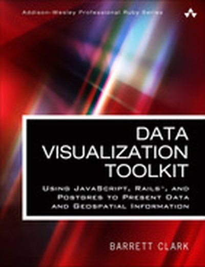
Data Visualization Toolkit: Using JavaScript, Rails™, and Postgres to Present Data and Geospatial Information

Create Beautiful Visualizations that Free Your Data to Tell Powerful Truths “The depth of Barrett Clark’s knowledge shines through in his writing: clear, concise, and confident. Barrett has been practicing all of this stuff in his day job for many years–Postgres, D3, GIS, all of it. The knowledge in this book is real-world and hard-earned!” –From the Foreword by Obie Fernandez is your hands-on, practical, and holistic guide to the art of visualizing data. You’ll learn how to use Rails, jQuery, D3, Leaflet, PostgreSQL, and PostGIS together, creating beautiful visualizations and maps that give your data a voice and to make it “dance.” Data Visualization Toolkit Barrett Clark teaches through real-world problems and examples developed specifically to illuminate every technique you need to generate stunningly effective visualizations. You’ll move from the absolute basics toward deep dives, mastering diverse visualizations and discovering when to use each. Along the way, you’ll build three start-to-finish visualization applications, using actual real estate, weather, and travel datasets. Clark addresses every component of data visualization: your data, database, application server, visualization libraries, and more. He explains data transformations; presents expert techniques in JavaScript, Ruby, and SQL; and illuminates key concepts associated with both descriptive statistics and geospatial data. Throughout, everything is aimed at one goal: to help you cut through the clutter and let your data tell all it can. This guide will help you Explore and understand the data visualization technology stack Master the thought process and steps involved in importing data Extract, transform, and load data in usable, reliable form Handle spotty data, or data that doesn’t line up with what your chart expects Use D3 to build pie and bar charts, scatter and box plots, and more Work effectively with time-series data Tweak Ruby and SQL to optimize performance with large datasets Use raw SQL in Rails: window functions, subqueries, and common table expressions Build chord diagrams and time-series aggregates Use separate databases or schema for reporting databases Integrate geographical data via geospatial SQL queries Construct maps with Leaflet and Rails Query geospatial data the “Rails way” and the “raw SQL way”

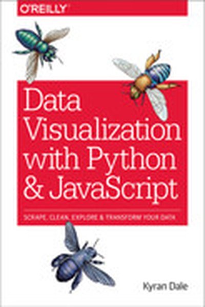
Data Visualization with Python and JavaScript

Learn how to turn raw data into rich, interactive web visualizations with the powerful combination of Python and JavaScript. With this hands-on guide, author Kyran Dale teaches you how build a basic dataviz toolchain with best-of-breed Python and JavaScript libraries—including Scrapy, Matplotlib, Pandas, Flask, and D3—for crafting engaging, browser-based visualizations. As a working example, throughout the book Dale walks you through transforming Wikipedia’s table-based list of Nobel Prize winners into an interactive visualization. You’ll examine steps along the entire toolchain, from scraping, cleaning, exploring, and delivering data to building the visualization with JavaScript’s D3 library. If you’re ready to create your own web-based data visualizations—and know either Python or JavaScript— this is the book for you. Learn how to manipulate data with Python Understand the commonalities between Python and JavaScript Extract information from websites by using Python’s web-scraping tools, BeautifulSoup and Scrapy Clean and explore data with Python’s Pandas, Matplotlib, and Numpy libraries Serve data and create RESTful web APIs with Python’s Flask framework Create engaging, interactive web visualizations with JavaScript’s D3 library

R: Data Analysis and Visualization

Master the art of building analytical models using R About This Book Load, wrangle, and analyze your data using the world's most powerful statistical programming language Build and customize publication-quality visualizations of powerful and stunning R graphs Develop key skills and techniques with R to create and customize data mining algorithms Use R to optimize your trading strategy and build up your own risk management system Discover how to build machine learning algorithms, prepare data, and dig deep into data prediction techniques with R Who This Book Is For This course is for data scientist or quantitative analyst who are looking at learning R and take advantage of its powerful analytical design framework. It's a seamless journey in becoming a full-stack R developer. What You Will Learn Describe and visualize the behavior of data and relationships between data Gain a thorough understanding of statistical reasoning and sampling Handle missing data gracefully using multiple imputation Create diverse types of bar charts using the default R functions Familiarize yourself with algorithms written in R for spatial data mining, text mining, and so on Understand relationships between market factors and their impact on your portfolio Harness the power of R to build machine learning algorithms with real-world data science applications Learn specialized machine learning techniques for text mining, big data, and more In Detail The R learning path created for you has five connected modules, which are a mini-course in their own right. As you complete each one, you'll have gained key skills and be ready for the material in the next module! This course begins by looking at the Data Analysis with R module. This will help you navigate the R environment. You'll gain a thorough understanding of statistical reasoning and sampling. Finally, you'll be able to put best practices into effect to make your job easier and facilitate reproducibility. The second place to explore is R Graphs, which will help you leverage powerful default R graphics and utilize advanced graphics systems such as lattice and ggplot2, the grammar of graphics. You'll learn how to produce, customize, and publish advanced visualizations using this popular and powerful framework. With the third module, Learning Data Mining with R, you will learn how to manipulate data with R using code snippets and be introduced to mining frequent patterns, association, and correlations while working with R programs. The Mastering R for Quantitative Finance module pragmatically introduces both the quantitative finance concepts and their modeling in R, enabling you to build a tailor-made trading system on your own. By the end of the module, you will be well-versed with various financial techniques using R and will be able to place good bets while making financial decisions. Finally, we'll look at the Machine Learning with R module. With this module, you'll discover all the analytical tools you need to gain insights from complex data and learn how to choose the correct algorithm for your specific needs. You'll also learn to apply machine learning methods to deal with common tasks, including classification, prediction, forecasting, and so on. Style and approach Learn data analysis, data visualization techniques, data mining, and machine learning all using R and also learn to build models in quantitative finance using this powerful language.

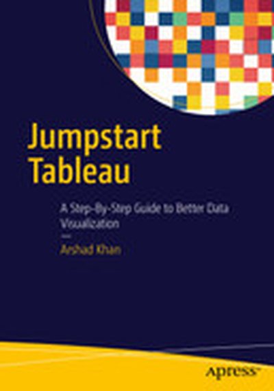
Jumpstart Tableau: A Step-By-Step Guide to Better Data Visualization

This book simplifies the use of Tableau software functionality for novice users so that they can create powerful data visualizations easily and quickly. Since it is often very difficult and expensive to provide external training on BI tools, this book aims to equip the reader with the resource they need to do it themselves. Jumpstart Tableau covers the basic reporting and analysis functions that most BI users perform in their day-to-day work. These include connecting to a data source, working with dimensions and measures, developing reports and charts, saving workbooks, filtering, swapping, sorting, formatting, grouping, creating hierarchies, forecasting, exporting, distributing, as well developing various chart types. Each exercise in Jumpstart Tableau provides screenshots that cover every step from start to finish. The exercises are based on a comprehensive sample Excel-based data source that Tableau Software (version 9) has provided, which makes it very easy to duplicate the exercises on the real software. In addition, the book: Enables readers to develop reports, queries, and visualizations Perform data analysis Execute each function in a step-by-step manner Provides the basic hands-on ability which can enable users to work up to more advanced and complex Tableau functionality Shows how to integrate individual development of content, such as tables/charts and visualizations., onto a dashboard for an effective presentation

Mastering Data Visualization with Microsoft Visio Professional 2016

Microsoft Visio Professional 2016 is an essential tool for creating sophisticated data visualizations across a variety of contexts and industries. In 'Mastering Data Visualization with Microsoft Visio Professional 2016', you'll learn how to utilize Visio's powerful features to transform data into compelling graphics and actionable insights. What this Book will help me do Understand how to integrate external data from various sources into your Visio diagrams. Master the use of Visio's tools to represent information using data-driven graphics. Learn the process of designing and utilizing custom shapes and templates for tailored visualizations. Discover methods for automating diagram creation from structured and external data sources. Gain techniques to share and present interactive and professional visuals with a wide audience. Author(s) John Marshall, the author of 'Mastering Data Visualization with Microsoft Visio Professional 2016,' brings years of experience in data modeling and visualization. With an extensive technical background, Marshall is a renowned expert in leveraging visual tools to communicate complex ideas effectively. His approachable writing style makes highly technical concepts accessible to professionals at various levels. Who is it for? If you're a business intelligence professional, technical analyst, or a Microsoft Office power user looking to enhance your skills in creating impactful visualizations, this book is for you. Its step-by-step approach is ideal for users of Visio Professional starting out or seeking advanced techniques. You'll gain practical insights and learn to apply them effectively in your business or technical workflows, achieving refined data presentations.

Mastering QlikView Data Visualization

"Mastering QlikView Data Visualization" is your essential guide to becoming proficient in advanced data visualization and analysis using QlikView. Through practical examples and real-world scenarios, this book enables you to create insightful and meaningful QlikView applications tailored to business needs. What this Book will help me do Design and implement advanced QlikView applications using realistic data and scenarios. Understand and fulfill business requirements across varied organizational departments. Create advanced charts and visualizations including frequency polygons and XmR charts. Integrate geographical, sentiment, and planning analysis into your QlikView models. Develop troubleshooting strategies for common QlikView data visualization challenges. Author(s) None Pover, an expert in data analytics and QlikView technologies, has extensive experience in implementing QlikView applications to address real-world business challenges. They are passionate about teaching practical solutions, ensuring readers gain actionable insights. With hands-on expertise, the author delivers clear, structured guidance in technical learning. Who is it for? If you're a QlikView developer wanting to go beyond the basics, this book is perfect for you. It is designed for individuals who have foundational knowledge of QlikView and are looking to enhance their ability to handle advanced projects. Whether you're focusing on analytics for sales, finance, or operations, you'll find this guide extremely useful.

Python Data Visualization Cookbook (Second Edition)

In 'Python Data Visualization Cookbook (Second Edition)', you'll learn how to create stunning and meaningful visual representations of data using Python's powerful libraries. Through step-by-step, recipe-based guidance, this book equips you to transform raw data into comprehensible and compelling visual stories. What this Book will help me do Master setting up Python and its libraries for data visualization. Learn how to import, clean, and organize data effectively. Create a variety of plots and charts tailored to your data's needs. Explore 3D visualizations and animations for more complex data insights. Incorporate visualization into environments like LaTeX and web frameworks. Author(s) The authors Igor Milovanovic, None Foures, and Giuseppe Vettigli bring extensive experience in Python programming and data analysis. With a passion for teaching and a clear instructional style, they make complex topics approachable and engaging. Their expertise ensures you gain practical knowledge you can apply immediately. Who is it for? This book is perfect for Python programmers who want to deepen their understanding of data and learn how to visualize it effectively. It's suitable for readers with basic Python knowledge, looking to elevate their skills in data visualization. Whether you aim to improve at data-driven storytelling or analyze data in clarity, this book has you covered.

Building Responsive Data Visualization for the Web

Unchain your data from the desktop with responsive visualizations Building Responsive Data Visualization for the Web is a handbook for any front-end development team needing a framework for integrating responsive web design into the current workflow. Written by a leading industry expert and design lead at Starbase Go, this book provides a wealth of information and practical guidance from the perspective of a real-world designer. You'll walk through the process of building data visualizations responsively as you learn best practices that build upon responsive web design principles, and get the hands-on practice you need with exercises, examples, and source code provided in every chapter. These strategies are designed to be implemented by teams large and small, with varying skill sets, so you can apply these concepts and skills to your project right away. Responsive web design is the practice of building a website to suit base browser capability, then adding features that enhance the experience based on the user's device's capabilities. Applying these ideas to data produces visualizations that always look as if they were designed specifically for the device through which they are viewed. This book shows you how to incorporate these principles into your current practices, with highly practical hands-on training. Examine the hard data surrounding responsive design Master best practices with hands-on exercises Learn data-based document manipulation using D3.js Adapt your current strategies to responsive workflows Data is growing exponentially, and the need to visualize it in any context has become crucial. Traditional visualizations allow important data to become lost when viewed on a small screen, and the web traffic speaks for itself – viewers repeatedly demonstrate their preference for responsive design. If you're ready to create more accessible, take-anywhere visualizations, Building Responsive Data Visualization for the Web is your tailor-made solution.