talk-data.com talk-data.com

Topic

data-visualization

162

tagged

Activity Trend

1 peak/qtr
2020-Q1 2026-Q1

Activities

Showing filtered results

Filtering by: O'Reilly Data Science Books ×
Tableau 2019.x Cookbook

Discover the ultimate guide to Tableau 2019.x that offers over 115 practical recipes to tackle business intelligence and data analysis challenges. This book takes you from the basics to advanced techniques, empowering you to create insightful dashboards, leverage powerful analytics, and seamlessly integrate with modern cloud data platforms. What this Book will help me do Master both basic and advanced functionalities of Tableau Desktop to effectively analyze and visualize data. Understand how to create impactful dashboards and compelling data stories for drive decision-making. Deploy advanced analytical tools including R-based forecasting and statistical techniques with Tableau. Set up and utilize Tableau Server in multi-node environments on Linux and Windows. Utilize Tableau Prep to efficiently clean, shape, and transform data for seamless integration into Tableau workflows. Author(s) The authors of the Tableau 2019.x Cookbook are recognized industry professionals with rich expertise in business intelligence, data analytics, and Tableau's ecosystem. Dmitry Anoshin and his co-authors bring hands-on experience from various industries to provide actionable insights. They focus on delivering practical solutions through structured learning paths. Who is it for? This book is tailored for data analysts, BI developers, and professionals equipped with some knowledge of Tableau wanting to enhance their skills. If you're aiming to solve complex analytics challenges or want to fully utilize the capabilities of Tableau products, this book offers the guidance and knowledge you need.

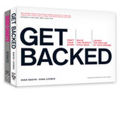
The Harvard Business Review Good Charts Collection

A good visualization can communicate the nature and potential impact of ideas more powerfully than any other form of communication. For a long time, "dataviz" was left to specialists--data scientists and professional designers. No longer. A new generation of tools and massive amounts of available data make it easy for anyone to create visualizations that communicate ideas far more effectively than generic spreadsheet charts ever could. The Harvard Business Review Good Charts Collection brings together two popular books to help you become more sophisticated in understanding and using dataviz to communicate your ideas and advance your career. In Good Charts, dataviz maven and Harvard Business Review editor Scott Berinato provides an essential guide to how visualization works and how to use this new language to impress and persuade. He lays out a system for thinking visually and building better charts through a process of talking, sketching, and prototyping. In Good Charts Workbook, Berinato extends the usefulness of Good Charts by putting theory into practice. He leads readers step-by-step through several example datasets and basic charts, providing space to practice the Good Charts talk-sketch-prototype process for improving those charts. Examples include a "Discussion Key" showing how to approach the challenge and why. Each challenge focuses on a different, common visualization problem such as simplification, storytelling, creating conceptual charts, and many others. The Harvard Business Review Good Charts Collection is your go-to resource for turning plain, uninspiring charts that merely present information into smart, effective visualizations that powerfully convey ideas.

Get Your Venture Backed with Persuasive Data Viz

Communicating your idea in a clear, compelling, and persuasive manner is critical when trying to launch a new venture. This Harvard Business Review collection brings together two popular books to help you craft your story, design better visualizations, impress your audience, and turn your idea into reality. Understanding and using data viz to persuade is a must-have skill for anyone in business today--especially if you're launching a new venture. In Good Charts, dataviz maven Scott Berinato provides an essential guide to how visualization works. Berinato lays out a system for thinking visually and building better charts through a process of talking, sketching, and prototyping. How do you launch the venture of your dreams? In Get Backed, entrepreneurs Evan Baehr and Evan Loomis argue that it's not just about securing startup funding. It's about building the right relationships, crafting a compelling story, and creating the perfect pitch deck. Filled with proven tips, exercises, and templates, this book shows the process for how to successfully communicate your vision. Good Charts will help you turn plain, uninspiring charts that merely present information into smart, effective visualizations that powerfully convey ideas. Get Backed will show you exactly what it takes to get funded and will give you the tools to launch a new venture. Together, these books will help you bring your idea to life.

Good Charts Workbook

Talk. Sketch. Prototype. Repeat. You know right away when you see an effective chart or graphic. It hits you with an immediate sense of its meaning and impact. But what actually makes it clearer, sharper, and more effective? If you're ready to create your own "good charts"--data visualizations that powerfully communicate your ideas and research and that advance your career—the Good Charts Workbook is the hands-on guide you've been looking for. The original Good Charts changed the landscape by helping readers understand how to think visually and by laying out a process for creating powerful data visualizations. Now, the Good Charts Workbook provides tools, exercises, and practical insights to help people in all kinds of enterprises gain the skills they need to get started. Harvard Business Review Senior Editor and dataviz expert Scott Berinato leads you, step-by-step, through the key challenges in creating good charts—controlling color, crafting for clarity, choosing chart types, practicing persuasion, capturing concepts—with warm-up exercises and mini-challenges for each. The Workbook includes helpful prompts and reminders throughout, as well as white space for users to practice the Good Charts talk-sketch-prototype process. Good Charts Workbook is the must-have manual for better understanding the dataviz around you and for creating better charts to make your case more effectively.

Tableau 10 Complete Reference

Explore and understand data with the powerful data visualization techniques of Tableau, and then communicate insights in powerful ways Key Features Apply best practices in data visualization and chart types exploration Explore the latest version of Tableau Desktop with hands-on examples Understand the fundamentals of Tableau storytelling Book Description Graphical presentation of data enables us to easily understand complex data sets. Tableau 10 Complete Reference provides easy-to-follow recipes with several use cases and real-world business scenarios to get you up and running with Tableau 10. This Learning Path begins with the history of data visualization and its importance in today's businesses. You'll also be introduced to Tableau - how to connect, clean, and analyze data in this visual analytics software. Then, you'll learn how to apply what you've learned by creating some simple calculations in Tableau and using Table Calculations to help drive greater analysis from your data. Next, you'll explore different advanced chart types in Tableau. These chart types require you to have some understanding of the Tableau interface and understand basic calculations. You'll study in detail all dashboard techniques and best practices. A number of recipes specifically for geospatial visualization, analytics, and data preparation are also covered. Last but not least, you'll learn about the power of storytelling through the creation of interactive dashboards in Tableau. Through this Learning Path, you will gain confidence and competence to analyze and communicate data and insights more efficiently and effectively by creating compelling interactive charts, dashboards, and stories in Tableau. This Learning Path includes content from the following Packt products: Learning Tableau 10 - Second Edition by Joshua N. Milligan Getting Started with Tableau 2018.x by Tristan Guillevin What you will learn Build effective visualizations, dashboards, and story points Build basic to more advanced charts with step-by-step recipes Become familiar row-level, aggregate, and table calculations Dig deep into data with clustering and distribution models Prepare and transform data for analysis Leverage Tableau's mapping capabilities to visualize data Use data storytelling techniques to aid decision making strategy Who this book is for Tableau 10 Complete Reference is designed for anyone who wants to understand their data better and represent it in an effective manner. It is also used for BI professionals and data analysts who want to do better at their jobs. Downloading the example code for this book You can download the example code files for all Packt books you have purchased from your account at http://www.PacktPub.com. If you purchased this book elsewhere, you can visit http://www.PacktPub.com/support and register to have the files e-mailed directly to you.

Mastering Matplotlib 2.x

Mastering Matplotlib 2.x guides you through the art and science of creating sophisticated data visualizations with Python's powerful Matplotlib library. You will start by learning the basics of plotting and customizing your charts, progressing to more advanced topics such as 3D visualization, geospatial data display, and creating interactive plots using Jupyter Notebook. What this Book will help me do Create complex and highly customizable data plots using Matplotlib. Effectively visualize data in three dimensions, including geospatial data. Use advanced matplotlib features to represent non-Cartesian and vector data. Build interactive visualizations using Jupyter Notebook and Python. Develop special-purpose and movie-style plots to enhance data representation. Author(s) None Keller is a seasoned software engineer and data visualization enthusiast with years of experience using Python for data analysis. Their practical and hands-on approach ensures that readers can directly apply the concepts taught in their projects. None aims to make advanced visualization techniques accessible to all. Who is it for? This book is perfect for developers, scientists, and analysts who need sophisticated visualization tools for their projects. Prior experience with Python and basic familiarity with Matplotlib will help you get the most out of the book. If you're looking to deepen your understanding of data visualization or to create interactive and advanced visualizations, this book is for you.

Matplotlib 3.0 Cookbook

Matplotlib 3.0 Cookbook is your go-to guide for mastering the Matplotlib library in Python for creating a wide range of data visualizations. Through 150+ practical recipes, you will learn how to design intuitive and detailed charts, graphs, and dashboards, navigating from simple plots to advanced interactive and 3D visualizations. What this Book will help me do Develop professional-quality data visualizations using Matplotlib. Leverage Matplotlib's API for both quick plotting and advanced customization. Create interactive and animative plots for engaging data representation. Extend Matplotlib functionalities with toolkits like cartopy and axisartist. Integrate Matplotlib figures into GUI applications for broader usage. Author(s) None Poladi and None Borkar are experienced Python developers and enthusiasts who have collaborated in creating a resourceful guide to Matplotlib. They bring extensive experience in data science visualization and Python programming. Their collaborative effort ensures clarity and an approachable learning curve for anyone delving into graphical data representation using Matplotlib. Who is it for? This book is ideal for data scientists, Python developers, and visualization enthusiasts eager to enhance their technical plotting skills. The content covers both fundamentals and advanced topics, suitable for users ranging from beginners curious about Python visualization to experts seeking streamlined workflows and advanced techniques.

Getting Started with Tableau 2018.x

Dive into the world of data visualization with "Getting Started with Tableau 2018.x." This comprehensive guide introduces you to both the fundamental and advanced functionalities of Tableau 2018.x, making it easier to create impactful data visualizations. Learn to unlock Tableau's full potential through practical examples and clear explanations. What this Book will help me do Understand the new Tableau 2018.x features like density, extensions, and transparency and how to leverage them. Learn how to connect to data sources, perform transformations, and build efficient data models to support your analysis. Master visualization techniques to design effective and insightful dashboards tailored to business needs. Explore advanced concepts such as calculations, cross-database joins, and data blending to handle complex scenarios. Develop the confidence to publish and interact with content on Tableau Server and share your insights effectively. Author(s) None Guillevin and None Pires are data visualization experts with extensive experience using Tableau. They aim to make data analysis accessible through hands-on examples and easy-to-follow explanations. Their writing balances clear instruction with practical application, making advanced concepts understandable for all readers. Who is it for? This book is ideal for beginners or experienced BI professionals who wish to gain expertise in Tableau 2018.x. It caters to aspiring analysts and business professionals looking to answer complex business-specific questions through data visualization. Regardless of prior experience in Tableau or other BI tools, this book provides value through a structured learning approach.

D3.js Quick Start Guide

D3.js Quick Start Guide is your go-to resource for mastering D3.js, a powerful JavaScript library for creating interactive visualizations in the browser. This book walks you through core concepts, from building scatter plots to creating force-directed graphs, helping you go from beginner to creating stunning visual data representations. What this Book will help me do Create interactive scatter plots showcasing data relationships. Implement bar graphs that dynamically update from API data. Design animated pie charts for visually appealing representations. Develop force-directed graphs to represent networked data. Leverage GeoJSON data for building informative interactive maps. Author(s) None Huntington is an experienced web developer with a clear knack for turning complex topics into understandable concepts. With expertise in data visualization and web technologies, Huntington explains technical subject matter in a friendly and approachable manner, ensuring learners grasp both theoretical and practical aspects effectively. Who is it for? This book is ideal for web developers and data enthusiasts eager to learn how to represent data via interactive visualizations using D3.js. If you have a basic understanding of JavaScript and are looking to enhance your web development skillset with dynamic visualization techniques, this guide is perfect for you. Through easy-to-follow examples, you'll get up to speed quickly and start building professional-looking visualizations right away. Whether you're a data scientist, interactive news developer, or just interested in bringing data to life, this book is your key to mastering D3.js.

Web Application Development with R Using Shiny - Third Edition

Transform your R programming into interactive web applications with "Web Application Development with R Using Shiny." This book takes you step-by-step through creating dynamic user interfaces and web solutions with the R Shiny package, empowering you to build impactful tools that showcase your data. What this Book will help me do Create interactive web applications using R Shiny. Apply JavaScript for added functionality and customization in Shiny apps. Effortlessly deploy Shiny apps online for accessibility. Understand Shiny UI functions to design effective user interfaces. Leverage data visualization techniques for insightful analytics in apps. Author(s) Chris Beeley and Shitalkumar R. Sukhdeve bring their profound expertise in R programming and Shiny development to this book. Chris is an experienced data scientist passionate about interactive data solutions, while Shitalkumar, with a strong computing background, shares his hands-on insights. Their collaborative and tutorial approach ensures learners grasp each concept smoothly. Who is it for? This book is ideal for R programmers eager to transition from static data evaluation to engaging, interactive web applications. It caters to professionals and enthusiasts seeking practical, hands-on coding guidance. Readers should have foundational R programming knowledge, ensuring a smooth transition into Shiny concepts.

Hands-On Dashboard Development with Shiny

"Hands-On Dashboard Development with Shiny" provides a focused and practical guide for developing polished and professional dashboards using R and the Shiny framework. Through applied examples, you'll explore techniques in HTML, CSS, and Bootstrap to elevate your Shiny apps' interface and functionality. The book ensures a comprehensive learning experience by focusing on creating custom interfaces and layouts. What this Book will help me do Create Shiny interfaces using pure HTML to achieve full customization Enhance your R Shiny dashboards with powerful layout functions for professional designs Utilize Bootstrap themes in Shiny for consistent and aesthetically pleasing interfaces Generate interactive dashboards complete with icons and notification elements Develop and distribute R Markdown reports directly from Shiny applications Author(s) Chris Beeley is an experienced data scientist and a frequent R Shiny practitioner. With years of experience building Shiny applications and working on data visualization in professional settings, Chris brings practical and precise teaching to this book. He is passionate about making knowledge accessible and guiding learners through hands-on and engaging content. Who is it for? This book is ideally suited for developers and data analysts who have prior experience with Shiny and wish to delve deeper into customizing their applications' design. If you want to extend your Shiny apps using HTML, CSS, and layouts via Bootstrap, this book is perfect for you. It equips you with the skills to build advanced dashboards efficiently. Whether you're looking to create more visually appealing apps or enhance your UI skills, this resource caters to your needs.

Mastering Kibana 6.x

Mastering Kibana 6.x is your guide to leveraging Kibana for creating impactful data visualizations and insightful dashboards. From setting up basic visualizations to exploring advanced analytics and machine learning integrations, this book equips you with the necessary skills to dive deep into your data and gain actionable insights at scale. You'll also learn to effectively manage and monitor data with powerful tools such as X-Pack and Beats. What this Book will help me do Build sophisticated dashboards to visualize elastic stack data effectively. Understand and utilize Timelion expressions for analyzing time series data. Incorporate X-Pack capabilities to enhance security and monitoring in Kibana. Extract, analyze, and visualize data from Elasticsearch for advanced analytics. Set up monitoring and alerting using Beats components for reliable data operations. Author(s) With extensive experience in big data technologies, the author brings a practical approach to teaching advanced Kibana topics. Having worked on real-world data analytics projects, their aim is to make complex concepts accessible while showing how to tackle analytics challenges using Kibana. Who is it for? This book is ideal for data engineers, DevOps professionals, and data scientists who want to optimize large-scale data visualizations. If you're looking to manage Elasticsearch data through insightful dashboards and visual analytics, or enhance your data operations with features like machine learning, then this book is perfect for you. A basic understanding of the Elastic Stack is helpful, though not required.

Python Graphics: A Reference for Creating 2D and 3D Images

This book will show you how to use Python to create graphic objects for technical illustrations and data visualization. Often, the function you need to produce the image you want cannot be found in a standard Python library. Knowing how to create your own graphics will free you from the chore of looking for a function that may not exist or be difficult to use. This book will give you the tools to eliminate that process and create and customize your own graphics to satisfy your own unique requirements. Using basic geometry and trigonometry, you will learn how to create math models of 2D and 3D shapes. Using Python, you will then learn how to project these objects onto the screen of your monitor, translate and rotate them in 2D and 3D, remove hidden lines, add shading, view in perspective, view intersections between surfaces, and display shadows cast from one object onto another. You will also learn how to visualize and analyze 2D and 3D data sets, fit lines, splines and functions. The final chapter includes demonstrations from quantum mechanics, astronomy and climate science. Includes Python programs written in a clear and open style with detailed explanation of the code. What You Will Learn How to create math and Python models of 2D and 3D shapes. How to rotate, view in perspective, shade, remove hidden lines, display projected shadows, and more. How to analyze and display data sets as curves and surfaces, fit lines and functions. Who This Book Is For Python developers, scientists, engineers, and students using Python to produce technical illustrations, display and analyze data sets. Assumes familiarity with vectors, matrices, geometry and trigonometry.

Matplotlib for Python Developers - Second Edition

"Matplotlib for Python Developers" is your comprehensive guide to creating interactive and informative data visualizations using the Matplotlib library in Python. This book covers all the essentials-from building static plots to integrating dynamic graphics with web applications. What this Book will help me do Design and customize stunning data visualizations including heatmaps and scatter plots. Integrate Matplotlib visualization seamlessly into GUI applications using GTK3 or Qt. Utilize advanced plotting libraries like Seaborn and GeoPandas for enhanced visual representation. Develop web-based dashboards and plots that dynamically update using Django. Master techniques to prepare your Matplotlib projects for deployment in a cloud-based environment. Author(s) Authors Aldrin Yim, Claire Chung, and Allen Yu are seasoned developers and data scientists with extensive experience in Python and data visualization. They bring a practical touch to technical concepts, aiming to bridge theory with hands-on applications. With such a skilled team behind this book, you'll gain both foundational knowledge and advanced insights into Matplotlib. Who is it for? This book is the ideal resource for Python developers and data analysts looking to enhance their data visualization skills. If you're familiar with Python and want to create engaging, clear, and dynamic visualizations, this book will give you the tools to achieve that. Designed for a range of expertise, from beginners understanding the basics to experienced users diving into complex integrations, this book has something for everyone. You'll be guided through every step, ensuring you build the confidence and skills needed to thrive in this area.

Practical Tableau

Whether you have some experience with Tableau software or are just getting started, this manual goes beyond the basics to help you build compelling, interactive data visualization applications. Author Ryan Sleeper, one of the worldâ??s most qualified Tableau consultants, complements his web posts and instructional videos with this guide to give you a firm understanding of how to use Tableau to find valuable insights in data. Over five sections, Sleeperâ??recognized as a Tableau Zen Master, Tableau Public Visualization of the Year author, and Tableau Iron Viz Championâ??provides visualization tips, tutorials, and strategies to help you avoid the pitfalls and take your Tableau knowledge to the next level. Practical Tableau sections include: Fundamentals: get started with Tableau from the beginning Chart types: use step-by-step tutorials to build a variety of charts in Tableau Tips and tricks: learn innovative uses of parameters, color theory, how to make your Tableau workbooks run efficiently, and more Framework: explore the INSIGHT framework, a proprietary process for building Tableau dashboards Storytelling: learn tangible tactics for storytelling with data, including specific and actionable tips you can implement immediately

Advanced Audio Visualization Using ThMAD: Creating Amazing Graphics with Open Source Software

Learn advanced techniques and improve your audio visualization skills with Thinking Machine Audio Dreams (ThMAD). With this book, you can concentrate on advanced examples and usage patterns, including using shaders in a more profound way, and how to incorporate ThMAD into a tool chain using the professional sound server JACK. Advanced Audio Visualization Using ThMAD provides advanced techniques for generating graphics, improving performance, and providing readers with the skills needed to create more interesting visualizations. You will also learn professional setups with highly developed visual and aural art tool chains. What You'll Learn Use the ThMAD software for advanced setups in their personal and professional projects Gain a pragmatic introduction to using shaders Use JACK sound servers with ThMAD Control the timing ThMAD Work withadvanced configurations Who This Book Is For Artists and developers already familiar with ThMAD and looking to enhance their projects. In addition, readers primarily interested in using shaders or the Jack audio server for graphics generation can benefit from the book as well.

Complex Network Analysis in Python

Construct, analyze, and visualize networks with networkx, a Python language module. Network analysis is a powerful tool you can apply to a multitude of datasets and situations. Discover how to work with all kinds of networks, including social, product, temporal, spatial, and semantic networks. Convert almost any real-world data into a complex network--such as recommendations on co-using cosmetic products, muddy hedge fund connections, and online friendships. Analyze and visualize the network, and make business decisions based on your analysis. If you're a curious Python programmer, a data scientist, or a CNA specialist interested in mechanizing mundane tasks, you'll increase your productivity exponentially. Complex network analysis used to be done by hand or with non-programmable network analysis tools, but not anymore! You can now automate and program these tasks in Python. Complex networks are collections of connected items, words, concepts, or people. By exploring their structure and individual elements, we can learn about their meaning, evolution, and resilience. Starting with simple networks, convert real-life and synthetic network graphs into networkx data structures. Look at more sophisticated networks and learn more powerful machinery to handle centrality calculation, blockmodeling, and clique and community detection. Get familiar with presentation-quality network visualization tools, both programmable and interactive--such as Gephi, a CNA explorer. Adapt the patterns from the case studies to your problems. Explore big networks with NetworKit, a high-performance networkx substitute. Each part in the book gives you an overview of a class of networks, includes a practical study of networkx functions and techniques, and concludes with case studies from various fields, including social networking, anthropology, marketing, and sports analytics. Combine your CNA and Python programming skills to become a better network analyst, a more accomplished data scientist, and a more versatile programmer. What You Need: You will need a Python 3.x installation with the following additional modules: Pandas (>=0.18), NumPy (>=1.10), matplotlib (>=1.5), networkx (>=1.11), python-louvain (>=0.5), NetworKit (>=3.6), and generalizesimilarity. We recommend using the Anaconda distribution that comes with all these modules, except for python-louvain, NetworKit, and generalizedsimilarity, and works on all major modern operating systems.

D3.js in Action, Second Edition

D3.js in Action, Second Edition is completely revised and updated for D3 v4 and ES6. It's a practical tutorial for creating interactive graphics and data-driven applications using D3. About the Technology Visualizing complex data is hard. Visualizing complex data on the web is darn near impossible without D3.js. D3 is a JavaScript library that provides a simple but powerful data visualization API over HTML, CSS, and SVG. Start with a structure, dataset, or algorithm; mix in D3; and you can programmatically generate static, animated, or interactive images that scale to any screen or browser. It's easy, and after a little practice, you'll be blown away by how beautiful your results can be! About the Book D3.js in Action, Second Edition is a completely updated revision of Manning's bestselling guide to data visualization with D3. You'll explore dozens of real-world examples in full-color, including force and network diagrams, workflow illustrations, geospatial constructions, and more! Along the way, you'll pick up best practices for building interactive graphics, animations, and live data representations. You'll also step through a fully interactive application created with D3 and React. What's Inside Rich full-color diagrams and illustrations Updated for D3 v4 and ES6 Reusable layouts and components Geospatial data visualizations Mixed-mode rendering About the Reader Suitable for web developers with HTML, CSS, and JavaScript skills. No specialized data science skills required. About the Author Elijah Meeks is a senior data visualization engineer at Netflix. Quotes From basic to complex, this book gives you the tools to create beautiful data visualizations. - Claudio Rodriguez, Cox Media Group The best reference for one of the most useful DataViz tools. - Jonathan Rioux, TD Insurance From toy examples to techniques for real projects. Shows how all the pieces fit together. - Scott McKissock, USAID A clever way to immerse yourself in the D3.js world. - Felipe Vildoso Castillo, University of Chile

Learning D3.js 5 Mapping - Second Edition

This book, "Learning D3.js 5 Mapping", guides developers through the process of creating dynamic and interactive data visualizations. With a focus on D3.js, you'll learn to harness the power of JavaScript to create maps and graphical objects that inform and engage. What this Book will help me do Gain expertise in working with SVG geometric shapes to design compelling graphics. Learn techniques to manage, process, and use geographic data effectively. Master adding interactivity to visual maps to provide an immersive user experience. Understand how to optimize and manipulate geoJSON files using topoJSON. Learn to create varied map types, such as hexbins and globes, using D3.js and Canvas. Author(s) None Newton and Oscar Villarreal, among others, collaborated to author this guide. They are experienced in front-end development and data visualization, bringing a practical and hands-on approach to learning through this book. Their backgrounds ensure the book addresses common challenges faced during implementation, offering thoughtful solutions. Who is it for? "Learning D3.js 5 Mapping" is perfect for web developers familiar with HTML, CSS, and JavaScript who want to expand their expertise in data visualization and mapping. If you're looking to incorporate interactive charts or maps into your web applications, this book will provide practical guidance and solid fundamentals. No prior experience with D3.js is necessary.