Free Data Storytelling Training Attend our FREE 'How to be the Chief Datastoryteller in your Org - Part 2 using our Analytics Design Guide' training at webinars.bidatastorytelling.com and download the FREE 50-page Guide!
In this episode, you'll learn:
[03:21] New Language, New Book for Reporting: Music to your ears! [05:24] Keys to Success: Visual Consistency, Certified Tools, and Management Support. [17:55] Hichert's impact and influence on how dashboards and reports are created.
For full show notes, and the links mentioned visit: https://bibrainz.com/podcast/50
Enjoyed the Show?
Please leave us a review on iTunes.
 talk-data.com
Topic
DataViz
Data Visualization
bi
charts
dashboards
434
tagged
Activity Trend
43
peak/qtr
2020-Q1
2026-Q2
Top Events
O'Reilly Data Science Books
170
O'Reilly Data Visualization Books
72
Outlier Conference 2025
26
O'Reilly Data Engineering Books
24
DataFramed
19
Data Career Podcast: Helping You Land a Data Analyst Job FAST
11
Data Skeptic
6
ADSP: Algorithms + Data Structures = Programs
6
Big Data & AI Paris 2025
6
Analytics on Fire
6
O'Reilly Business Intelligence Books
6
SciPy 2025
5
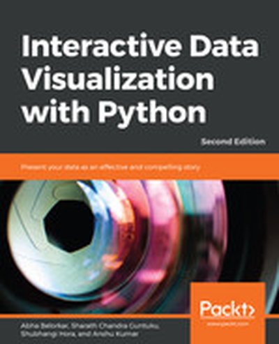
With Interactive Data Visualization with Python, you will learn to turn raw data into compelling, interactive visual stories. This book guides you through the practical uses of Python libraries such as Bokeh and Plotly, teaching you skills to create visualizations that captivate and inform. What this Book will help me do Understand and apply different principles and techniques of interactive data visualization to bring your data to life. Master the use of libraries like Matplotlib, Seaborn, Altair, and Bokeh for creating a variety of data visualizations. Learn how to customize data visualizations effectively to meet the needs of different audiences and use cases. Gain proficiency in using advanced tools like Plotly for creating dynamic and engaging visual presentations. Acquire the ability to identify common pitfalls in visualization and learn strategies to avoid them, ensuring clarity and impact. Author(s) Abha Belorkar, Sharath Chandra Guntuku, Shubhangi Hora, and Anshu Kumar are experts in Python programming and data visualization with years of experience in data science and software development. They have collaborated to blend their knowledge into this book-a clear and practical guide to mastering interactive visualization with Python. Who is it for? This book is perfect for Python developers, data analysts, and data scientists who want to enhance their skills in data presentation. If you are ready to transform complex data into digestible and interactive visuals, this book is for you. A basic familiarity with Python programming and libraries like pandas is recommended. By the end of the book, you'll feel confident in creating professional-grade data visualizations.
Jessica Hullman joins us to share her expertise on data visualization and communication of data in the media. We discuss Jessica's work on visualizing uncertainty, interviewing visualization designers on why they don't visualize uncertainty, and modeling interactions with visualizations as Bayesian updates. Homepage: http://users.eecs.northwestern.edu/~jhullman/ Lab: MU Collective
Send us a text Want to be featured as a guest on Making Data Simple? Reach out to us at [[email protected]] and tell us why you should be next. Abstract This week, we are joined by Professor Yoon Chung Han of San Jose State University. Yoon can be described as a digital media artist, leveraging data science methodologies within her creative projects. She talks us through some of the innovating projects she has been working on, while offering her insight on the state of the industry - specifically from an academic perspective. Connect with Yoon Portofolio Website LinkedIn Twitter Instagram Show Notes 02:26 - New to digital art? Check out this helpful article on where to start. 06:38 - Click here to learn more on the importance of art. 16:40 - Learn about data visualization here. 18:39 - Find out more about Processing and its' capabilities here. Connect with the Team Producer Liam Seston - LinkedIn. Producer Lana Cosic - LinkedIn. Producer Meighann Helene - LinkedIn. Producer Mark Simmonds - LinkedIn. Host Al Martin - LinkedIn and Twitter. Want to be featured as a guest on Making Data Simple? Reach out to us at [email protected] and tell us why you should be next. The Making Data Simple Podcast is hosted by Al Martin, WW VP Technical Sales, IBM, where we explore trending technologies, business innovation, and leadership ... while keeping it simple & fun.
You know me — I love community! Being a part of the BI community has changed my life and it can change your too for the better if you choose the right community, and understand how to use it to your advantage. Listen and learn.
Today's guest is Allen Hillery, editor of Nightingale, a data visualization society journal. Allen describes why community is important and what you can do to give and take within the community. Recently, he interviewed me and wrote a very popular article on Medium titled, "Mico Yuk on the Importance of Community and the Paradigm Shift in Business Intelligence."
In this episode, you'll learn: [09:25] Allen's Background: Writer, editor, and adjunct professor passionate about storytelling with data. [10:40] Data Business Communities: First, there were not enough, now why there's too many to choose from. [11:03] Priorities Put in Place: Passing of family members led to self-discovery and fulfillment through data storytelling journey. For full show notes, and the links mentioned visit: bibrainz.com/podcast/44 Sponsor The next BI Data Storytelling Mastery Accelerator 3-Day Live workshop is live! Many BI teams are still struggling to deliver consistent, high-engaging analytics their users love. At the end of three days, you'll leave with a clear BI delivery action plan. Register today! Enjoyed the Show? Please leave us a review on iTunes.
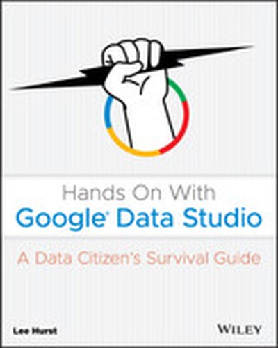
Learn how to easily transform your data into engaging, interactive visual reports! Data is no longer the sole domain of tech professionals and scientists. Whether in our personal, business, or community lives, data is rapidly increasing in both importance and sheer volume. The ability to visualize all kinds of data is now within reach for anyone with a computer and an internet connection. Google Data Studio, quickly becoming the most popular free tool in data visualization, offers users a flexible, powerful way to transform private and public data into interactive knowledge that can be easily shared and understood. Hands On With Google Data Studio teaches you how to visualize your data today and produce professional quality results quickly and easily. No previous experience is required to get started right away—all you need is this guide, a Gmail account, and a little curiosity to access and visualize data just like large businesses and organizations. Clear, step-by-step instructions help you identify business trends, turn budget data into a report, assess how your websites or business listings are performing, analyze public data, and much more. Practical examples and expert tips are found throughout the text to help you fully understand and apply your new knowledge to a wide array of real-world scenarios. This engaging, reader-friendly guide will enable you to: Use Google Data Studio to access various types of data, from your own personal data to public sources Build your first data set, navigate the Data Studio interface, customize reports, and share your work Learn the fundamentals of data visualization, personal data accessibility, and open data API's Harness the power of publicly accessible data services including Google’s recently released Data Set Search Add banners, logos, custom graphics, and color palettes Hands On With Google Data Studio: A Data Citizens Survival Guide is a must-have resource for anyone starting their data visualization journey, from individuals, consultants, and small business owners to large business and organization managers and leaders.
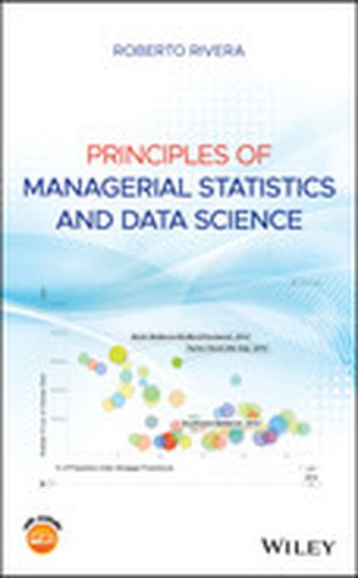
Introduces readers to the principles of managerial statistics and data science, with an emphasis on statistical literacy of business students Through a statistical perspective, this book introduces readers to the topic of data science, including Big Data, data analytics, and data wrangling. Chapters include multiple examples showing the application of the theoretical aspects presented. It features practice problems designed to ensure that readers understand the concepts and can apply them using real data. Over 100 open data sets used for examples and problems come from regions throughout the world, allowing the instructor to adapt the application to local data with which students can identify. Applications with these data sets include: Assessing if searches during a police stop in San Diego are dependent on driver’s race Visualizing the association between fat percentage and moisture percentage in Canadian cheese Modeling taxi fares in Chicago using data from millions of rides Analyzing mean sales per unit of legal marijuana products in Washington state Topics covered in Principles of Managerial Statistics and Data Science include:data visualization; descriptive measures; probability; probability distributions; mathematical expectation; confidence intervals; and hypothesis testing. Analysis of variance; simple linear regression; and multiple linear regression are also included. In addition, the book offers contingency tables, Chi-square tests, non-parametric methods, and time series methods. The textbook: Includes academic material usually covered in introductory Statistics courses, but with a data science twist, and less emphasis in the theory Relies on Minitab to present how to perform tasks with a computer Presents and motivates use of data that comes from open portals Focuses on developing an intuition on how the procedures work Exposes readers to the potential in Big Data and current failures of its use Supplementary material includes: a companion website that houses PowerPoint slides; an Instructor's Manual with tips, a syllabus model, and project ideas; R code to reproduce examples and case studies; and information about the open portal data Features an appendix with solutions to some practice problems Principles of Managerial Statistics and Data Science is a textbook for undergraduate and graduate students taking managerial Statistics courses, and a reference book for working business professionals.

Whether we use Data Studio, Excel, Google Sheets, Tableau, R, some other platform, or (most likely) some combination of platforms, at the end of the day, as analysts, a core mechanism we use for communicating with our stakeholders is data visualization. The difference between an excellent visualization and a mediocre one can easily be the difference between whether a stakeholder understands and acts upon the data or whether she, instead, struggles to internalize the information and actually put it to use. In this session, Tim will walk through some of the neuroscience and psychology that underpins best practices in data visualization, as well as provide platform-agnostic tactical tips that put these principles to effective use.
Enrico Bertini joins us to discuss how data visualization can be used to help make machine learning more interpretable and explainable. Find out more about Enrico at http://enrico.bertini.io/. More from Enrico with co-host Moritz Stefaner on the Data Stories podcast!
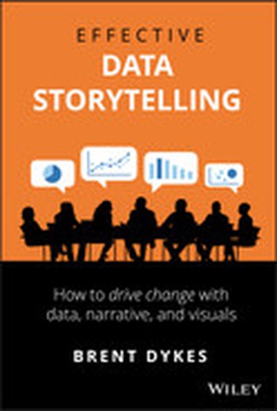
Master the art and science of data storytelling—with frameworks and techniques to help you craft compelling stories with data. The ability to effectively communicate with data is no longer a luxury in today’s economy; it is a necessity. Transforming data into visual communication is only one part of the picture. It is equally important to engage your audience with a narrative—to tell a story with the numbers. Effective Data Storytelling will teach you the essential skills necessary to communicate your insights through persuasive and memorable data stories. Narratives are more powerful than raw statistics, more enduring than pretty charts. When done correctly, data stories can influence decisions and drive change. Most other books focus only on data visualization while neglecting the powerful narrative and psychological aspects of telling stories with data. Author Brent Dykes shows you how to take the three central elements of data storytelling—data, narrative, and visuals—and combine them for maximum effectiveness. Taking a comprehensive look at all the elements of data storytelling, this unique book will enable you to: Transform your insights and data visualizations into appealing, impactful data stories Learn the fundamental elements of a data story and key audience drivers Understand the differences between how the brain processes facts and narrative Structure your findings as a data narrative, using a four-step storyboarding process Incorporate the seven essential principles of better visual storytelling into your work Avoid common data storytelling mistakes by learning from historical and modern examples Effective Data Storytelling: How to Drive Change with Data, Narrative and Visuals is a must-have resource for anyone who communicates regularly with data, including business professionals, analysts, marketers, salespeople, financial managers, and educators.
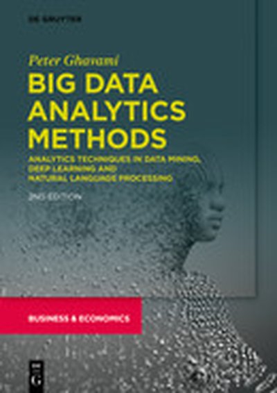
Big Data Analytics Methods unveils secrets to advanced analytics techniques ranging from machine learning, random forest classifiers, predictive modeling, cluster analysis, natural language processing (NLP), Kalman filtering and ensembles of models for optimal accuracy of analysis and prediction. More than 100 analytics techniques and methods provide big data professionals, business intelligence professionals and citizen data scientists insight on how to overcome challenges and avoid common pitfalls and traps in data analytics. The book offers solutions and tips on handling missing data, noisy and dirty data, error reduction and boosting signal to reduce noise. It discusses data visualization, prediction, optimization, artificial intelligence, regression analysis, the Cox hazard model and many analytics using case examples with applications in the healthcare, transportation, retail, telecommunication, consulting, manufacturing, energy and financial services industries. This book's state of the art treatment of advanced data analytics methods and important best practices will help readers succeed in data analytics.
BI tools change by the minute, so have you ever considered outsourcing your data visualization needs in the future? Maybe you should, especially if you don't have proper in-house skill sets. Don't risk your reputation because users can't unsee a bad data visualization.
Today's guest is long-term BI Brainz customer Mustafa Mustafa, senior director of IT at Ferrara Candy Company. Mustafa transformed Ferrara Candy into a forward-thinking and innovative company. He discusses the pros and cons of outsourcing data visualization by choosing the right partners. In this episode, you'll learn: [04:13] Key Quote: Users cannot unsee a bad data visualization. - Mico Yuk [11:20] Mustafa's background in learning Mico's BI Framework and dashboard strategies. [20:45] Should data visualization be outsourced? Consider customer cases and challenges, such as communication, common sense, and strategy to share information. For full show notes, and the links mentioned visit: https://bibrainz.com/podcast/40 Sponsor This exciting season of AOF is sponsored by our BI Data Storytelling Mastery Accelerator 3-Day Live workshop. Our second one is coming up on Jan 28-30 and registration is open! Join us and consider upgrading to be a VIP (we have tons of bonuses planned). Many BI teams are still struggling to deliver consistent, high-engaging analytics their users love. At the end of three days, you'll leave with the tools, techniques, and resources you need to engage your users. Register today! Enjoyed the Show? Please leave us a review on iTunes.
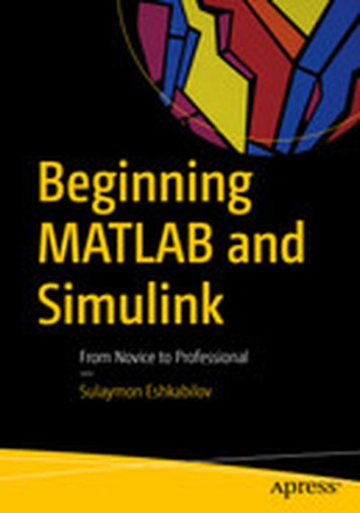
Employ essential and hands-on tools and functions of the MATLAB and Simulink packages, which are explained and demonstrated via interactive examples and case studies. This book contains dozens of simulation models and solved problems via m-files/scripts and Simulink models which help you to learn programming and modeling essentials. You’ll become efficient with many of the built-in tools and functions of MATLAB/Simulink while solving engineering and scientific computing problems. Beginning MATLAB and Simulink explains various practical issues of programming and modelling in parallel by comparing MATLAB and Simulink. After reading and using this book, you'll be proficient at using MATLAB and applying the source code from the book's examples as templates for your own projects in data science or engineering. What You Will Learn Get started using MATLAB and Simulink Carry out data visualization with MATLAB Gain the programming and modeling essentials of MATLAB Build a GUI with MATLAB Work with integration and numerical root finding methods Apply MATLAB to differential equations-based models and simulations Use MATLAB for data science projects Who This Book Is For Engineers, programmers, data scientists, and students majoring in engineering and scientific computing.
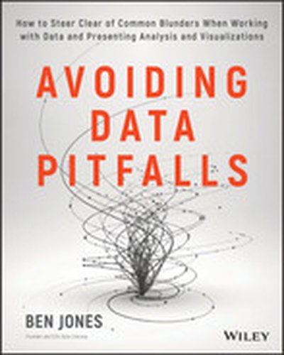
Avoid data blunders and create truly useful visualizations Avoiding Data Pitfalls is a reputation-saving handbook for those who work with data, designed to help you avoid the all-too-common blunders that occur in data analysis, visualization, and presentation. Plenty of data tools exist, along with plenty of books that tell you how to use them—but unless you truly understand how to work with data, each of these tools can ultimately mislead and cause costly mistakes. This book walks you step by step through the full data visualization process, from calculation and analysis through accurate, useful presentation. Common blunders are explored in depth to show you how they arise, how they have become so common, and how you can avoid them from the outset. Then and only then can you take advantage of the wealth of tools that are out there—in the hands of someone who knows what they're doing, the right tools can cut down on the time, labor, and myriad decisions that go into each and every data presentation. Workers in almost every industry are now commonly expected to effectively analyze and present data, even with little or no formal training. There are many pitfalls—some might say chasms—in the process, and no one wants to be the source of a data error that costs money or even lives. This book provides a full walk-through of the process to help you ensure a truly useful result. Delve into the "data-reality gap" that grows with our dependence on data Learn how the right tools can streamline the visualization process Avoid common mistakes in data analysis, visualization, and presentation Create and present clear, accurate, effective data visualizations To err is human, but in today's data-driven world, the stakes can be high and the mistakes costly. Don't rely on "catching" mistakes, avoid them from the outset with the expert instruction in Avoiding Data Pitfalls.
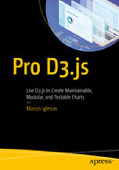
Go beyond the basics of D3.js to create maintainable, modular, and testable charts and to package them into a library that can be distributed as open source software or kept for private use. This book will show you how to transform regular D3.js chart code into reusable and extendable modules.You know the basics of working with D3.js, but it's time to become a professional D3.js practitioner. This book is your launching pad to refactoring code, composing complex visualizations from small components, working as a team with other developers, and integrating charts with a Continuous Integration system. You'll begin by creating a production-ready chart using D3.js v5, ES2015, and a test-driven approach and then move on to using and extending Britecharts, the reusable charting library based on Reusable API patterns. Finally, you'll see how to use D3.js along with React to document and build your charts to compose a charting library you can release into the NPM repository. With Pro D3.js, you'll become an accomplished D3.js developer in no time. What You Will Learn Create v5 D3.js charts with ES2016 and unit tests Develop modular, testable and extensible code with the Reusable API pattern Work with and extend Britecharts, a reusable charting library created at Eventbrite Use Webpack and npm to create and publish a charting library from your own chart collections Write reference documentation and build a documentation homepage for your library. Who This Book Is For Data scientists, data visualization engineers, and frontend developers with a fundamental knowledge of D3.js and some experience with JavaScript, as well as data journalists and consultants.
In the "R Bioinformatics Cookbook", you will explore the full potential of the R programming language and the Bioconductor ecosystem to overcome challenges in bioinformatics. By working through real-world examples, you will learn to handle biological data effectively and gain insights into genomics, RNA sequencing, and advanced data visualization. What this Book will help me do Develop skills to analyze RNA sequencing data using R and Bioconductor packages such as edgeR and DESeq. Learn to create professional-grade graphical representations of biological data using ggplot and other visualization tools. Understand how to perform genome-wide studies like variant calling and metagenomics analysis with R. Master the integration of external genomic databases with Ensembl for functional annotation. Explore machine learning applications in bioinformatics including classification and clustering models. Author(s) None MacLean and Dr. Dan Maclean are experienced bioinformatics researchers and R programmers. With a deep understanding of computational biology and visualization techniques, they bring years of academic and practical expertise to help readers excel in bioinformatics. Their approachable writing style ensures that complex topics are made accessible. Who is it for? This book is ideal for bioinformatics professionals and data analysts with an interest in applying R to biological data. It is particularly suited for those with a basic knowledge of R and bioinformatics looking to enhance their analysis skills. Researchers seeking to integrate genomics and computational methods into their workflows will find this book valuable. It's perfect for anyone aiming to tackle intermediate to advanced topics in biological data analysis.
Learn how to fuse today's data science tools and techniques with your SAP enterprise resource planning (ERP) system. With this practical guide, SAP veterans Greg Foss and Paul Modderman demonstrate how to use several data analysis tools to solve interesting problems with your SAP data. Data engineers and scientists will explore ways to add SAP data to their analysis processes, while SAP business analysts will learn practical methods for answering questions about the business. By focusing on grounded explanations of both SAP processes and data science tools, this book gives data scientists and business analysts powerful methods for discovering deep data truths. You'll explore: Examples of how data analysis can help you solve several SAP challenges Natural language processing for unlocking the secrets in text Data science techniques for data clustering and segmentation Methods for detecting anomalies in your SAP data Data visualization techniques for making your data come to life
Send us a text On this episode of Making Data Simple, host Al Martin chats with David Townsend, the head of design for IBM Data and AI. Before IBM, David was working as the design director, brand components and user experience for General Motors. His areas of design include multi-cloud, machine learning, AI, data visualization and augmented reality. Listen to learn about IBM design thinking and more.
Check us out on: - YouTube - Apple Podcasts - Google Play Music - Spotify - TuneIn - Stitcher
Show notes: 00:00 - Check out Making Data Simple on YouTube and SoundCloud. 00:05 - Connect with Producer Steve Moore on LinkedIn and Twitter. 00:10 - Connect with Producer Liam Seston on LinkedIn and Twitter. 00:15 - Connect with Producer Rachit Sharma on LinkedIn. 00:20 - Connect with Producer Lana Cosic on LinkedIn. 00:25 - Connect with Host Al Martin on LinkedIn and Twitter. 00:40 - Connect with David Townsend on LinkedIn. 06:35 - What is ICP for Data? 18:10 - What is Offering Management (OM)? 34:30 - What is Design Thinking? Want to be featured as a guest on Making Data Simple? Reach out to us at [email protected] and tell us why you should be next. The Making Data Simple Podcast is hosted by Al Martin, WW VP Technical Sales, IBM, where we explore trending technologies, business innovation, and leadership ... while keeping it simple & fun.
"Getting Started with Tableau 2019.2" is your primer to mastering the latest version of Tableau, a leading tool for data visualization and analysis. Whether you're new to Tableau or looking to upgrade your skills, this book will guide you through both foundational and advanced features, enabling you to create impactful dashboards and visual analytics. What this Book will help me do Understand and utilize the latest features introduced in Tableau 2019.2, including natural language queries in Ask Data. Learn how to connect to diverse data sources, transform data by pivoting fields, and split columns effectively. Gain skills to design intuitive data visualizations and dashboards using various Tableau mark types and properties. Develop interactive and storytelling-based dashboards to communicate insights visually and effectively. Discover methods to securely share your analyses through Tableau Server, enhancing collaboration. Author(s) Tristan Guillevin is an experienced data visualization consultant and an expert in Tableau. Having helped several organizations adopt Tableau for business intelligence, he brings a practical and results-oriented approach to teaching. Tristan's philosophy is to make data accessible and actionable for everyone, no matter their technical background. Who is it for? This book is ideal for Tableau users and data professionals looking to enhance their skills on Tableau 2019.2. If you're passionate about uncovering insights from data but need the right tools to communicate and collaborate effectively, this book is for you. It's suited for those with some prior experience in Tableau but also offers introductory content for newcomers. Whether you're a business analyst, data enthusiast, or BI professional, this guide will build solid foundations and sharpen your Tableau expertise.
Send us a text Augmented reality will change the way we experience data. But, what will this new reality look and feel like, and how can we take advantage of it to make better decisions? Tune in to this episode of Making Data Simple to learn about augmented reality data visualization from Ben Resnick and Alfredo Ruiz, members of the IBM Immersive Insights team. Shownotes 00.10 Connect with Al Martin on Twitter (@amartin_v) and LinkedIn (linkedin.com/in/al-martin-ku) 00.25 Connect with Benjamin Resnick on LinkedIn (linkedin.com/in/benjamin-resnick-7b602b7b), view his online profile (http://benjaminresnick.com/), see his medium account (https://medium.com/@benjaminresnick) or email him at [email protected] 00.45 Connect with Alfredo Ruiz on Twitter (@alfredoruizc), LinkedIn (linkedin.com/in/alfredoruizc), view his profile (http://www.aruizdesign.com/), see his medium account (https://medium.com/@alfredo.ruiz/) or email him at [email protected] 01.40 Learn more about the Blue Unicorn Initiative at http://www.blueunicorn.nl/ 02.30 Connect with Rob Thomas on Twitter (@robdthomas) and LinkedIn (linkedin.com/in/robertdthomas) and read more of his work on his blog https://www.robdthomas.com/ 02.40 Connect with Jay Griffin in LinkedIn (https://www.linkedin.com/in/james-griffin-43094711) 02.45 Watch Elon Musks video at http://www.businessinsider.com/elon-musk-first-principles-2015-1 03.50 See Visualizing High Dimensional Data in Augmented Reality at http://bit.ly/2xkdZpS 04.20 See image of Daenerys looking at the map of Westeros at http://bit.ly/2yLdY1k 21.20 See Benjamin and Alfredo's award nominations here: Information is Beautiful Award https://www.informationisbeautifulawards.com/showcase/2189-ibm-immersive-insights Driven by Design:https://drivenxdesign.com/next17/project.asp?id=1612822.10 Find The Fourth Transformation by Robert Scoble at http://amzn.to/2iV2JtR 22.30 Find Ready Player One by Ernest Cline at http://amzn.to/2xlgjwO 23.00 Find Made in America by Sam Walton at http://amzn.to/2gzl5A2 Want to be featured as a guest on Making Data Simple? Reach out to us at [email protected] and tell us why you should be next. The Making Data Simple Podcast is hosted by Al Martin, WW VP Technical Sales, IBM, where we explore trending technologies, business innovation, and leadership ... while keeping it simple & fun.