talk-data.com talk-data.com

Topic

DataViz

Data Visualization

bi charts dashboards

434

tagged

Activity Trend

43 peak/qtr
2020-Q1 2026-Q1

Activities

434 activities · Newest first

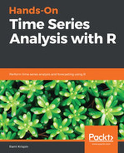
Hands-On Time Series Analysis with R

Dive into the intricacies of time series analysis and forecasting with R in this comprehensive guide. From foundational concepts to practical implementations, this book equips you with the tools and techniques to analyze, understand, and predict time-dependent data. What this Book will help me do Develop insights by visualizing time-series data and identifying patterns. Master statistical time-series concepts including autocorrelation and moving averages. Learn and implement forecasting models like ARIMA and exponential smoothing. Apply machine learning methodologies for advanced time-series predictions. Work with key R packages for cleaning, manipulating, and analyzing time-series data. Author(s) Rami Krispin is an accomplished statistician and R programmer with extensive experience in data analysis and time-series modeling. His hands-on approach in utilizing R packages and libraries brings clarity to complex time-series concepts. With a passion for teaching and simplifying intricate topics, Rami ensures readers both grasp the theories and apply them effectively. Who is it for? This book is ideal for data analysts, statisticians, and R developers interested in mastering time-series analysis for real-world applications. Designed for readers with a basic understanding of statistics and R programming, it offers a practical approach to learning effective forecasting and data visualization techniques. Professionals aiming to expand their skillset in predictive analytics will find it particularly beneficial.

Visual Analytics with Tableau

A four-color journey through a complete Tableau visualization Tableau is a popular data visualization tool that’s easy for individual desktop use as well as enterprise. Used by financial analysts, marketers, statisticians, business and sales leadership, and many other job roles to present data visually for easy understanding, it’s no surprise that Tableau is an essential tool in our data-driven economy. Visual Analytics with Tableau is a complete journey in Tableau visualization for a non-technical business user. You can start from zero, connect your first data, and get right into creating and publishing awesome visualizations and insightful dashboards. • Learn the different types of charts you can create • Use aggregation, calculated fields, and parameters • Create insightful maps • Share interactive dashboards Geared toward beginners looking to get their feet wet with Tableau, this book makes it easy and approachable to get started right away.

Learn D3.js

Dive into the world of data visualization with 'Learn D3.js'. This comprehensive guide introduces D3.js-the leading JavaScript library for creating interactive, data-driven visualizations on the web. By following practical examples, you'll understand core concepts of D3.js, learn to implement various types of visualizations, and develop skills to bring dynamic, responsive graphics to your projects. What this Book will help me do Master the fundamentals of D3.js and use it to produce stunning web-based data visualizations. Bind data to the DOM using D3.js and configure interactive transitions and animations. Gain experience generating a multitude of chart types such as bar, pie, scatter charts, and more. Incorporate user interactivity into your visualizations using D3.js effectively. Work with map-based data visualizations using GIS data and various geographical projections. Author(s) Helder da Rocha is an experienced developer and educator with a passion for data visualization. With a solid background in JavaScript and web technologies, he has crafted this book to make the complexities of D3.js accessible and engaging. His approach emphasizes practical, hands-on learning, nurturing both new and seasoned developers alike. Who is it for? Are you a web developer, designer, or data scientist aiming to create interactive data visualizations for the web? If you have foundational knowledge of HTML, CSS, and JavaScript, this book is your perfect guide. Whether you're dipping your toes into web-based charts or seeking to craft advanced interactive graphics, 'Learn D3.js' is tailored to empower your journey.

TIBCO Spotfire: A Comprehensive Primer - Second Edition

Explore the possibilities of TIBCO Spotfire with this comprehensive guide. You'll start with fundamental data visualization principles and progress to creating powerful, professional-grade analytics dashboards and applications. By following this book, you'll master both basic usage and advanced features such as predictive and spatial analytics. What this Book will help me do Understand the fundamentals of TIBCO Spotfire and its various interfaces including web and desktop clients. Utilize Spotfire's range of visualization tools to effectively analyze and present data. Develop robust analytics dashboards and applications tailored for enterprise needs. Implement advanced features like predictive analytics and location-based data representations. Learn strategies for deploying and administrating Spotfire in a scalable, enterprise-oriented environment. Author(s) The authors, None Berridge and None Phillips, bring years of experience in business intelligence and data analytics. Their practical knowledge and real-world perspective shape the book into a practical resource for learning Spotfire. Their approach ensures that concepts are clearly explained with relatable examples, improving accessibility for all readers. Who is it for? This book is intended for business intelligence professionals, data analysts, and developers who aim to enhance their analytics skills using TIBCO Spotfire. It is suitable for beginners as no prior experience with Spotfire or advanced analytics is required. Readers looking to develop enterprise-grade visualization and analytical solutions will find it valuable.

Send us a text This week, host Al Martin welcomes IBMers Reena Ganga and Jenna Goldberg. Reena and Jenna both serve as senior designers working at the intersection of Augmented Reality and Big Data. Both are passionate advocates for user experience design and the Design Thinking method, determined to improve — and illuminate — the way we experience and understand data.

Check us out on: - YouTube - Apple Podcasts - Google Play Music - Spotify - TuneIn - Stitcher

Show Notes 00:10 - Connect with Producer Steve Moore on LinkedIn and Twitter.

00:15 - Connect with Producer Liam Seston on LinkedIn and Twitter.

00:20 - Connect with Producer Rachit Sharma on LinkedIn.

00:25 - Connect with Host Al Martin on LinkedIn and Twitter.

00:40 - Connect with Rena on LinkedIn & Twitter.

00:45 - Connect with Jenna on LinkedIn & Twitter.

08:40 - What is User Experience Design (UXD)?

12:40 - What is Data Visualization? 17:00 - What is Augmented Reality (AR)? Want to be featured as a guest on Making Data Simple? Reach out to us at [email protected] and tell us why you should be next. The Making Data Simple Podcast is hosted by Al Martin, WW VP Technical Sales, IBM, where we explore trending technologies, business innovation, and leadership ... while keeping it simple & fun.

Learn RStudio IDE: Quick, Effective, and Productive Data Science

Discover how to use the popular RStudio IDE as a professional tool that includes code refactoring support, debugging, and Git version control integration. This book gives you a tour of RStudio and shows you how it helps you do exploratory data analysis; build data visualizations with ggplot; and create custom R packages and web-based interactive visualizations with Shiny. In addition, you will cover common data analysis tasks including importing data from diverse sources such as SAS files, CSV files, and JSON. You will map out the features in RStudio so that you will be able to customize RStudio to fit your own style of coding. Finally, you will see how to save a ton of time by adopting best practices and using packages to extend RStudio. Learn RStudio IDE is a quick, no-nonsense tutorial of RStudio that will give you a head start to develop the insights you need in your data science projects. What YouWill Learn Quickly, effectively, and productively use RStudio IDE for building data science applications Install RStudio and program your first Hello World application Adopt the RStudio workflow Make your code reusable using RStudio Use RStudio and Shiny for data visualization projects Debug your code with RStudio Import CSV, SPSS, SAS, JSON, and other data Who This Book Is For Programmers who want to start doing data science, but don’t know what tools to focus on to get up to speed quickly.

Fundamentals of Data Visualization

Effective visualization is the best way to communicate information from the increasingly large and complex datasets in the natural and social sciences. But with the increasing power of visualization software today, scientists, engineers, and business analysts often have to navigate a bewildering array of visualization choices and options. This practical book takes you through many commonly encountered visualization problems, and it provides guidelines on how to turn large datasets into clear and compelling figures. What visualization type is best for the story you want to tell? How do you make informative figures that are visually pleasing? Author Claus O. Wilke teaches you the elements most critical to successful data visualization. Explore the basic concepts of color as a tool to highlight, distinguish, or represent a value Understand the importance of redundant coding to ensure you provide key information in multiple ways Use the book’s visualizations directory, a graphical guide to commonly used types of data visualizations Get extensive examples of good and bad figures Learn how to use figures in a document or report and how employ them effectively to tell a compelling story

Learning Tableau 2019 - Third Edition

Discover how to harness the power of Tableau 2019 to transform raw data into insightful, actionable business intelligence. This book serves as a comprehensive guide to mastering Tableau's features-from creating stunning visualizations to managing complex datasets with Tableau Prep. By the end, you'll be well-equipped to use Tableau for informed decision-making. What this Book will help me do Master the essential features of Tableau 2019 to become proficient in data visualization. Learn to prepare and integrate data effectively using Tableau Prep. Develop advanced visual analytics skills, including calculations and table calculations. Understand how to craft compelling dashboards and data stories for impactful communication. Leverage new Tableau features like set actions and transparent views for enhanced analytics. Author(s) Joshua N. Milligan is a Tableau-certified professional and Tableau Zen Master with extensive industry experience in data analytics. Known for his clarity in teaching, Joshua takes a practical and comprehensive approach to help users navigate Tableau effectively. His passion for empowering data-driven decisions is evident in his writing. Who is it for? This book is ideal for data professionals, analysts, or anyone new to Tableau who seeks to gain proficiency in data visualization and analysis. It is suitable for beginners, as it walks the reader through foundational concepts before introducing complex topics. Readers looking to enhance their skills in advanced Tableau techniques will also find value here. Familiarity with databases is helpful but not mandatory.

Hands-On Dashboard Development with QlikView

"Hands-On Dashboard Development with QlikView" is a practical guide that will teach you how to create interactive and visually appealing business intelligence dashboards using QlikView. You will learn to connect data from various sources, build effective data models, and craft dynamic visualizations to communicate critical insights with stakeholders. What this Book will help me do Learn the latest features of QlikView and how to effectively apply them. Connect QlikView to diverse data sources, including databases and websites. Develop comprehensive data models that avoid circular references. Utilize advanced visualization techniques to create maps, charts, and dashboards. Implement robust security measures and manage user access efficiently. Author(s) None Agarwal is a seasoned Business Intelligence professional with extensive experience in building and managing BI solutions for different industries. Having a passion for data visualization, None dedicates themselves to empowering others through clear, actionable, and concise tutorials. Their warm, instructive style makes advanced concepts approachable for learners of all levels. Who is it for? This book is ideal for business intelligence professionals, data analysts, and aspiring QlikView developers with fundamental knowledge of data visualization and BI concepts. It is designed for those looking to enhance their skills in QlikView and create impactful dashboards to leverage their data effectively. Beginners who are eager to learn QlikView will also find this book to be a great resource.

Learn Chart.js

This book, 'Learn Chart.js', serves as a comprehensive guide to mastering Chart.js for creating stunning web-based data visualizations. By combining JavaScript, HTML5 Canvas, and Chart.js, you will understand how to turn raw data into interactive visual stories. What this Book will help me do Develop skills to create interactive and engaging data visualizations using the Chart.js library. Learn to efficiently load, parse, and handle data from external formats like CSV and JSON. Understand different chart types offered by Chart.js and learn when to best use each one. Gain the ability to customize Chart.js charts, such as adjusting properties for styling or animations. Acquire hands-on experience with practical examples, equipping you to apply what you learn in real-world scenarios. Author(s) Helder da Rocha brings his extensive experience in programming and software development to this book, offering readers a clear and practical approach to mastering Chart.js. With a deep understanding of data visualization and web technologies, he conveys complex concepts in a straightforward way. Who is it for? This book is ideal for web developers, data analysts, and designers who have basic proficiency in HTML, CSS, and JavaScript. It is particularly suited for professionals looking to create impactful web-based data visualizations using open-source tools. Additionally, the book assumes no prior knowledge of the Canvas element, making it accessible for Chart.js beginners.

Mastering Tableau 2019.1 - Second Edition

Mastering Tableau 2019.1 is your essential guide for becoming an expert in Tableau's advanced features and functionalities. This book will teach you how to use Tableau Prep for data preparation, create complex visualizations and dashboards, and leverage Tableau's integration with R, Python, and MATLAB. You'll be equipped with the skills to solve both common and advanced BI challenges. What this Book will help me do Gain expertise in preparing and blending data using Tableau Prep and other data handling tools. Create advanced data visualizations and designs that effectively communicate insights. Implement narrative storytelling in BI with advanced presentation designs in Tableau. Integrate Tableau with programming tools like R, Python, and MATLAB for extended functionalities. Optimize performance and improve dashboard interactivity for user-friendly analytics solutions. Author(s) Marleen Meier, with extensive experience in business intelligence and analytics, and None Baldwin, an expert in data visualization, collaboratively bring this advanced Tableau guide to life. Their passion for empowering users with practical BI solutions reflects in the hands-on approach employed throughout the book. Who is it for? This book is perfectly suited for business analysts, BI professionals, and data analysts who already have foundational knowledge of Tableau and seek to advance their skills for tackling more complex BI challenges. It's ideal for individuals aiming to master Tableau's premium features for impactful analytics solutions.

SAP Business Intelligence Quick Start Guide

This book is your practical guide to understanding and using the SAP BusinessObjects Business Intelligence (BI) Platform. Through hands-on examples and clear instructions, you'll learn how to create insightful data visualizations, manage business intelligence reports, and deploy and maintain the BI platform effectively, empowering better data-driven decision making. What this Book will help me do Learn how to use SAP Web Intelligence to develop insightful dashboards and reports. Understand the use of SAP Crystal Reports for Enterprise in creating detailed analytics. Gain proficiency in SAP Lumira for advanced data visualization and storytelling. Learn to configure and deploy the SAP BusinessObjects BI platform in a business environment. Develop skills in using SAP Predictive Analytics to perform advanced data analysis capabilities. Author(s) Vinay Singh brings significant expertise in data analysis and the SAP BusinessObjects platform. With years of experience implementing and consulting on SAP solutions across industries, Vinay offers a unique ability to demystify complex technical subjects for readers. His practical approach and commitment to empowering readers make his book a valuable learning resource. Who is it for? This book is ideal for Business Intelligence professionals seeking to explore advanced tools for data analysis. It caters to SAP users eager to expand their expertise in leveraging SAP BusinessObjects for improved decision-making capabilities. It serves IT consultants and data analysts wishing to gain deeper insights into deployment and utilization strategies. Appropriate for beginners with foundational understanding of BI principles aiming to learn a globally recognized BI tool.

Advanced R Statistical Programming and Data Models: Analysis, Machine Learning, and Visualization

Carry out a variety of advanced statistical analyses including generalized additive models, mixed effects models, multiple imputation, machine learning, and missing data techniques using R. Each chapter starts with conceptual background information about the techniques, includes multiple examples using R to achieve results, and concludes with a case study. Written by Matt and Joshua F. Wiley, Advanced R Statistical Programming and Data Models shows you how to conduct data analysis using the popular R language. You’ll delve into the preconditions or hypothesis for various statistical tests and techniques and work through concrete examples using R for a variety of these next-level analytics. This is a must-have guide and reference on using and programming with the R language. What You’ll Learn Conduct advanced analyses in R including: generalized linear models, generalized additive models, mixedeffects models, machine learning, and parallel processing Carry out regression modeling using R data visualization, linear and advanced regression, additive models, survival / time to event analysis Handle machine learning using R including parallel processing, dimension reduction, and feature selection and classification Address missing data using multiple imputation in R Work on factor analysis, generalized linear mixed models, and modeling intraindividual variability Who This Book Is For Working professionals, researchers, or students who are familiar with R and basic statistical techniques such as linear regression and who want to learn how to use R to perform more advanced analytics. Particularly, researchers and data analysts in the social sciences may benefit from these techniques. Additionally, analysts who need parallel processing to speed up analytics are givenproven code to reduce time to result(s).

Kibana 7 Quick Start Guide

Dive into the world of Kibana 7 with this hands-on guide that simplifies the process of visualizing and analyzing data using Elasticsearch. From fundamental concepts to advanced tools, this book enables you to create intuitive dashboards and leverage powerful machine learning capabilities effectively. Discover how to transform your data into actionable insights with ease. What this Book will help me do Configure Logstash to fetch and process CSV data for visualization. Master creating and managing index patterns within Kibana for efficient data navigation. Effectively apply filters to refine data presentations and insights. Develop and utilize machine learning jobs in Kibana to identify trends and anomalies. Create, customize, and share impactful visualizations and dashboards to drive data-driven decisions. Author(s) None Srivastava is a technical expert in data visualization and Elasticsearch tools, with practical experience implementing and teaching about the Elastic Stack. The author brings a hands-on approach to this book, simplifying complex concepts for ease of understanding. Their expertise ensures that the book serves both as a learning guide and a practical reference. Who is it for? This book is ideal for developers and IT professionals who are either new to Kibana or looking to deepen their understanding of its visualization capabilities. It is suitable for individuals working with the Elastic Stack or seeking to leverage Kibana for data analysis purposes. Even if you are progressing from a novice to an intermediate level, this guide will provide future-proof skills to optimize your workflow.

The Harvard Business Review Good Charts Collection

A good visualization can communicate the nature and potential impact of ideas more powerfully than any other form of communication. For a long time, "dataviz" was left to specialists--data scientists and professional designers. No longer. A new generation of tools and massive amounts of available data make it easy for anyone to create visualizations that communicate ideas far more effectively than generic spreadsheet charts ever could. The Harvard Business Review Good Charts Collection brings together two popular books to help you become more sophisticated in understanding and using dataviz to communicate your ideas and advance your career. In Good Charts, dataviz maven and Harvard Business Review editor Scott Berinato provides an essential guide to how visualization works and how to use this new language to impress and persuade. He lays out a system for thinking visually and building better charts through a process of talking, sketching, and prototyping. In Good Charts Workbook, Berinato extends the usefulness of Good Charts by putting theory into practice. He leads readers step-by-step through several example datasets and basic charts, providing space to practice the Good Charts talk-sketch-prototype process for improving those charts. Examples include a "Discussion Key" showing how to approach the challenge and why. Each challenge focuses on a different, common visualization problem such as simplification, storytelling, creating conceptual charts, and many others. The Harvard Business Review Good Charts Collection is your go-to resource for turning plain, uninspiring charts that merely present information into smart, effective visualizations that powerfully convey ideas.

Send us a text Host Al Martin looks back on his top 5 favourite clips from episodes published in 2018. These conversations range from explaining the importance of data visualization, to discussing the differences between A.I. and deep learning. Thanks to all of our listeners for an incredible 2018, and prepare yourself for Season 3 of the Making Data Simple podcast!

Show Notes

00:00 - Check us out on YouTube and SoundCloud!  00:10 - Connect with producer Liam Seston on LinkedIn and Twitter.   00:15 - Connect with producer Steve Moore on LinkedIn and Twitter.  00:24 - Connect with host Al Martin on LinkedIn and Twitter.   00:55 - Listen to the full conversation with Lisa Seacat DeLuca here. 05:45 - Listen to the full conversation with John Thomas here. 09:59 - Listen to the full conversation with Jillian Lellis here.   13:39 - Listen to the full conversation with Adam Storm here. 18:36 - Listen to the full conversation with Jean Francois Puget here. Want to be featured as a guest on Making Data Simple? Reach out to us at [email protected] and tell us why you should be next. The Making Data Simple Podcast is hosted by Al Martin, WW VP Technical Sales, IBM, where we explore trending technologies, business innovation, and leadership ... while keeping it simple & fun.

Get Your Venture Backed with Persuasive Data Viz

Communicating your idea in a clear, compelling, and persuasive manner is critical when trying to launch a new venture. This Harvard Business Review collection brings together two popular books to help you craft your story, design better visualizations, impress your audience, and turn your idea into reality. Understanding and using data viz to persuade is a must-have skill for anyone in business today--especially if you're launching a new venture. In Good Charts, dataviz maven Scott Berinato provides an essential guide to how visualization works. Berinato lays out a system for thinking visually and building better charts through a process of talking, sketching, and prototyping. How do you launch the venture of your dreams? In Get Backed, entrepreneurs Evan Baehr and Evan Loomis argue that it's not just about securing startup funding. It's about building the right relationships, crafting a compelling story, and creating the perfect pitch deck. Filled with proven tips, exercises, and templates, this book shows the process for how to successfully communicate your vision. Good Charts will help you turn plain, uninspiring charts that merely present information into smart, effective visualizations that powerfully convey ideas. Get Backed will show you exactly what it takes to get funded and will give you the tools to launch a new venture. Together, these books will help you bring your idea to life.

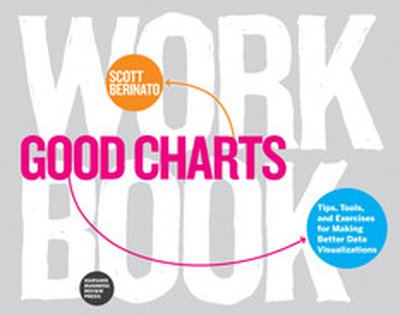
Good Charts Workbook

Talk. Sketch. Prototype. Repeat. You know right away when you see an effective chart or graphic. It hits you with an immediate sense of its meaning and impact. But what actually makes it clearer, sharper, and more effective? If you're ready to create your own "good charts"--data visualizations that powerfully communicate your ideas and research and that advance your career—the Good Charts Workbook is the hands-on guide you've been looking for. The original Good Charts changed the landscape by helping readers understand how to think visually and by laying out a process for creating powerful data visualizations. Now, the Good Charts Workbook provides tools, exercises, and practical insights to help people in all kinds of enterprises gain the skills they need to get started. Harvard Business Review Senior Editor and dataviz expert Scott Berinato leads you, step-by-step, through the key challenges in creating good charts—controlling color, crafting for clarity, choosing chart types, practicing persuasion, capturing concepts—with warm-up exercises and mini-challenges for each. The Workbook includes helpful prompts and reminders throughout, as well as white space for users to practice the Good Charts talk-sketch-prototype process. Good Charts Workbook is the must-have manual for better understanding the dataviz around you and for creating better charts to make your case more effectively.

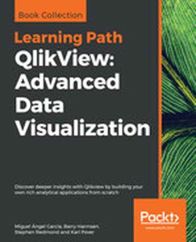
QlikView: Advanced Data Visualization

Build powerful data analytics applications with this business intelligence tool and overcome all your business challenges Key Features Master time-saving techniques and make your QlikView development more efficient Perform geographical analysis and sentiment analysis in your QlikView applications Explore advanced QlikView techniques, tips, and tricks to deliver complex business requirements Book Description QlikView is one of the most flexible and powerful business intelligence platforms around, and if you want to transform data into insights, it is one of the best options you have at hand. Use this Learning Path, to explore the many features of QlikView to realize the potential of your data and present it as impactful and engaging visualizations. Each chapter in this Learning Path starts with an understanding of a business requirement and its associated data model and then helps you create insightful analysis and data visualizations around it. You will look at problems that you might encounter while visualizing complex data insights using QlikView, and learn how to troubleshoot these and other not-so-common errors. This Learning Path contains real-world examples from a variety of business domains, such as sales, finance, marketing, and human resources. With all the knowledge that you gain from this Learning Path, you will have all the experience you need to implement your next QlikView project like a pro. This Learning Path includes content from the following Packt products: QlikView for Developers by Miguel Angel Garcia, Barry Harmsen Mastering QlikView by Stephen Redmond Mastering QlikView Data Visualization by Karl Pover What you will learn Deliver common business requirements using advanced techniques Load data from disparate sources to build associative data models Understand when to apply more advanced data visualization Utilize the built-in aggregation functions for complex calculations Build a data architecture that supports scalable QlikView deployments Troubleshoot common data visualization errors in QlikView Protect your QlikView applications and data Who this book is for This Learning Path is designed for developers who want to go beyond their technical knowledge of QlikView and understand how to create analysis and data visualizations that solve real business needs. To grasp the concepts explained in this Learning Path, you should have a basic understanding of the common QlikView functions and some hands-on experience with the tool. Downloading the example code for this book You can download the example code files for all Packt books you have purchased from your account at http://www.PacktPub.com. If you purchased this book elsewhere, you can visit http://www.PacktPub.com/support and register to have the files e-mailed directly to you.

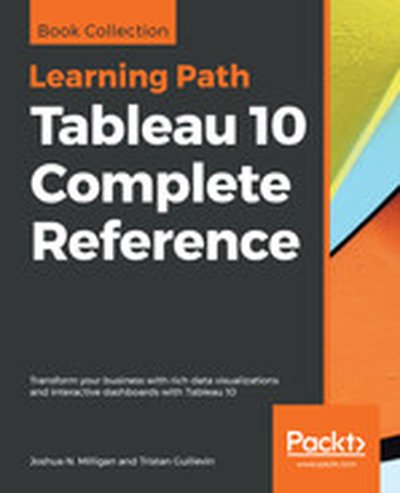
Tableau 10 Complete Reference

Explore and understand data with the powerful data visualization techniques of Tableau, and then communicate insights in powerful ways Key Features Apply best practices in data visualization and chart types exploration Explore the latest version of Tableau Desktop with hands-on examples Understand the fundamentals of Tableau storytelling Book Description Graphical presentation of data enables us to easily understand complex data sets. Tableau 10 Complete Reference provides easy-to-follow recipes with several use cases and real-world business scenarios to get you up and running with Tableau 10. This Learning Path begins with the history of data visualization and its importance in today's businesses. You'll also be introduced to Tableau - how to connect, clean, and analyze data in this visual analytics software. Then, you'll learn how to apply what you've learned by creating some simple calculations in Tableau and using Table Calculations to help drive greater analysis from your data. Next, you'll explore different advanced chart types in Tableau. These chart types require you to have some understanding of the Tableau interface and understand basic calculations. You'll study in detail all dashboard techniques and best practices. A number of recipes specifically for geospatial visualization, analytics, and data preparation are also covered. Last but not least, you'll learn about the power of storytelling through the creation of interactive dashboards in Tableau. Through this Learning Path, you will gain confidence and competence to analyze and communicate data and insights more efficiently and effectively by creating compelling interactive charts, dashboards, and stories in Tableau. This Learning Path includes content from the following Packt products: Learning Tableau 10 - Second Edition by Joshua N. Milligan Getting Started with Tableau 2018.x by Tristan Guillevin What you will learn Build effective visualizations, dashboards, and story points Build basic to more advanced charts with step-by-step recipes Become familiar row-level, aggregate, and table calculations Dig deep into data with clustering and distribution models Prepare and transform data for analysis Leverage Tableau's mapping capabilities to visualize data Use data storytelling techniques to aid decision making strategy Who this book is for Tableau 10 Complete Reference is designed for anyone who wants to understand their data better and represent it in an effective manner. It is also used for BI professionals and data analysts who want to do better at their jobs. Downloading the example code for this book You can download the example code files for all Packt books you have purchased from your account at http://www.PacktPub.com. If you purchased this book elsewhere, you can visit http://www.PacktPub.com/support and register to have the files e-mailed directly to you.