talk-data.com talk-data.com

Event

O'Reilly Data Visualization Books

2007-12-18 – 2026-02-25 Oreilly Visit website ↗

Activities tracked

94

Collection of O'Reilly books on Data Visualization.

Sessions & talks

Showing 51–75 of 94 · Newest first

Search within this event →
Source Code Analytics With Roslyn and JavaScript Data Visualization

Learn how to build an interactive source code analytics system using Roslyn and JavaScript. This concise 150 page book will help you create and use practical code analysis tools utilizing the new features of Microsoft's Roslyn compiler to understand the health of your code and identify parts of the code for refactoring. Source code is one of the biggest assets of a software company. However if not maintained well, it can become a big liability. As source code becomes larger. more complex and accessed via the cloud, maintaining code quality becomes even more challenging. The author provides straightforward tools and advice on how to manage code quality in this new environment. Roslyn exposes a set of APIs which allow developers to parse their C# and VB.NET code and drastically lower the barrier to entry for Meta programming in .NET. Roslyn has a dedicated set of APIs for creating custom refactoring for integrating with Visual Studio. This title will show readers how to use Roslyn along with industry standard JavaScript visualization APIs like HighCharts, D3.js etc to create a scalable and highly responsive source code analytics system. What You Will Learn Understand the Roslyn Syntax API Use Data Visualization techniques to assist code analysis process visually Code health monitoring matrices (from the standard of Code Query Language) Code mining techniques to identify design patterns used in source code Code forensics techniques to identify probable author of a given source code Techniques to identify duplicate/near duplicate code Who This Book is For .NET Software Developers and Architects

Visualizing Graph Data

Visualizing Graph Data teaches you not only how to build graph data structures, but also how to create your own dynamic and interactive visualizations using a variety of tools. This book is loaded with fascinating examples and case studies to show you the real-world value of graph visualizations. About the Technology Assume you are doing a great job collecting data about your customers and products. Are you able to turn your rich data into important insight? Complex relationships in large data sets can be difficult to recognize. Visualizing these connections as graphs makes it possible to see the patterns, so you can find meaning in an otherwise over-whelming sea of facts. About the Book Visualizing Graph Data teaches you how to understand graph data, build graph data structures, and create meaningful visualizations. This engaging book gently introduces graph data visualization through fascinating examples and compelling case studies. You'll discover simple, but effective, techniques to model your data, handle big data, and depict temporal and spatial data. By the end, you'll have a conceptual foundation as well as the practical skills to explore your own data with confidence. What's Inside Techniques for creating effective visualizations Examples using the Gephi and KeyLines visualization packages Real-world case studies About the Reader No prior experience with graph data is required. About the Author Corey Lanum has decades of experience building visualization and analysis applications for companies and government agencies around the globe. Quotes Shows you how to solve visualization problems and explore complex data sets. A pragmatic introduction. - John D. Lewis, DDN Excellent! Hands-on! Shows you how to kick-start your graph data visualization. - Rocio Chongtay, University of Southern Denmark A clear and concise guide to both graph theory and visualization. - Jonathan Suever, PhD, Georgia Institute of Technology Great coverage, with real-life business use cases. - Sumit Pal, Big Data consultant

Data Visualization: Representing Information on Modern Web

Unleash the power of data by creating interactive, engaging, and compelling visualizations for the web About This Book Get a portable, versatile, and flexible data visualization design approach that will help you navigate the complex path towards success Get thorough explanation of the many visual variables and visualization taxonomy to provide you with a menu of creative options A comprehensive and contemporary introduction to data-driven visualization design and the most effective approaches to designing impact-maximizing and cognition-amplifying visualizations Who This Book Is For This course is for developers who are excited about data and who want to share that excitement with others and it will be handy for the web developers or data scientists who want to create interactive visualizations for the web. Prior knowledge of developing web applications is required. You should have a working knowledge of both JavaScript and HTML. What You Will Learn Harness the power of D3 by building interactive and real-time data-driven web visualizations Find out how to use JavaScript to create compelling visualizations of social data Identify the purpose of your visualization and your project's parameters to determine overriding design considerations across your project's execution Apply critical thinking to visualization design and get intimate with your dataset to identify its potential visual characteristics Explore the various features of HTML5 to design creative visualizations Discover what data is available on Stack Overflow, Facebook, Twitter, and Google+ Gain a solid understanding of the common D3 development idioms Find out how to write basic D3 code for server using Node.js In Detail Do you want to create more attractive charts? Or do you have huge data sets and need to unearth the key insights in a visual manner? Data visualization is the representation and presentation of data, using proven design techniques to bring alive the patterns, stories, and key insights that are locked away. This learning path is divided into three modules. The first module will equip you with the key techniques required to overcome contemporary data visualization challenges. After getting familiar with key concepts of data visualization, it's time to incorporate it with various technologies. In the second module, Social Data Visualization with HTML5 and JavaScript, it teaches you how to leverage HTML5 techniques through JavaScript to build visualizations. It also clears up how the often complicated OAuth protocol works to help you unlock a universe of social media data from sites such as Twitter, Facebook, and Google+. Once you are familiar with the concepts of incorporating data visualization with HTML5 and JavaScript, third module, Learning d3.js Data Visualization, will lead you to D3, which has emerged as one of the leading platforms to develop beautiful, interactive visualizations over the web. This module provides a strong foundation in designing compelling web visualizations with D3.js. By the end of this course, you will have unlocked the mystery behind successful data visualizations. This Learning Path combines some of the best that Packt has to offer in one complete, curated package. It includes content from the following Packt products: Data Visualization: a successful design process by Andy Kirk Social Data Visualization with HTML5 and JavaScript by Simon Timms Learning d3.js Data Visualization, Second Edition by Ændrew Rininsland and Swizec Teller Style and approach This course includes all the resources that will help you jump into creating interactive and engaging visualizations for the web. Through this comprehensive course, you’ll learn how to create engaging visualizations for the web to represent your data from start to finish! Downloading the example code for this book. You can download the example code files for all Packt books you have purchased from your account at http://www.PacktPub.com. If you purchased this book elsewhere, you can visit http://www.PacktPub.com/support and register to have the code file.

Tableau: Creating Interactive Data Visualizations

Illustrate your data in a more interactive way by implementing data visualization principles and creating visual stories using Tableau About This Book Use data visualization principles to help you to design dashboards that enlighten and support business decisions Integrate your data to provide mashed-up dashboards Connect to various data sources and understand what data is appropriate for Tableau Public Understand chart types and when to use specific chart types with different types of data Who This Book Is For Data scientists who have just started using Tableau and want to build on the skills using practical examples. Familiarity with previous versions of Tableau will be helpful, but not necessary. What You Will Learn Customize your designs to meet the needs of your business using Tableau Use Tableau to prototype, develop, and deploy the final dashboard Create filled maps and use any shape file Discover features of Tableau Public, from basic to advanced Build geographic maps to bring context to data Create filters and actions to allow greater interactivity to Tableau Public visualizations and dashboards Publish and embed Tableau visualizations and dashboards in articles In Detail With increasing interest for data visualization in the media, businesses are looking to create effective dashboards that engage as well as communicate the truth of data. Tableau makes data accessible to everyone, and is a great way of sharing enterprise dashboards across the business. Tableau is a revolutionary toolkit that lets you simply and effectively create high-quality data visualizations. This course starts with making you familiar with its features and enable you to develop and enhance your dashboard skills, starting with an overview of what dashboard is, followed by how you can collect data using various mathematical formulas. Next, you'll learn to filter and group data, as well as how to use various functions to present the data in an appealing and accurate way. In the first module, you will learn how to use the key advanced string functions to play with data and images. You will be walked through the various features of Tableau including dual axes, scatterplot matrices, heat maps, and sizing.In the second module, you'll start with getting your data into Tableau, move onto generating progressively complex graphics, and end with the finishing touches and packaging your work for distribution. This module is filled with practical examples to help you create filled maps, use custom markers, add slider selectors, and create dashboards. You will learn how to manipulate data in various ways by applying various filters, logic, and calculating various aggregate measures. Finally, in the third module, you learn about Tableau Public using which allows readers to explore data associations in multiple-sourced public data, and uses state-of-the-art dashboard and chart graphics to immerse the users in an interactive experience. In this module, the readers can quickly gain confidence in understanding and expanding their visualization, creation knowledge, and quickly create interesting, interactive data visualizations to bring a richness and vibrancy to complex articles. The course provides a great overview for beginner to intermediate Tableau users, and covers the creation of data visualizations of varying complexities. Style and approach The approach will be a combined perspective, wherein we start by performing some basic recipes and move on to some advanced ones. Finally, we perform some advanced analytics and create appealing and insightful data stories using Tableau Public in a step-by-step manner.

Data Visualization Toolkit: Using JavaScript, Rails™, and Postgres to Present Data and Geospatial Information

Create Beautiful Visualizations that Free Your Data to Tell Powerful Truths “The depth of Barrett Clark’s knowledge shines through in his writing: clear, concise, and confident. Barrett has been practicing all of this stuff in his day job for many years–Postgres, D3, GIS, all of it. The knowledge in this book is real-world and hard-earned!” –From the Foreword by Obie Fernandez is your hands-on, practical, and holistic guide to the art of visualizing data. You’ll learn how to use Rails, jQuery, D3, Leaflet, PostgreSQL, and PostGIS together, creating beautiful visualizations and maps that give your data a voice and to make it “dance.” Data Visualization Toolkit Barrett Clark teaches through real-world problems and examples developed specifically to illuminate every technique you need to generate stunningly effective visualizations. You’ll move from the absolute basics toward deep dives, mastering diverse visualizations and discovering when to use each. Along the way, you’ll build three start-to-finish visualization applications, using actual real estate, weather, and travel datasets. Clark addresses every component of data visualization: your data, database, application server, visualization libraries, and more. He explains data transformations; presents expert techniques in JavaScript, Ruby, and SQL; and illuminates key concepts associated with both descriptive statistics and geospatial data. Throughout, everything is aimed at one goal: to help you cut through the clutter and let your data tell all it can. This guide will help you Explore and understand the data visualization technology stack Master the thought process and steps involved in importing data Extract, transform, and load data in usable, reliable form Handle spotty data, or data that doesn’t line up with what your chart expects Use D3 to build pie and bar charts, scatter and box plots, and more Work effectively with time-series data Tweak Ruby and SQL to optimize performance with large datasets Use raw SQL in Rails: window functions, subqueries, and common table expressions Build chord diagrams and time-series aggregates Use separate databases or schema for reporting databases Integrate geographical data via geospatial SQL queries Construct maps with Leaflet and Rails Query geospatial data the “Rails way” and the “raw SQL way”

Data Visualization with Python and JavaScript

Learn how to turn raw data into rich, interactive web visualizations with the powerful combination of Python and JavaScript. With this hands-on guide, author Kyran Dale teaches you how build a basic dataviz toolchain with best-of-breed Python and JavaScript libraries—including Scrapy, Matplotlib, Pandas, Flask, and D3—for crafting engaging, browser-based visualizations. As a working example, throughout the book Dale walks you through transforming Wikipedia’s table-based list of Nobel Prize winners into an interactive visualization. You’ll examine steps along the entire toolchain, from scraping, cleaning, exploring, and delivering data to building the visualization with JavaScript’s D3 library. If you’re ready to create your own web-based data visualizations—and know either Python or JavaScript— this is the book for you. Learn how to manipulate data with Python Understand the commonalities between Python and JavaScript Extract information from websites by using Python’s web-scraping tools, BeautifulSoup and Scrapy Clean and explore data with Python’s Pandas, Matplotlib, and Numpy libraries Serve data and create RESTful web APIs with Python’s Flask framework Create engaging, interactive web visualizations with JavaScript’s D3 library

R: Data Analysis and Visualization

Master the art of building analytical models using R About This Book Load, wrangle, and analyze your data using the world's most powerful statistical programming language Build and customize publication-quality visualizations of powerful and stunning R graphs Develop key skills and techniques with R to create and customize data mining algorithms Use R to optimize your trading strategy and build up your own risk management system Discover how to build machine learning algorithms, prepare data, and dig deep into data prediction techniques with R Who This Book Is For This course is for data scientist or quantitative analyst who are looking at learning R and take advantage of its powerful analytical design framework. It's a seamless journey in becoming a full-stack R developer. What You Will Learn Describe and visualize the behavior of data and relationships between data Gain a thorough understanding of statistical reasoning and sampling Handle missing data gracefully using multiple imputation Create diverse types of bar charts using the default R functions Familiarize yourself with algorithms written in R for spatial data mining, text mining, and so on Understand relationships between market factors and their impact on your portfolio Harness the power of R to build machine learning algorithms with real-world data science applications Learn specialized machine learning techniques for text mining, big data, and more In Detail The R learning path created for you has five connected modules, which are a mini-course in their own right. As you complete each one, you'll have gained key skills and be ready for the material in the next module! This course begins by looking at the Data Analysis with R module. This will help you navigate the R environment. You'll gain a thorough understanding of statistical reasoning and sampling. Finally, you'll be able to put best practices into effect to make your job easier and facilitate reproducibility. The second place to explore is R Graphs, which will help you leverage powerful default R graphics and utilize advanced graphics systems such as lattice and ggplot2, the grammar of graphics. You'll learn how to produce, customize, and publish advanced visualizations using this popular and powerful framework. With the third module, Learning Data Mining with R, you will learn how to manipulate data with R using code snippets and be introduced to mining frequent patterns, association, and correlations while working with R programs. The Mastering R for Quantitative Finance module pragmatically introduces both the quantitative finance concepts and their modeling in R, enabling you to build a tailor-made trading system on your own. By the end of the module, you will be well-versed with various financial techniques using R and will be able to place good bets while making financial decisions. Finally, we'll look at the Machine Learning with R module. With this module, you'll discover all the analytical tools you need to gain insights from complex data and learn how to choose the correct algorithm for your specific needs. You'll also learn to apply machine learning methods to deal with common tasks, including classification, prediction, forecasting, and so on. Style and approach Learn data analysis, data visualization techniques, data mining, and machine learning all using R and also learn to build models in quantitative finance using this powerful language.

Jumpstart Tableau: A Step-By-Step Guide to Better Data Visualization

This book simplifies the use of Tableau software functionality for novice users so that they can create powerful data visualizations easily and quickly. Since it is often very difficult and expensive to provide external training on BI tools, this book aims to equip the reader with the resource they need to do it themselves. Jumpstart Tableau covers the basic reporting and analysis functions that most BI users perform in their day-to-day work. These include connecting to a data source, working with dimensions and measures, developing reports and charts, saving workbooks, filtering, swapping, sorting, formatting, grouping, creating hierarchies, forecasting, exporting, distributing, as well developing various chart types. Each exercise in Jumpstart Tableau provides screenshots that cover every step from start to finish. The exercises are based on a comprehensive sample Excel-based data source that Tableau Software (version 9) has provided, which makes it very easy to duplicate the exercises on the real software. In addition, the book: Enables readers to develop reports, queries, and visualizations Perform data analysis Execute each function in a step-by-step manner Provides the basic hands-on ability which can enable users to work up to more advanced and complex Tableau functionality Shows how to integrate individual development of content, such as tables/charts and visualizations., onto a dashboard for an effective presentation

Mastering Data Visualization with Microsoft Visio Professional 2016

Microsoft Visio Professional 2016 is an essential tool for creating sophisticated data visualizations across a variety of contexts and industries. In 'Mastering Data Visualization with Microsoft Visio Professional 2016', you'll learn how to utilize Visio's powerful features to transform data into compelling graphics and actionable insights. What this Book will help me do Understand how to integrate external data from various sources into your Visio diagrams. Master the use of Visio's tools to represent information using data-driven graphics. Learn the process of designing and utilizing custom shapes and templates for tailored visualizations. Discover methods for automating diagram creation from structured and external data sources. Gain techniques to share and present interactive and professional visuals with a wide audience. Author(s) John Marshall, the author of 'Mastering Data Visualization with Microsoft Visio Professional 2016,' brings years of experience in data modeling and visualization. With an extensive technical background, Marshall is a renowned expert in leveraging visual tools to communicate complex ideas effectively. His approachable writing style makes highly technical concepts accessible to professionals at various levels. Who is it for? If you're a business intelligence professional, technical analyst, or a Microsoft Office power user looking to enhance your skills in creating impactful visualizations, this book is for you. Its step-by-step approach is ideal for users of Visio Professional starting out or seeking advanced techniques. You'll gain practical insights and learn to apply them effectively in your business or technical workflows, achieving refined data presentations.

Visualizing Financial Data

A fresh take on financial data visualization for greater accuracy and understanding Your data provides a snapshot of the state of your business and is key to the success of your conversations, decisions, and communications. But all of that communication is lost — or incorrectly interpreted — without proper data visualizations that provide context and accurate representation of the numbers. In Visualizing Financial Data, authors Julie Rodriguez and Piotr Kaczmarek draw upon their understanding of information design and visual communication to show you how to turn your raw data into meaningful information. Coverage includes current conventions paired with innovative visualizations that cater to the unique requirements across financial domains, including investment management, financial accounting, regulatory reporting, sales, and marketing communications. Presented as a series of case studies, this highly visual guide presents problems and solutions in the context of real-world scenarios. With over 250 visualizations, you’ll have access to relevant examples that serve as a starting point to your implementations. • Expand the boundaries of data visualization conventions and learn new approaches to traditional charts and graphs • Optimize data communications that cater to you and your audience • Provide clarity to maximize understanding • Solve data presentation problems using efficient visualization techniques • Use the provided companion website to follow along with examples The companion website gives you the illustration files and the source data sets, and points you to the types of resources you need to get started.

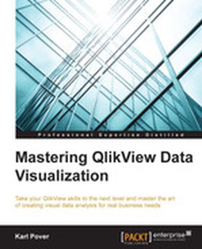
Mastering QlikView Data Visualization

"Mastering QlikView Data Visualization" is your essential guide to becoming proficient in advanced data visualization and analysis using QlikView. Through practical examples and real-world scenarios, this book enables you to create insightful and meaningful QlikView applications tailored to business needs. What this Book will help me do Design and implement advanced QlikView applications using realistic data and scenarios. Understand and fulfill business requirements across varied organizational departments. Create advanced charts and visualizations including frequency polygons and XmR charts. Integrate geographical, sentiment, and planning analysis into your QlikView models. Develop troubleshooting strategies for common QlikView data visualization challenges. Author(s) None Pover, an expert in data analytics and QlikView technologies, has extensive experience in implementing QlikView applications to address real-world business challenges. They are passionate about teaching practical solutions, ensuring readers gain actionable insights. With hands-on expertise, the author delivers clear, structured guidance in technical learning. Who is it for? If you're a QlikView developer wanting to go beyond the basics, this book is perfect for you. It is designed for individuals who have foundational knowledge of QlikView and are looking to enhance their ability to handle advanced projects. Whether you're focusing on analytics for sales, finance, or operations, you'll find this guide extremely useful.

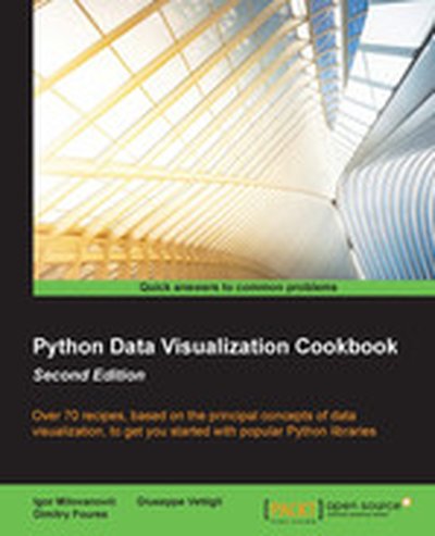
Python Data Visualization Cookbook (Second Edition)

In 'Python Data Visualization Cookbook (Second Edition)', you'll learn how to create stunning and meaningful visual representations of data using Python's powerful libraries. Through step-by-step, recipe-based guidance, this book equips you to transform raw data into comprehensible and compelling visual stories. What this Book will help me do Master setting up Python and its libraries for data visualization. Learn how to import, clean, and organize data effectively. Create a variety of plots and charts tailored to your data's needs. Explore 3D visualizations and animations for more complex data insights. Incorporate visualization into environments like LaTeX and web frameworks. Author(s) The authors Igor Milovanovic, None Foures, and Giuseppe Vettigli bring extensive experience in Python programming and data analysis. With a passion for teaching and a clear instructional style, they make complex topics approachable and engaging. Their expertise ensures you gain practical knowledge you can apply immediately. Who is it for? This book is perfect for Python programmers who want to deepen their understanding of data and learn how to visualize it effectively. It's suitable for readers with basic Python knowledge, looking to elevate their skills in data visualization. Whether you aim to improve at data-driven storytelling or analyze data in clarity, this book has you covered.

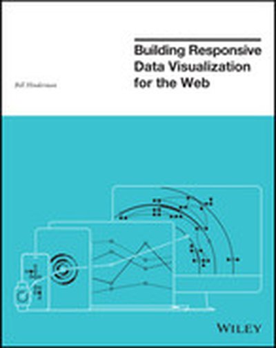
Building Responsive Data Visualization for the Web

Unchain your data from the desktop with responsive visualizations Building Responsive Data Visualization for the Web is a handbook for any front-end development team needing a framework for integrating responsive web design into the current workflow. Written by a leading industry expert and design lead at Starbase Go, this book provides a wealth of information and practical guidance from the perspective of a real-world designer. You'll walk through the process of building data visualizations responsively as you learn best practices that build upon responsive web design principles, and get the hands-on practice you need with exercises, examples, and source code provided in every chapter. These strategies are designed to be implemented by teams large and small, with varying skill sets, so you can apply these concepts and skills to your project right away. Responsive web design is the practice of building a website to suit base browser capability, then adding features that enhance the experience based on the user's device's capabilities. Applying these ideas to data produces visualizations that always look as if they were designed specifically for the device through which they are viewed. This book shows you how to incorporate these principles into your current practices, with highly practical hands-on training. Examine the hard data surrounding responsive design Master best practices with hands-on exercises Learn data-based document manipulation using D3.js Adapt your current strategies to responsive workflows Data is growing exponentially, and the need to visualize it in any context has become crucial. Traditional visualizations allow important data to become lost when viewed on a small screen, and the web traffic speaks for itself – viewers repeatedly demonstrate their preference for responsive design. If you're ready to create more accessible, take-anywhere visualizations, Building Responsive Data Visualization for the Web is your tailor-made solution.

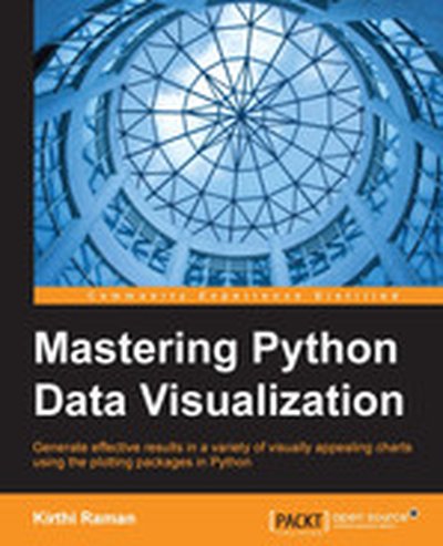
Mastering Python Data Visualization

Mastering Python Data Visualization provides thorough, hands-on guidance for creating impactful visual representations of data by leveraging Python's powerful libraries such as Matplotlib, Pandas, and Scikit-Learn. By following this book, you will gain proficiency in understanding data, performing analyses, and ultimately presenting your findings in a clear and engaging way. What this Book will help me do Effectively transform raw data into insightful visualizations using Python's rich ecosystem of libraries. Understand and apply best practices for selecting the most appropriate visualization techniques for different datasets and objectives. Master the use of Python for interactive plotting, regression analysis, clustering, and classification tasks. Develop a solid foundation in data visualization aesthetics and how to convey information clearly through visuals. Utilize Python for specialized fields such as finance, bioinformatics, and social network analysis, incorporating advanced computation techniques. Author(s) Kirthi Raman is an experienced data scientist and Python advocate with a strong background in technical computing and data visualization. He has hands-on experience in using Python's ecosystem to solve real-world data problems and a passion for sharing knowledge. Raman's writing focuses on blending practical insights with comprehensive explanations, ensuring readers not only learn the tools but also apply them effectively. Who is it for? This book is ideal for data analysts, data scientists, and researchers who want to deepen their knowledge of Python-based data visualization techniques. It requires readers to have a basic understanding of Python and data manipulation. If your goal is to create professional and informative visual narratives that are both visually appealing and data-driven, this book is for you.

Learning IPython for Interactive Computing and Data Visualization, Second Edition

Dive into the powerful world of interactive computing and data visualization with Python in the Jupyter Notebook. In this book, you will gain foundational skills in Python and learn how to analyze and visualize data using popular libraries like pandas, NumPy, matplotlib, and more. By the end, you will be creating efficient computations and meaningful visualizations effortlessly. What this Book will help me do Understand the installation and usage of Anaconda and coding in Python through the Jupyter Notebook Gain practical experience in manipulating and exploring datasets with pandas Design advanced visualizations for data representation using matplotlib and seaborn Learn numerical computation and simulation techniques with NumPy and other tools Accelerate performance-sensitive tasks using tools like Numba and Cython Author(s) Cyrille Rossant, the author of this book, is a software developer and data scientist with extensive experience in Python, numerical computing, and data visualization. With a passion for making technical concepts approachable, his writing style blends clarity with practicality, ensuring readers from diverse backgrounds can successfully enhance their skills. Who is it for? This book is ideal for students, professionals, and hobbyists interested in data analysis and visualization. Beginners to Python programming will find it highly approachable. Those with some programming background but new to Python will also benefit greatly. Advanced readers will enjoy the in-depth discussions of performance optimizations and visualization customizations.

Analyzing and Visualizing Data with F#

In this report, F# contributor Tomas Petricek explains many of the key features of the F# language that make it a great tool for data science and machine learning. Real world examples take you through the entire data science workflow with F#, from data access and analysis to presenting the results. You'll learn about: How F# and its unique features—such as type providers—ease the chore of data access The process of data analysis and visualization, using the Deedle library, R type provider and the XPlot charting library Implementations for a clustering algorithm using the standard F# library and how the F# type inference helps you understand your code The report also includes a list of resources to help you learn more about using F# for data science.

OpenGL Data Visualization Cookbook

Dive into the world of data visualization with "OpenGL Data Visualization Cookbook." This guide offers over 35 hands-on recipes using OpenGL to craft stunning and interactive visualizations for various applications. You will learn how to render data dynamically, handle complex datasets, and create compelling graphics across platforms. What this Book will help me do Set up an efficient OpenGL development environment across different operating systems. Build interactive data visualizations with 2D and 3D graphics using OpenGL and related libraries. Master advanced techniques for rendering volumetric and motion data on a variety of devices. Integrate shaders to create realistic visual effects and dynamic content within your applications. Develop impactful OpenGL-based applications for both conventional and modern mobile platforms. Author(s) The authors behind "OpenGL Data Visualization Cookbook" are experienced developers and educators with years of expertise in computer graphics and real-time visualizations. They specialize in breaking down complex topics into digestible and hands-on lessons, offering practical guidance for using OpenGL. Who is it for? This book is perfect for developers, engineers, and scientists who wish to leverage OpenGL for advanced data visualization. It suits hands-on learners with basic programming skills in languages like C/C++ or similar languages. If you are eager to expand your skills in real-time graphics and explore the cutting-edge visualization techniques, this book is a suitable fit for you.

SAS Programming and Data Visualization Techniques: A Power User’s Guide

SAS Programming and Data Visualization Techniques: A Power User’s Guide brings together a wealth of ideas about strategic and tactical solutions to everyday situations experienced when transferring, extracting, processing, analyzing, and reporting the valuable data you have at your fingertips. Best, you can achieve most of the solutions using the SAS components you already license, meaning that this book’s insights can keep you from throwing money at problems needlessly. Author Philip R. Holland advises a broad range of clients throughout Europe and the United States as an independent consultant and founder of Holland Numerics Ltd, a SAS technical consultancy. In this book he explains techniques—through code samples and example—that will enable you to increase your knowledge of all aspects of SAS programming, improve your coding productivity, and interface SAS with other programs. He also provides an expert’s overview of Graph Templates, which was recently moved into Base SAS. You will learn to create attractive, standardized, reusable, and platform-independent graphs—both statistical and non-statistical—to help you and your business users explore, visualize, and capitalize on your company’s data. In addition, you will find many examples and cases pertaining to healthcare, finance, retail, and other industries. Among other things, SAS Programming and Data Visualization Techniques will show you how to: Write efficient and reusable SAS code Combine look-up data sets with larger data sets effectively Run R and Perl from SAS Run SAS programs from SAS Studio and Enterprise Guide Output data into insightful, valuable charts and graphs SAS Programming and Data Visualization Techniques prepares you to make better use of your existing SAS components by learning to use the newest features, improve your coding efficiency, help you develop applications that are easier to maintain, and make data analysis easier. In other words, it will save you time, money, and effort—and make you a more valuable member of the development team.

Data Visualization with D3 and AngularJS

In "Data Visualization with D3 and AngularJS," you'll discover how to create dynamic, data-driven visualizations with the power of D3.js integrated seamlessly into AngularJS apps. This book offers a hands-on approach, demonstrating step-by-step how to leverage the strengths of these technologies to build interactive dashboards and visual components. What this Book will help me do Build and integrate interactive dashboards using D3.js and AngularJS. Design varied types of charts, including scatter plots, bar graphs, and area charts. Understand how to load, parse, and preprocess external data for visualizations. Develop modular and reusable visualization components in AngularJS. Create custom animations and interactions for user engagement with data visualizations. Author(s) With years of experience in front-end development and data visualization, the authors None Hanchett and None Körner bring expert insight and clarity to these topics. Their instructional approach focuses on practical, real-world applications, aiming to empower readers to achieve professional results through clear explanations and well-structured examples. Who is it for? This book is tailored for web developers familiar with AngularJS who are eager to incorporate advanced visualizations into their applications. Whether you're looking to build professional dashboards or simply explore the capabilities of D3.js, this book provides the knowledge you need. Ideal for those aiming to gain hands-on experience and enhance their development skill set.

Data Visualization with JavaScript

You've got data to communicate. But what kind of visualization do you choose, how do you build it, and how do you ensure that it's up to the demands of the Web? In Data Visualization with JavaScript, you'll learn how to use JavaScript, HTML, and CSS to build the most practical visualizations for your data. Step-by-step examples walk you through creating, integrating, and debugging different types of visualizations and will have you building basic visualizations, like bar, line, and scatter graphs, in no time. Then you'll move on to more advanced topics, including how to: Create tree maps, heat maps, network graphs, word clouds, and timelines Map geographic data, and build sparklines and composite charts Add interactivity and retrieve data with AJAX Manage data in the browser and build data-driven web applications Harness the power of the Flotr2, Flot, Chronoline.js, D3.js, Underscore.js, and Backbone.js libraries If you already know your way around building a web page but aren't quite sure how to build a good visualization, Data Visualization with JavaScript will help you get your feet wet without throwing you into the deep end. Before you know it, you'll be well on your way to creating simple, powerful data visualizations.

Data Visualization for Oracle Business Intelligence 11g

The only Oracle Press guide to creating effective visual presentations of business intelligence data quickly and easily Data Visualization for Oracle Business Intelligence 11g reveals the best practices for creating graphs, tables, maps, and other methodologies for presenting data-driven insights using one of the most common business intelligence front-end systems in the world, Oracle Business Intelligence 11 g. This information-rich guide offers clear instructions for building top-quality dashboards, analyses, and visualizations from real-world implementers and respected data visualization experts. You’ll learn everything from improving the readability of your tables to implementing the latest Advanced Trellis Chart features and from adding native map views of BI data to designing optimal dashboard layout strategies. You’ll see how to produce accurate, compelling, and professional graphics that will immediately enhance corporate decision making. Shows proven steps for extracting maximum impact from native features that are little known to the majority of BI users Covers dashboard strategy, including layout, design, navigation, master detail linking, action links, and prompts Addresses how to extend Oracle Business Intelligence 11 g with advanced languages and visualization systems such as JavaScript-based D3 and JQuery, R, and Oracle Application Development Framework Includes an associated web gallery showcasing the colors and graphics that render best digitally

Graph Analysis and Visualization: Discovering Business Opportunity in Linked Data

Wring more out of the data with a scientific approach to analysis Graph Analysis and Visualization brings graph theory out of the lab and into the real world. Using sophisticated methods and tools that span analysis functions, this guide shows you how to exploit graph and network analytic techniques to enable the discovery of new business insights and opportunities. Published in full color, the book describes the process of creating powerful visualizations using a rich and engaging set of examples from sports, finance, marketing, security, social media, and more. You will find practical guidance toward pattern identification and using various data sources, including Big Data, plus clear instruction on the use of software and programming. The companion website offers data sets, full code examples in Python, and links to all the tools covered in the book. Science has already reaped the benefit of network and graph theory, which has powered breakthroughs in physics, economics, genetics, and more. This book brings those proven techniques into the world of business, finance, strategy, and design, helping extract more information from data and better communicate the results to decision-makers. Study graphical examples of networks using clear and insightful visualizations Analyze specifically-curated, easy-to-use data sets from various industries Learn the software tools and programming languages that extract insights from data Code examples using the popular Python programming language There is a tremendous body of scientific work on network and graph theory, but very little of it directly applies to analyst functions outside of the core sciences - until now. Written for those seeking empirically based, systematic analysis methods and powerful tools that apply outside the lab, Graph Analysis and Visualization is a thorough, authoritative resource.

JavaScript and jQuery for Data Analysis and Visualization

Go beyond design concepts—build dynamic data visualizations using JavaScript JavaScript and jQuery for Data Analysis and Visualization goes beyond design concepts to show readers how to build dynamic, best-of-breed visualizations using JavaScript—the most popular language for web programming. The authors show data analysts, developers, and web designers how they can put the power and flexibility of modern JavaScript libraries to work to analyze data and then present it using best-of-breed visualizations. They also demonstrate the use of each technique with real-world use cases, showing how to apply the appropriate JavaScript and jQuery libraries to achieve the desired visualization. All of the key techniques and tools are explained in this full-color, step-by-step guide. The companion website includes all sample codes used to generate the visualizations in the book, data sets, and links to the libraries and other resources covered. Go beyond basic design concepts and get a firm grasp of visualization approaches and techniques using JavaScript and jQuery Discover detailed, step-by-step directions for building specific types of data visualizations in this full-color guide Learn more about the core JavaScript and jQuery libraries that enable analysis and visualization Find compelling stories in complex data, and create amazing visualizations cost-effectively Let JavaScript and jQuery for Data Analysis and Visualization be the resource that guides you through the myriad strategies and solutions for combining analysis and visualization with stunning results.

Visualization Analysis and Design

This book provides a systematic, comprehensive framework for thinking about visualization in terms of principles and design choices. It features a unified approach encompassing information visualization techniques for abstract data, scientific visualization techniques for spatial data, and visual analytics techniques for interweaving data transformation and analysis with interactive visual exploration. Suitable for both beginners and more experienced designers, the book does not assume any experience with programming, mathematics, human-computer interaction, or graphic design.

Data Visualization, 2nd Edition

This book explores the study of processing and visually representing data sets. Data visualization is closely related to information graphics, information visualization, scientific visualization, and statistical graphics. This second edition presents a better treatment of the relationship between traditional scientific visualization and information visualization, a description of the emerging field of visual analytics, and updated techniques using the GPU and new generations of software tools and packages. This edition is also enhanced with exercises and downloadable code and data sets.