talk-data.com talk-data.com

Topic

DataViz

Data Visualization

bi charts dashboards

434

tagged

Activity Trend

43 peak/qtr
2020-Q1 2026-Q1

Activities

434 activities · Newest first

Steve Wexler—Seeing Data Through Your Audience’s Eyes (Outlier 2025)

Steve Wexler—Seeing Data Through Your Audience’s Eyes (Outlier 2025)

🌟Outlier is a one-of-a-kind data visualization conference hosted by the Data Visualization Society. Outlier brings together all corners of the data visualization community, from artists to business intelligence developers, working in various tech stacks and media. Attendees stretch their creativity and learn from practitioners who they may not otherwise connect with. Learn more on the Outlier website: https://www.outlierconf.com/


📈About the Data Visualization Society: The Data Visualization Society was founded to serve as a professional home for those working across the discipline. Our mission is to connect data visualizers across tech stacks, subject areas, and experience. Advance your skills and grow your network by joining our community: https://www.datavisualizationsociety.org/

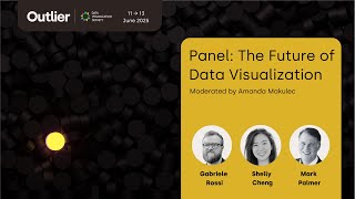
The Future of Data Visualization—Panel Outlier 2025

The Future of Data Visualization—Panel Outlier 2025

🌟Outlier is a one-of-a-kind data visualization conference hosted by the Data Visualization Society. Outlier brings together all corners of the data visualization community, from artists to business intelligence developers, working in various tech stacks and media. Attendees stretch their creativity and learn from practitioners who they may not otherwise connect with. Learn more on the Outlier website: https://www.outlierconf.com/


📈About the Data Visualization Society: The Data Visualization Society was founded to serve as a professional home for those working across the discipline. Our mission is to connect data visualizers across tech stacks, subject areas, and experience. Advance your skills and grow your network by joining our community: https://www.datavisualizationsociety.org/

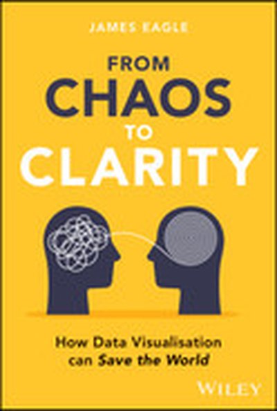
From Chaos to Clarity

A radical wake up call for world overloaded with data and how data visualisation could be the answer In From Chaos to Clarity: How Data Visualisation Can Save the World, celebrated data visualisation creator James Eagle reveals how our data-saturated age harbours hidden dangers that places humanity in peril. He looks at how masterful visual storytelling might be our salvation. Through vivid examples and profound insights, James Eagle exposes the data pollution clouding modern life, whilst demonstrating how thoughtful, human-centred data visuals can cut through the noise, sharpen our collective understanding and light the path toward a more discerning future. Inside the book: How to unlock the human side of data visualisation by using empathy and storytelling Understanding our brain's deep connection to pictures and stories, and why this matters in this digital age Ways data visualisation can restore our human understanding of this world and tackle misinformation This is a must-read urgent message on how data visualisation is needed to confront data overload and misuse. From Chaos to Clarity is perfect for professionals in finance, engineering, science, mathematics and health, as well as journalists, writers, data scientists, and anyone interested in visual storytelling, reclaiming truth and sharpening our collective thinking to tackling some of the biggest challenges we face in this world.

Matplotlib is already a favorite plotting library for creating static data visualizations in Python. Here, we discuss the development of a new DataContainer interface and accompanying transformation pipeline which enable easier dynamic data visualization in Matplotlib. This improves the experience of plotting pure functions, automatically recomputing when you pan and zoom. Data containers can ingest data from a variety of sources, including structured data such as Pandas Dataframes or Xarrays, up to live updating data from web services or databases. The flexible transformation pipeline allows for control over how your data is encoded into a plot.

Once we constrain ourselves to a rectangle of fixed-width characters (preferably white on a black background), we start to see the world a bit differently. If we want to thoroughly investigate it (a.k.a. perform data analysis), we have to be equipped with appropriate tools - be it techniques, libraries or standalone console-based applications. Let's see what the terminal has to offer when reading, manipulating, presenting and even plotting numerical data. We might even finish with a live dashboard your audience will love (or perhaps will not).

The rapid expansion of the geospatial industry and accompanying increase in availability of geospatial data, presents unique opportunities and challenges in data science. As the need for skilled data scientists increases, the ability to manipulate and interpret this data becomes crucial. This workshop introduces the essentials of geospatial data manipulation and data visualisation, emphasizing hands-on techniques to transform, analyze and visualise diverse datasets effectively.

Throughout the workshop, attendees will explore the extensive ecosystem of geospatial Python libraries. Key tools include GeoPandas, Shapely and Cartopy for vector data, GDAL, Rasterio and rioxarray for raster data and participants will also learn to integrate these with popular plotting libraries such as Matplotlib, Bokeh, and Plotly for visualizations.

This tutorial will cover three primary topics: visualizing geospatial shapes, managing raster datasets, and synthesizing multiple data types into unified visual representations. Each section will incorporate data manipulation exercises to ensure attendees not only visualize but also deeply understand geospatial data.

Targeting both beginners and advanced practitioners, the workshop will employ real-world examples to guide participants through the necessary steps to produce striking and informative geospatial visualizations. By the end, attendees will be equipped with the knowledge to leverage advanced data science techniques in their geospatial projects, making them proficient in both the analysis and communication of spatial information.

TL;DR Learn how to turn your Python functions into interactive web applications using open-source tools. By the end, each of us will have deployed a portfolio (or store) with multiple web applications and learned how to reproduce it easily later on.

Tell me more Work not shown is work lost. Many excellent scientists and engineers are not always adept at showcasing their work. This results in many interesting scientific ideas that have never been brought to light.

However, using today's tools, one no longer has to leave the Python ecosystem to create classy, complete prototypes using modern data visualization and web development tools. With over five years of experience building and presenting data solutions at huge science companies, we show it doesn't have to be challenging. We provide a walkthrough of the primary web application frameworks and showcase Fast Dash, an open-source Python library that we built to address specific prototyping needs.

This tutorial is designed for all data professionals who value the ability to quickly convert their scientific code into web applications. Participants will learn about the leading frameworks, their strengths and limitations, and a decision flowchart for picking the best one for a given task. We will go through some day-to-day applications and hands-on Python coding throughout the session. Whether you bring your use-cases and datasets, or pick from our suggestions, you'll have a reproducible portfolio (app store) of deployed web applications by the end!

This tutorial will explore GPU-accelerated clustering techniques using RAPIDS cuML, optimizing algorithms like K-Means, DBSCAN, and HDBSCAN for large datasets. Traditional clustering methods struggle with scalability, but GPU acceleration significantly enhances performance and efficiency.

Participants will learn to leverage dimensionality reduction techniques (PCA, T-SNE, UMAP) for better data visualization and apply hyperparameter tuning with Optuna and cuML. The session also includes real-world applications like topic modeling in NLP and customer segmentation. By the end, attendees will be equipped to implement, optimize, and scale clustering algorithms effectively, unlocking faster and more powerful insights in machine learning workflows.

This tutorial is an introduction to data visualization using the popular Vega-Altair Python library. Vega-Altair provides a simple and expressive API, enabling authors to rapidly create a wide range of interactive charts.

Participants will explore the fundamentals of effective chart design and gain hands-on experience building a variety of visualizations using Vega-Altair's declarative API. Furthermore, this tutorial will introduce users to advanced topics such as data transformations and interaction design. We will finish off by covering practical workflows such as integrating Vega-Altair into dashboarding systems, publishing visualizations, and creating reusable, themed charting libraries. By the end of the session, attendees will have the skills to leverage Vega-Altair for both rapid prototyping and production-ready visualizations in diverse environments

podcast_episode
by Rose Weeks (Johns Hopkins Bloomberg School of Public Health) , Heather Bree (GovEx) , Debi Denney (Johns Hopkins Office of Climate & Sustainability) , Sara Betran de Lis (GovEx)

--- According to the U.S. Environmental Protection Agency, transportation accounts for 28% of U.S. greenhouse gas emissions. For short trips, flying is much more carbon-intensive than rail or bus travel. At Johns Hopkins, faculty members travel the most of all affiliate types, producing more than double the emissions of administrative employees and staff.

--- The Johns Hopkins University Office of Climate and Sustainability, through its Campus as a Living Lab initiative - a program that supports sustainability innovation - partnered with GovEx to build a tool to help address this problem. Using interactive visualizations with comparable statistics across all Johns Hopkins divisions, users can compare the emissions data of different methods of transportation, enabling them to make more environmentally-friendly choices as they conduct their business.

--- We sit down with four contributors to the project to discuss how the tool was built and how cities can use it as a model to support their own climate change initiatives: Sara Betran de Lis, Director of Research and Analytics at GovEx; Heather Bree, Data Visualization and D3 Developer at GovEx; Debi Denney, Assistant Director of Johns Hopkins Office of Climate & Sustainability; and Rose Weeks, Senior Research Associate at Johns Hopkins Bloomberg School of Public Health, working with the Campus as a Living Lab Program at the Office of Climate & Sustainability.

--- Learn more about GovEx --- Fill out our listener survey!

Curious how code truly flows inside Airflow? Join me for a unique visualisation journey into Airflow’s inner workings (first of its kind) — code blocks and modules called when certain operations are running. A walkthrough that unveils task execution, observability, and debugging like never before. Scaling of Airflow in action, showing performance comparison b/w Airflow 3 vs 2. This session will demystify Airflow’s architecture, showcasing real-time task flows and the heartbeat of pipelines in action. Perfect for engineers looking to optimize workflows, troubleshoot efficiently, and gain a new perspective on Airflow’s powerful upgraded core. See Airflow running live with detailed insights and unlock the secrets to better pipeline management!

Join this meetup to share experiences and challenges in data visualization and storytelling. Connect with peers to explore techniques for turning complex data into compelling narratives for diverse audiences. Discuss best practices for creating visualizations that enhance understanding and drive action. Exchange insights on tools and methodologies for dynamic data stories. Peer Meetups are networking sessions for connecting and sharing with a small group without Gartner facilitation. Your attendance is valued by fellow attendees.

Build AI-Powered Applications Natively on Databricks

Discover how to build and deploy AI-powered applications natively on the Databricks Data Intelligence Platform. This session introduces best practices and a standard reference architecture for developing production-ready apps using popular frameworks like Dash, Shiny, Gradio, Streamlit and Flask. Learn how to leverage agents for orchestration and explore primary use cases supported by Databricks Apps, including data visualization, AI applications, self-service analytics and data quality monitoring. With serverless deployment and built-in governance through Unity Catalog, Databricks Apps enables seamless integration with your data and AI models, allowing you to focus on delivering impactful solutions without the complexities of infrastructure management. Whether you're a data engineer or an app developer, this session will equip you with the knowledge to create secure, scalable and efficient applications within a Databricks environment.

Transforming HP’s Print ELT Reporting with GenIT: Real-Time Insights Tool Powered by Databricks AI

Timely and actionable insights are critical for staying competitive in today’s fast-paced environment. At HP Print, manual reporting for executive leadership (ELT) has been labor-intensive, hindering agility and productivity. To address this, we developed the Generative Insights Tool (GenIT) using Databricks Genie and Mosaic AI to create a real-time insights engine automating SQL generation, data visualization, and narrative creation. GenIT delivers instant insights, enabling faster decisions, greater productivity, and improved consistency while empowering leaders to respond to printer trends. With automated querying, AI-powered narratives, and a chatbot, GenIT reduces inefficiencies and ensures quality data and insights. Our roadmap integrates multi-modal data, enhances chatbot functionality, and scales globally. This initiative shows how HP Print leverages GenAI to improve decision-making, efficiency, and agility, and we will showcase this transformation at the Databricks AI Summit.

Today, I’m responding to a listener's question about what it takes to succeed as a data or AI product manager, especially if you’re coming from roles like design/BI/data visualization, data science/engineering, or traditional software product management. This reader correctly observed that most of my content “seems more targeted at senior leadership” — and had asked if I could address this more IC-oriented topic on the show. I’ll break down why technical chops alone aren’t enough, and how user-centered thinking, business impact, and outcome-focused mindsets are key to real success — and where each of these prior roles brings strengths and/or weaknesses. I’ll also get into the evolving nature of PM roles in the age of AI, and what I think the super-powered AI product manager will look like.

Highlights/ Skip to:

Who can transition into an AI and data product management role? What does it take? (5:29) Software product managers moving into  AI product management (10:05) Designers moving into data/AI product management (13:32) Moving into the AI PM role from the engineering side (21:47) Why the challenge of user adoption and trust is often the blocker to the business value (29:56) Designing change management into AI/data products as a skill (31:26) The challenge of value creation vs. delivery work — and how incentives are aligned for ICs  (35:17) Quantifying the financial value of data and AI product work(40:23)

Quotes from Today’s Episode

“Who can transition into this type of role, and what is this role? I’m combining these two things. AI product management often seems closely tied to software companies that are primarily leveraging AI, or trying to, and therefore, they tend to utilize this AI product management role. I’m seeing less of that in internal data teams, where you tend to see data product management more, which, for me, feels like an umbrella term that may include traditional analytics work, data platforms, and often AI and machine learning. I’m going to frame this more in the AI space, primarily because I think AI tends to capture the end-to-end product than data product management does more frequently.” — Brian (2:55)

“There are three disciplines I’m going to talk about moving into this role. Coming into AI and data PM from design and UX, coming into it from data engineering (or just broadly technical spaces), and then coming into it from software product management. I think software product management and moving into the AI product management - as long as you’re not someone that has two years of experience, and then 18 years of repeating the second year of experience over and over again - and you’ve had a robust product management background across some different types of products; you can show that the domain doesn’t necessarily stop you from producing value. I think you will have the easiest time moving into AI product management because you’ve shown that you can adapt across different industries.” - Brian (9:45)

“Let’s talk about designers next. I’m going to include data visualization, user experience research, user experience design, product design, all those types of broad design, category roles. Moving into data and/or AI product management, first of all, you don’t see too many—I don’t hear about too many designers wanting to move into DPM roles, because oftentimes I don’t think there’s a lot of heavy UI and UX all the time in that space. Or at least the teams that are doing that work feel that’s somebody else’s job because they’re not doing end-to-end product thinking the way I talk about it, so therefore, a lot of times they don’t see the application, the user experience, the human adoption, the change management, they’re just not looking at the world that way, even though I think they should be.” - Brian (13:32)

“Coming at this from the data and engineering side, this is the classic track for data product management. At least that is the way I tend to see it. I believe most companies prefer to develop this role in-house. My biggest concern is that you end up with job title changes, but not necessarily the benefits that are supposed to come with this. I do like learning by doing, but having a coach and someone senior who can coach your other PMs is important because there’s a lot of information that you won’t necessarily get in a class or a course. It’s going to come from experience doing the work.” - Brian (22:26)

“This value piece is the most important thing, and I want to focus on that. This is something I frequently discuss in my training seminar: how do we attach financial value to the work we’re doing? This is both art and science, but it’s a language that anyone in a product management role needs to be comfortable with. If you’re finding it very hard to figure out how your data product contributes financial value because it’s based on this waterfalling of “We own the model, and it’s deployed on a platform.” The platform then powers these other things, which in turn power an application. How do we determine the value of our tool? These things are challenging, and if it’s challenging for you, guess how hard it will be for stakeholders downstream if you haven’t had the practice and the skills required to understand how to estimate value, both before we build something as well as after?” - Brian (31:51)

“If you don’t want to spend your time getting to know how your business makes money or creates value, then [AI and data product management work] is not for you. It’s just not. I would stay doing what you’re doing already or find a different thing because a lot of your time is going to be spent “managing up” for half the time, and then managing the product stuff “down.” Then, sitting in this middle layer, trying to explain to the business what’s going to come out and what the impact is going to be, in language that they care about and understand. You can't be talking about models, model accuracy, data pipelines, and all that stuff. They’re not going to care about any of that. - Brian (34:08)
Data Warehousing with Databricks

This course is designed for data professionals who want to explore the data warehousing capabilities of Databricks. Assuming no prior knowledge of Databricks, it provides an introduction to leveraging Databricks as a modern cloud-based data warehousing solution. Learners will explore how use the Databricks Data Intelligence Platform to ingest, transform, govern, and analyze data efficiently. Learners will also explore Genie, an innovative Databricks feature that simplifies data exploration through natural language queries. By the end of this course, participants will be equipped with the foundational skills to implement and optimize a data warehouse using Databricks. Pre-requisites: Basic understanding of SQL and data querying concepts General knowledge of data warehousing concepts, including tables, schemas, and ETL/ELT processes is recommended Some experience with BI and/or data visualization tools is helpful but not required Labs: Yes

In this course, you’ll learn the fundamentals of preparing data for machine learning using Databricks. We’ll cover topics like exploring, cleaning, and organizing data tailored for traditional machine learning applications. We’ll also cover data visualization, feature engineering, and optimal feature storage strategies. By building a strong foundation in data preparation, this course equips you with the essential skills to create high-quality datasets that can power accurate and reliable machine learning and AI models. Whether you're developing predictive models or enabling downstream AI applications, these capabilities are critical for delivering impactful, data-driven solutions. Pre-requisites: Familiarity with Databricks workspace, notebooks, as well as Unity Catalog. An intermediate level knowledge of Python (scikit-learn, Matplotlib), Pandas, and PySpark. As well as with concepts of exploratory data analysis, feature engineering, standardization, and imputation methods). Labs: Yes Certification Path: Databricks Certified Machine Learning Associate

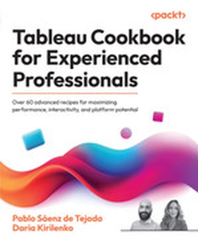
Tableau Cookbook for Experienced Professionals

This book takes an advanced dive into using Tableau for professional data visualization and analytics. You will learn techniques for crafting highly interactive dashboards, optimizing their performance, and leveraging Tableau's APIs and server features. With a focus on real-world applications, this resource serves as a guide for professionals aiming to master advanced Tableau skills. What this Book will help me do Build robust, high-performing Tableau data models for enterprise analytics. Use advanced geospatial techniques to create dynamic, data-rich mapping visualizations. Leverage APIs and developer tools to integrate Tableau with other platforms. Optimize Tableau dashboards for performance and interactivity. Apply best practices for content management and data security in Tableau implementations. Author(s) Pablo Sáenz de Tejada and Daria Kirilenko are seasoned Tableau experts with vast professional experience in implementing advanced analytics solutions. Pablo specializes in enterprise-level dashboard design and has trained numerous professionals globally. Daria focuses on integrating Tableau into complex data ecosystems, bringing a practical and innovative approach to analytics. Who is it for? This book is tailored for professionals such as Tableau developers, data analysts, and BI consultants who already have a foundational knowledge of Tableau. It is ideal for those seeking to deepen their skills and gain expertise in tackling advanced data visualization challenges. Whether you work in corporate analytics or enjoy exploring data in your own projects, this book will enhance your Tableau proficiency.

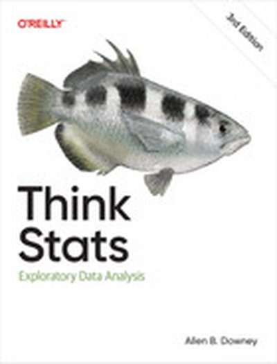
Think Stats, 3rd Edition

If you know how to program, you have the skills to turn data into knowledge. This thoroughly revised edition presents statistical concepts computationally, rather than mathematically, using programs written in Python. Through practical examples and exercises based on real-world datasets, you'll learn the entire process of exploratory data analysis—from wrangling data and generating statistics to identifying patterns and testing hypotheses. Whether you're a data scientist, software engineer, or data enthusiast, you'll get up to speed on commonly used tools including NumPy, SciPy, and Pandas. You'll explore distributions, relationships between variables, visualization, and many other concepts. And all chapters are available as Jupyter notebooks, so you can read the text, run the code, and work on exercises all in one place. Analyze data distributions and visualize patterns using Python libraries Improve predictions and insights with regression models Dive into specialized topics like time series analysis and survival analysis Integrate statistical techniques and tools for validation, inference, and more Communicate findings with effective data visualization Troubleshoot common data analysis challenges Boost reproducibility and collaboration in data analysis projects with interactive notebooks

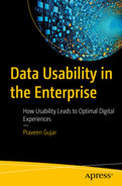
Data Usability in the Enterprise: How Usability Leads to Optimal Digital Experiences

Ensuring data usability is paramount to unlocking a company’s full potential and driving informed decision-making. Part of author Saurav Bhattacharya’s trilogy that covers the essential pillars of digital ecosystems—security, reliability, and usability—this book offers a comprehensive exploration of the fundamental concepts, principles, and practices essential for enhancing data accessibility and effectiveness. You’ll study the core aspects of data design, standardization, and interoperability, gaining the knowledge needed to create and maintain high-quality data environments. By examining the tools and technologies that improve data usability, along with best practices for data visualization and user-centric strategies, this book serves as an invaluable resource for professionals seeking to leverage data more effectively. The book also addresses crucial governance issues, ensuring data quality, integrity, and security are maintained. Through a detailed analysis of data governance frameworks and privacy concerns, you’ll see how to manage data responsibly. Additionally, the book includes compelling case studies that highlight successful data usability implementations, future trends, and the challenges faced in achieving optimal data usability. By fostering a culture of data literacy and usability, this book will help you and your organization navigate the evolving data landscape and harness the power of data for innovation and growth. What You Will Learn Understand the fundamental concepts and importance of data usability, including effective data design, enhancing data accessibility, and ensuring data standardization and interoperability. Review the latest tools and technologies that enhance data usability, best practices for data visualization, and strategies for implementing user-centric data approaches. Ensure data quality and integrity, while navigating data privacy and security concerns. Implement robust data governance frameworks to manage data responsibly and effectively. Who This Book Is For Cybersecurity and IT professionals