talk-data.com talk-data.com

Topic

Dashboard

data_visualization reporting bi

306

tagged

Activity Trend

23 peak/qtr
2020-Q1 2026-Q1

Activities

306 activities · Newest first

Beyond Monitoring: The Rise of Data Observability

"Why did our dashboard break?" "What happened to my data?" "Why is this column missing?" If you've been on the receiving end of these messages (and many others!) from downstream stakeholders, you're not alone. Data engineering teams spend 40 percent or more of their time tackling data downtime, or periods of time when data is missing, erroneous, or otherwise inaccurate, and as data systems become increasingly complex and distributed, this number will only increase. To address this problem, data observability is becoming an increasingly important part of the cloud data stack, helping engineers and analysts reduce time to detection and resolution for data incidents caused by faulty data, code, and operational environments. But what does data observability actually look like in practice? During this presentation, Barr Moses, CEO and co-founder of Monte Carlo, will present on how some of today's best data leaders implement observability across their data lake ecosystem and share best practices for data teams seeking to achieve end-to-end visibility into their data at scale. Topics addressed will include: building automated lineage for Apache Spark, applying data reliability workflows, and extending beyond testing and monitoring to solve for unknown unknowns in your data pipelines.

Connect with us: Website: https://databricks.com Facebook: https://www.facebook.com/databricksinc Twitter: https://twitter.com/databricks LinkedIn: https://www.linkedin.com/company/data... Instagram: https://www.instagram.com/databricksinc/

Predicting Repeat Admissions to Substance Abuse Treatment with Machine Learning

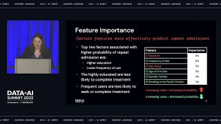
In our presentation, we will walk through a model created to predict repeat admissions to substance abuse treatment centers. The goal is to predict early who will be at high risk for relapse so care can be tailored to put additional focus on these patients. We used the Treatment Episode Data Set (TEDS) Admissions data set, which includes every publicly funded substance abuse treatment admission in the US.

While longitudinal data is not available in the data set, we were able to predict with 88% accuracy and an f-score of 0.85 which admissions were first or repeat admissions. Our solution used a scikit-learn Random Forest model and leveraged MLFlow to track model metrics to choose the most effective model. Our pipeline tested over 100 models of different types ranging from Gradient Boosted Trees to Deep Neural Networks in Tensorflow.

To improve model interpretability, we used Shapley values to measure which variables were most important for predicting readmission. These model metrics along with other valuable data are visualized in an interactive Power BI dashboard designed to help practitioners understand who to focus on during treatment. We are in discussions with companies and researchers who may be able to leverage this model in substance abuse treatment centers in the field.

Connect with us: Website: https://databricks.com Facebook: https://www.facebook.com/databricksinc Twitter: https://twitter.com/databricks LinkedIn: https://www.linkedin.com/company/data... Instagram: https://www.instagram.com/databricksinc/

Turbocharge your AI/ML Databricks workflows with Precisely

Trusted analytics and predictive data models require accurate, consistent, and contextual data. The more attributes used to fuel models, the more accurate their results. However, building comprehensive models with trusted data is not easy. Accessing data from multiple disparate sources, making spatial data consumable, and enriching models with reliable third-party data is challenging.

In response to these challenges, Precisely has developed tools to facilitate a location-enabled lakehouse on the Databricks platform, helping users get more out of their data. Come see live demos and learn how to build your own location-enabled lakehouse by:

• Organizing and managing address data and assigning a unique and persistent identifier • Enriching addresses with standard and dynamic attributes from our curated data portfolio • Analyzing enriched data to uncover relationships and create dashboard visualizations • Understanding high-level solution architecture

Connect with us: Website: https://databricks.com Facebook: https://www.facebook.com/databricksinc Twitter: https://twitter.com/databricks LinkedIn: https://www.linkedin.com/company/data... Instagram: https://www.instagram.com/databricksinc/

Discover Data Lakehouse With End-to-End Lineage

Data Lineage is key for managing change, ensuring data quality and implementing Data Governance in an organization. There are a few use cases for Data Lineage: Data Governance: For compliance and regulatory purposes our customers are required to prove the data/reports they are submitting came from a trusted and verified source.

This typically means identifying the tables and data sets used in a report or dashboard and tracing the source of these tables and fields. Another use case for the Governance scenario is to understand the spread of sensitive data within the lakehouse. Data Discovery: Data analysts looking to self-serve and build their own analytics and models typically spend time exploring and understanding the data in their lakehouse.

Lineage is a key piece of information which enhances the understanding and trustworthiness of the data the analyst plans to use. Problem Identification: Data teams are often called to solve errors in analysts dashboards and reports (“Why is the total number of widgets different in this report than the one I have built?”). This usually leads to an expensive forensic exercise by the DE team to understand the sources of data and the transformations applied to it before it hits the report. Change Management : It is not uncommon for data sources to change, a new source may stop delivering data or a field in the source system changes its semantics.

In this scenario the DE team would like to understand the downstream impact of this change - to get a sense of how many datasets and users will be affected by this change. This will help them determine the impact of the change, manage user expectations and address issues ahead of time In this talk, we will talk about how we capture table and column lineage for spark / delta and unity catalog for our customers in details and how users could leverage data lineage to serve various use cases mentioned above.

Connect with us: Website: https://databricks.com Facebook: https://www.facebook.com/databricksinc Twitter: https://twitter.com/databricks LinkedIn: https://www.linkedin.com/company/data... Instagram: https://www.instagram.com/databricksinc/

Pro Power BI Dashboard Creation: Building Elegant and Interactive Dashboards with Visually Arresting Analytics

Produce high-quality, visually attractive analysis quickly and effectively with Microsoft’s key BI tool. This book teaches analysts, managers, power users, and developers how to harness the power of Microsoft’s self-service business intelligence flagship product to deliver compelling and interactive insight with remarkable ease. It then shows you the essential techniques needed to go from source data to dashboards that seize your audience’s attention and provide them with clear and accurate information. As well as producing elegant and visually arresting output, you learn how to enhance the user experience through adding polished interactivity. This book shows you how to make interactive dashboards that allow you to guide users through the meaning of the data that they are exploring. Drill down features are also covered that allow you and your audience to dig deeper and uncover new insights by exploring anomalous and interesting data points. Reading this book builds your skills around creating meaningful and elegant dashboards using a range of compelling visuals. It shows you how to apply simple techniques to convert data into business insight. The book covers tablet and smartphone layouts for delivering business value in today’s highly mobile world. You’ll learn about formatting for effect to make your data tell its story, and you’ll be a master at creating visually arresting output on multiple devices that grabs attention, builds influence, and drives change. What You Will Learn Produce designer output that will astound your bosses and peers Make new insights as you chop and tweak your data as never before Create high-quality analyses in record time Create interdependent charts, maps, and tables Deliver visually stunning information Drill down through data to provide unique understandings Outshinecompeting products and enhance existing skills Adapt your dashboard delivery to mobile devices Who This Book Is For For any Power BI user who wants to strengthen their ability to deliver compelling analytics via Microsoft’s widely adopted analytics platform. For those new to Power BI who want to learn the full extent of what the platform is capable of. For power users such as BI analysts, data architects, IT managers, accountants, and C-suite members who want to drive change in their organizations.

Send us a text Part 1 : David Collins, Chief Revenue Officer of Diwo, enters the building.  We go a bit deep to learn about Decision Intelligence this week.  Enjoy.   Show Notes 03:28 Meet David Collins.  Who is this dude? 07:46 Why Diwo? 09:53 Decision Intelligence is NOT Data Science 14:44 Skip the dashboard 17:23 The pursuit of data perfection? 19:24 Contextual intelligence 23:12 Where does Diwo start? 27:09 A use case example 29:05 Are historical data trends meaningless? Find David : https://www.linkedin.com/in/dacollin/ Website : https://diwo.ai/ Want to be featured as a guest on Making Data Simple?  Reach out to us at [email protected] and tell us why you should be next.  The Making Data Simple Podcast is hosted by Al Martin, WW VP Technical Sales, IBM, where we explore trending technologies, business innovation, and leadership ... while keeping it simple & fun.  Want to be featured as a guest on Making Data Simple? Reach out to us at [email protected] and tell us why you should be next. The Making Data Simple Podcast is hosted by Al Martin, WW VP Technical Sales, IBM, where we explore trending technologies, business innovation, and leadership ... while keeping it simple & fun.

AI-Powered Business Intelligence

Use business intelligence to power corporate growth, increase efficiency, and improve corporate decision making. With this practical book featuring hands-on examples in Power BI with basic Python and R code, you'll explore the most relevant AI use cases for BI, including improved forecasting, automated classification, and AI-powered recommendations. And you'll learn how to draw insights from unstructured data sources like text, document, and image files. Author Tobias Zwingmann helps BI professionals, business analysts, and data analytics understand high-impact areas of artificial intelligence. You'll learn how to leverage popular AI-as-a-service and AutoML platforms to ship enterprise-grade proofs of concept without the help of software engineers or data scientists. Learn how AI can generate business impact in BI environments Use AutoML for automated classification and improved forecasting Implement recommendation services to support decision-making Draw insights from text data at scale with NLP services Extract information from documents and images with computer vision services Build interactive user frontends for AI-powered dashboard prototypes Implement an end-to-end case study for building an AI-powered customer analytics dashboard

Dashboards are at the forefront of today’s episode, and so I will be responding to some reader questions who wrote in to one of my weekly mailing list missives about this topic. I’ve not talked much about dashboards despite their frequent appearance in data product UIs, and in this episode, I’ll explain why. Here are some of the key points and the original questions asked in this episode:

My introduction to dashboards (00:00) Some overall thoughts on dashboards (02:50) What the risk is to the user if the insights are wrong or misinterpreted (4:56) Your data outputs create an experience, whether intentional or not (07:13) John asks: How do we figure out exactly what the jobs are that the dashboard user is trying to do? Are they building next year's budget or looking for broken widgets?  What does this user value today? Is a low resource utilization percentage something to be celebrated or avoided for this dashboard user today?  (13:05) Value is not intrinsically in the dashboard (18:47) Mareike asks: How do we provide Information in a way that people are able to act upon the presented Information?  How do we translate the presented Information into action? What can we learn about user expectation management when designing dashboard/analytics solutions? (22:00) The change towards predictive and prescriptive analytics (24:30) The upfront work that needs to get done before the technology is in front of the user (30:20) James asks: How can we get people to focus less on the assumption-laden and often restrictive term "dashboard", and instead worry about designing solutions focused on outcomes for particular personas and workflows that happen to have some or all of the typical ingredients associated with the catch-all term "dashboards?” (33:30) Stop measuring the creation of outputs and focus on the user workflows and the jobs to be done (37:00) The data product manager shouldn’t just be focused on deliverables (42:28)

Quotes from Today’s Episode “The term dashboards is almost meaningless today, it seems to mean almost any home default screen in a data product. It also can just mean a report. For others, it means an entire monitoring tool, for some, it means the summary of a bunch of data that lives in some other reports. The terms are all over the place.”- Brian (@rhythmspice) (01:36)

“The big idea here that I really want leaders to be thinking about here is you need to get your teams focused on workflows—sometimes called jobs to be done—and the downstream decisions that users want to make with machine-learning or analytical insights. ” - Brian (@rhythmspice) (06:12)

“This idea of human-centered design and user experience is really about trying to fit the technology into their world, from their perspective as opposed to building something in isolation where we then try to get them to adopt our thing.  This may be out of phase with the way people like to do their work and may lead to a much higher barrier to adoption.” - Brian (@rhythmspice) (14:30)

“Leaders who want their data science and analytics efforts to show value really need to understand that value is not intrinsically in the dashboard or the model or the engineering or the analysis.” - Brian (@rhythmspice) (18:45)

“There's a whole bunch of plumbing that needs to be done, and it’s really difficult. The tool that we end up generating in those situations tends to be a tool that’s modeled around the data and not modeled around [the customers] mental model of this space, the customer purchase space, the marketing spend space, the sales conversion, or propensity-to-buy space.” - Brian (@rhythmspice) (27:48)

“Data product managers should be these problem owners, if there has to be a single entity for this. When we’re talking about different initiatives in the enterprise or for a commercial software company, it’s really sits at this product management function.”  - Brian (@rhythmspice) (34:42)

“It’s really important that [data product managers] are not just focused on deliverables; they need to really be the ones that summarize the problem space for the entire team, and help define a strategy with the entire team that clarifies the direction the team is going in. They are not a project manager; they are someone responsible for delivering value.” - Brian (@rhythmspice) (42:23)

Links Referenced:

Mailing List: https://designingforanalytics.com/list CED UX Framework for Advanced Analytics:Original Article: https://designingforanalytics.com/ced Podcast/Audio Episode: https://designingforanalytics.com/resources/episodes/086-ced-my-ux-framework-for-designing-analytics-tools-that-drive-decision-making/ 

My LinkedIn Live about Measuring the Usability of Data Products: https://www.linkedin.com/video/event/urn:li:ugcPost:6911800738209800192/ Work With Me / My Services: https://designingforanalytics.com/services

Mike Oren, Head of Design Research at Klaviyo, joins today’s episode to discuss how we do UX research for data products—and why qualitative research matters. Mike and I recently met in Lou Rosenfeld’s Quant vs. Qual group, which is for people interested in both qualitative and quantitative methods for conducting user research. Mike goes into the details on how Klaviyo and his teams are identifying what customers need through research, how they use data to get to that point, what data scientists and non-UX professionals need to know about conducting UX research, and some tips for getting started quickly. He also explains how Klaviyo’s data scientists—not just the UX team—are directly involved in talking to users to develop an understanding of their problem space.

Klaviyo is a communications platform that allows customers to personalize email and text messages powered by data. In this episode, Mike talks about how to ask research questions to get at what customers actually need. Mikes also offers some excellent “getting started” techniques for conducting interviews (qualitative research), the kinds of things to be aware of and avoid when interviewing users, and some examples of the types of findings you might learn. He also gives us some examples of how these research insights become features or solutions in the product, and how they interpret whether their design choices are actually useful and usable once a customer interacts with them. I really enjoyed Mike’s take on designing data-driven solutions, his ideas on data literacy (for both designers, and users), and hearing about the types of dinner conversations he has with his wife who is an economist ;-) . Check out our conversation for Mike’s take on the relevance of research for data products and user experience. 

In this episode, we cover:

Using “small data” such as qualitative user feedback  to improve UX and data products—and the #1 way qualitative data beats quantitative data  (01:45) Mike explains what Klaviyo is, and gives an example of how they use qualitative information to inform the design of this communications product  (03:38) Mike discusses Klaviyo data scientists doing research and their methods for conducting research with their customers (09:45) Mike’s tips on what to avoid when you’re conducting research so you get objective, useful feedback on your data product  (12:45) Why dashboards are Mike’s pet peeve (17:45) Mike’s thoughts about data illiteracy, how much design needs to accommodate it, and how design can help with it (22:36) How Mike conveys the research to other teams that help mitigate risk  (32:00) Life with an economist! (36:00) What the UX and design community needs to know about data (38:30)

Quotes from Today’s Episode “I actually tell my team never to do any qualitative research around preferences…Preferences are usually something that you’re not going to get a reliable enough sample from if you’re just getting it qualitatively, just because preferences do tend to vary a lot from individual to individual; there’s lots of other factors. ”- Mike (@mikeoren) (03:05)

“[Discussing a product design choice influenced by research findings]: Three options gave [the customers a] feeling of more control. In terms of what actual options they wanted, two options was really the most practical, but the thing was that we weren’t really answering the main question that they had, which was what was going to happen with their data if they restarted the test with a new algorithm that was being used. That was something that we wouldn’t have been able to identify if we were only looking at the quantitative data if we were only serving them; we had to get them to voice through their concerns about it.” - Mike (@mikeoren) (07:00)

“When people create dashboards, they stick everything on there. If a stakeholder within the organization asked for a piece of data, that goes on the dashboard. If one time a piece of information was needed with other pieces of information that are already on the dashboard, that now gets added to the dashboard. And so you end up with dashboards that just have all these different things on them…you no longer have a clear line of signal.” - Mike (@mikeoren) (17:50)

“Part of the experience we need to talk about when we talk about experiencing data is that the experience can happen in more additional vehicles besides a dashboard: A text message, an email notification, there’s other ways to experience the effects of good, intelligent data product work. Pushing the right information at the right time instead of all the information all the time.” - Brian (@rhythmspice) (20:00)

“[Data illiteracy is] everyone’s problem. Depending upon what type of data we’re talking about, and what that product is doing, if an organization is truly trying to make data-driven decisions, but then they haven’t trained their leaders to understand the data in the right way, then they’re not actually making data-driven decisions; they’re really making instinctual decisions, or they’re pretending that they’re using the data.” - Mike (@mikeoren)(23:50)

“Sometimes statistical significance doesn’t matter to your end-users. More often than not organizations aren’t looking for 95% significance. Usually, 80% is actually good enough for most business decisions. Depending upon the cost of getting a high level of confidence, they might not even really value that additional 15% significance.” - Mike (@mikeoren) (31:06)

“In order to effectively make software easier for people to use, to make it useful to people, [designers have] to learn a minimum amount about that medium in order to start crafting those different pieces of the experience that we’re preparing to provide value to people. We’re running into the same thing with data applications where it’s not enough to just know that numbers exist and those are a thing, or to know some graphic primitives of line charts, bar charts, et cetera. As a designer, we have to understand that medium well enough that we can have a conversation with our partners on the data science team.” - Mike (@mikeoren) (39:30)

Data Science on the Google Cloud Platform, 2nd Edition

Learn how easy it is to apply sophisticated statistical and machine learning methods to real-world problems when you build using Google Cloud Platform (GCP). This hands-on guide shows data engineers and data scientists how to implement an end-to-end data pipeline with cloud native tools on GCP. Throughout this updated second edition, you'll work through a sample business decision by employing a variety of data science approaches. Follow along by building a data pipeline in your own project on GCP, and discover how to solve data science problems in a transformative and more collaborative way. You'll learn how to: Employ best practices in building highly scalable data and ML pipelines on Google Cloud Automate and schedule data ingest using Cloud Run Create and populate a dashboard in Data Studio Build a real-time analytics pipeline using Pub/Sub, Dataflow, and BigQuery Conduct interactive data exploration with BigQuery Create a Bayesian model with Spark on Cloud Dataproc Forecast time series and do anomaly detection with BigQuery ML Aggregate within time windows with Dataflow Train explainable machine learning models with Vertex AI Operationalize ML with Vertex AI Pipelines

For Danielle Crop, the Chief Data Officer of Albertsons, to draw distinctions between “digital” and “data” only limits the ability of an organization to create useful products. One of the reasons I asked Danielle on the show is due to her background as a CDO and former SVP of digital at AMEX, where she also managed  product and design groups. My theory is that data leaders who have been exposed to the worlds of software product and UX design are prone to approach their data product work differently, and so that’s what we dug into this episode.   It didn’t take long for Danielle to share how she pushes her data science team to collaborate with business product managers for a “cross-functional, collaborative” end result. This also means getting the team to understand what their models are personalizing, and how customers experience the data products they use. In short, for her, it is about getting the data team to focus on “outcomes” vs “outputs.”

Scaling some of the data science and ML modeling work at Albertsons is a big challenge, and we talked about one of the big use cases she is trying to enable for customers, as well as one “real-life” non-digital experience that her team’s data science efforts are behind.

The big takeaway for me here was hearing how a CDO like Danielle is really putting customer experience and the company’s brand at the center of their data product work, as opposed solely focusing on ML model development, dashboard/BI creation, and seeing data as a raw ingredient that lives in a vacuum isolated from people.  

In this episode, we cover:

Danielle’s take on the “D” in CDO: is the distinction between “digital” and “data” even relevant, especially for a food and drug retailer? (01:25) The role of data product management and design in her org and how UX (i.e. shopper experience) is influenced by and considered in her team’s data science work (06:05) How Danielle’s team thinks about “customers” particularly in the context of internal stakeholders vs. grocery shoppers  (10:20) Danielle’s current and future plans for bringing her data team into stores to better understand shoppers and customers (11:11) How Danielle’s data team works with the digital shopper experience team (12:02)  “Outputs” versus “Outcomes”  for product managers, data science teams, and data products (16:30) Building customer loyalty, in-store personalization, and long term brand interaction with data science at Albertsons (20:40) How Danielle and her team at Albertsons measure the success of their data products (24:04) Finding the problems, building the solutions, and connecting the data to the non-technical side of the company (29:11)

Quotes from Today’s Episode “Data always comes from somewhere, right? It always has a source. And in our modern world, most of that source is some sort of digital software. So, to distinguish your data from its source is not very smart as a data scientist. You need to understand your data very well, where it came from, how it was developed, and software is a massive source of data. [As a CDO], I think it’s not important to distinguish between [data and digital]. It is important to distinguish between roles and responsibilities, you need different skills for these different areas, but to create an artificial silo between them doesn’t make a whole lot of sense to me.”- Danielle  (03:00)

“Product managers need to understand what the customer wants, what the business needs, how to pass that along to data scientists and data scientists, and to understand how that’s affecting business outcomes. That’s how I see this all working. And it depends on what type of models they’re customizing and building, right? Are they building personalization models that are going to be a digital asset? Are they building automation models that will go directly to some sort of operational activity in the store? What are they trying to solve?” - Danielle (06:30)

“In a company that sells products—groceries—to individuals, personalization is a huge opportunity. How do we make that experience, both in-digital and in-store, more relevant to the customer, more sticky and build loyalty with those customers? That’s the core problem, but underneath that is you got to build a lot of models that help personalize that experience. When you start talking about building a lot of different models, you need scale.”  - Danielle (9:24)

“[Customer interaction in the store] is a true big data problem, right, because you need to use the WiFi devices, et cetera. that you have in store that are pinging the devices at all times, and it’s a massive amount of data. Trying to weed through that and find the important signals that help us to actually drive that type of personalized experience is challenging. No one’s gotten there yet. I hope that we’ll be the first.” -  Danielle (19:50)

“I can imagine a checkout clerk who doesn’t want to talk to the customer, despite a data-driven suggestion appearing on the clerk’s monitor as to how to personalize a given customer interaction. The recommendation suggested to the clerk may be ‘accurate from a data science point of view, but if the clerk doesn’t actually act on it, then the data product didn’t provide any value. When I train people in my seminar, I try to get them thinking about that last mile. It may not be data science work, and maybe you have a big enough org where that clerk/customer experience is someone else’s responsibility, but being aware that this is a fault point and having a cross-team perspective is key.” - Brian @rhythmspice (24:50)

“We’re going through a moment in time in which trust in data is shaky. What I’d like people to understand and know on a broader philosophical level, is that in order to be able to understand data and use it to make decisions, you have to know its source. You have to understand its source. You have to understand the incentives around that source of data….you have to look at the data from the perspective of what it means and what the incentives were for creating it, and then analyze it, and then give an output. And fortunately, most statisticians, most data scientists, most people in most fields that I know, are incredibly motivated to be ethical and accurate in the information that they’re putting out.” - Danielle (34:15)
Data is eating the world and every industry is impacted. In most modern businesses, customer and employee activities create a plethora of data points and information that can be analysed and interpreted to make better decisions for the business and its customers. Unfortunately, this sounds a lot easier than it is. Despite the huge mountains of data being created, many organisations struggle to get their business intelligence to serve them in the best way. This is not due to a shortage of reports and dashboard floating around – in many cases there are too many ways to get an answer to the same question.  So, why are so many organisations lacking good BI and what should they do about it? I recently spoke to Jen Stirrup to get an answer to this question and many more relating to producing and consuming business intelligence effectively. Jen is the CEO & Founder of Data Relish, a global AI, Data Science and Business Intelligence Consultancy. She is a leading authority in AI and Business Intelligence Leadership and has been named one of the Top 50 Global Data Visionaries and Top 50 Women in Technology worldwide. In this episode of Leaders of Analytics, you will learn how to avoid data paralysis and discover how to create business intelligence that gives your organisation new superpowers. Jen's website: https://jenstirrup.com/ Jen's LinkedIn profile: https://www.linkedin.com/in/jenstirrup/ Jen on Twitter: https://twitter.com/jenstirrup

Summary Business intelligence is often equated with a collection of dashboards that show various charts and graphs representing data for an organization. What is overlooked in that characterization is the level of complexity and effort that are required to collect and present that information, and the opportunities for providing those insights in other contexts. In this episode Telmo Silva explains how he co-founded ClicData to bring full featured business intelligence and reporting to every organization without having to build and maintain that capability on their own. This is a great conversation about the technical and organizational operations involved in building a comprehensive business intelligence system and the current state of the market.

Announcements

Hello and welcome to the Data Engineering Podcast, the show about modern data management When you’re ready to build your next pipeline, or want to test out the projects you hear about on the show, you’ll need somewhere to deploy it, so check out our friends at Linode. With their managed Kubernetes platform it’s now even easier to deploy and scale your workflows, or try out the latest Helm charts from tools like Pulsar and Pachyderm. With simple pricing, fast networking, object storage, and worldwide data centers, you’ve got everything you need to run a bulletproof data platform. Go to dataengineeringpodcast.com/linode today and get a $100 credit to try out a Kubernetes cluster of your own. And don’t forget to thank them for their continued support of this show! Modern Data teams are dealing with a lot of complexity in their data pipelines and analytical code. Monitoring data quality, tracing incidents, and testing changes can be daunting and often takes hours to days. Datafold helps Data teams gain visibility and confidence in the quality of their analytical data through data profiling, column-level lineage and intelligent anomaly detection. Datafold also helps automate regression testing of ETL code with its Data Diff feature that instantly shows how a change in ETL or BI code affects the produced data, both on a statistical level and down to individual rows and values. Datafold integrates with all major data warehouses as well as frameworks such as Airflow & dbt and seamlessly plugs into CI workflows. Go to dataengineeringpodcast.com/datafold today to start a 30-day trial of Datafold. Atlan is a collaborative workspace for data-driven teams, like Github for engineering or Figma for design teams. By acting as a virtual hub for data assets ranging from tables and dashboards to SQL snippets & code, Atlan enables teams to create a single source of truth for all their data assets, and collaborate across the modern data stack through deep integrations with tools like Snowflake, Slack, Looker and more. Go to dataengineeringpodcast.com/atlan today and sign up for a free trial. If you’re a data engineering podcast listener, you get credits worth $3000 on an annual subscription Your host is Tobias Macey and today I’m interviewing Telmo Silva about ClicData,

Interview

Introduction How did you get involved in the area of data management? Can you describe what ClicData is and the story behind it? How would you characterize the current state of the market for business intelligence?

What are the systems/capabilities that are required to run a full-featured BI system?

What are the challenges that businesses face in developing in-house capacity for business intelligence? Can you describe how the ClicData platform is architected?

How has it changed or evolved since you first began working on it?

How are you approaching schema design and evolution in the storage layer? How do you handle questions of data security/privacy/regulations given that you are storing the information on behalf of the business? In your work with clients what are some of the challenges that businesses are facing when attempting to answer questions and gain insights from their data in a rep

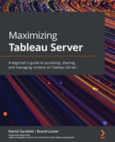
Maximizing Tableau Server

Maximizing Tableau Server guides you on how to make the most of your Tableau Server experience. You'll learn to organize, share, and interact with dashboards and data sources effectively. This book empowers you to enhance your productivity with Tableau Server and achieve seamless collaboration with your team. What this Book will help me do Navigate Tableau Server's interface to locate and customize content easily. Manage and organize Tableau Server content for efficient collaboration. Share, download, and interact with dashboards, enhancing user productivity. Automate tasks such as subscriptions and data refresh schedules. Apply best practices to optimize dashboard performance and usability. Author(s) None Sarsfield and None Locker are seasoned data professionals with extensive knowledge of Tableau. They have guided many organizations in utilizing Tableau Server to its full potential. Their practical insights and step-by-step approach demystify Tableau Server for readers of all backgrounds. Who is it for? This book is perfect for BI developers, data analysts, and professionals who are new to Tableau Server. If you're aiming to streamline the way you handle and share dashboards and want actionable advice on enhancing efficiency, this book is ideal for you. Basic familiarity with web navigation is all that is needed.

podcast_episode
by Val Kroll , Julie Hoyer , Tim Wilson (Analytics Power Hour - Columbus (OH) , Moe Kiss (Canva) , Michael Helbling (Search Discovery)
KPI

One of our KPIs for the show is to keep the Topic Repeat Rate (TRR) below 1.2%. From carefully monitoring our show dashboard, we had an actionable insight: we could finally revisit episode #002. Conveniently, the topic of that show was dashboards, which explains the self-referential stemwinder of a description of this episode. That show was "a long, long time ago. We can still remember… when the dashboards used to make us smile." For complete show notes, including links to items mentioned in this episode and a transcript of the show, visit the show page.

Seth Rosen has broken data Twitter many times, and in his early-fatherhood sleep deprivation developed a wonderful Twitter persona as the battle-tested data analyst. IRL though Seth is a serious data practitioner, and as Founder at the data consultancy HashPath has helped dozens of companies get into the modern data stack + build public-facing data apps.  Now, as the founder of TopCoat, he's empowering analysts to build + publish those same public-facing data apps. In this episode, Tristan, Julia & Seth graciously dive into spicy debates around data mesh + "dashboard factories", and explore a future where data analysts become full-stack application developers. For full show notes and to read 6+ years of back issues of the podcast's companion newsletter, head to https://roundup.getdbt.com.  The Analytics Engineering Podcast is sponsored by dbt Labs.

Summary The accuracy and availability of data has become critically important to the day-to-day operation of businesses. Similar to the practice of site reliability engineering as a means of ensuring consistent uptime of web services, there has been a new trend of building data reliability engineering practices in companies that rely heavily on their data. In this episode Egor Gryaznov explains how this practice manifests from a technical and organizational perspective and how you can start adopting it in your own teams.

Announcements

Hello and welcome to the Data Engineering Podcast, the show about modern data management When you’re ready to build your next pipeline, or want to test out the projects you hear about on the show, you’ll need somewhere to deploy it, so check out our friends at Linode. With their managed Kubernetes platform it’s now even easier to deploy and scale your workflows, or try out the latest Helm charts from tools like Pulsar and Pachyderm. With simple pricing, fast networking, object storage, and worldwide data centers, you’ve got everything you need to run a bulletproof data platform. Go to dataengineeringpodcast.com/linode today and get a $100 credit to try out a Kubernetes cluster of your own. And don’t forget to thank them for their continued support of this show! Atlan is a collaborative workspace for data-driven teams, like Github for engineering or Figma for design teams. By acting as a virtual hub for data assets ranging from tables and dashboards to SQL snippets & code, Atlan enables teams to create a single source of truth for all their data assets, and collaborate across the modern data stack through deep integrations with tools like Snowflake, Slack, Looker and more. Go to dataengineeringpodcast.com/atlan today and sign up for a free trial. If you’re a data engineering podcast listener, you get credits worth $3000 on an annual subscription Schema changes, missing data, and volume anomalies caused by your data sources can happen without any advanced notice if you lack visibility into your data-in-motion. That leaves DataOps reactive to data quality issues and can make your consumers lose confidence in your data. By connecting to your pipeline orchestrator like Apache Airflow and centralizing your end-to-end metadata, Databand.ai lets you identify data quality issues and their root causes from a single dashboard. With Databand.ai, you’ll know whether the data moving from your sources to your warehouse will be available, accurate, and usable when it arrives. Go to dataengineeringpodcast.com/databand to sign up for a free 30-day trial of Databand.ai and take control of your data quality today. Your host is Tobias Macey and today I’m interviewing Egor Gryaznov, co-founder and CTO of Bigeye, about the ideas and practices of data reliability engineering and how to integrate it into your systems

Interview

Introduction How did you get involved in the area of data management? What does the term "Data Reliability Engineering" mean? What is encompassed under the umbrella of Data Reliability Engineering?

How does it compare to the concepts from site reliability engineering? Is DRE just a repackaged version of DataOps?

Why is Data Reliability Engineering particularly important now? Who is responsible for the practice of DRE in an organization? What are some areas of innovation that teams are focusing on to support a DRE practice? What are the tools that teams are using to improve the reliability of their data operations? What are the organizational systems that need to be in place to support a DRE practice?

What are some potential roadblocks that teams might have to address when planning and implementing a DRE strategy?

What are the most interesting, innovative, or unexpected approaches/solutions to DRE that you have seen? What are the most interesting, unexpected, or challenging lessons that you have learned while working on Data Reliability Engineering? Is Data Reliability Engi

Summary Building, scaling, and maintaining the operational components of a machine learning workflow are all hard problems. Add the work of creating the model itself, and it’s not surprising that a majority of companies that could greatly benefit from machine learning have yet to either put it into production or see the value. Tristan Zajonc recognized the complexity that acts as a barrier to adoption and created the Continual platform in response. In this episode he shares his perspective on the benefits of declarative machine learning workflows as a means of accelerating adoption in businesses that don’t have the time, money, or ambition to build everything from scratch. He also discusses the technical underpinnings of what he is building and how using the data warehouse as a shared resource drastically shortens the time required to see value. This is a fascinating episode and Tristan’s work at Continual is likely to be the catalyst for a new stage in the machine learning community.

Announcements

Hello and welcome to the Data Engineering Podcast, the show about modern data management When you’re ready to build your next pipeline, or want to test out the projects you hear about on the show, you’ll need somewhere to deploy it, so check out our friends at Linode. With their managed Kubernetes platform it’s now even easier to deploy and scale your workflows, or try out the latest Helm charts from tools like Pulsar and Pachyderm. With simple pricing, fast networking, object storage, and worldwide data centers, you’ve got everything you need to run a bulletproof data platform. Go to dataengineeringpodcast.com/linode today and get a $100 credit to try out a Kubernetes cluster of your own. And don’t forget to thank them for their continued support of this show! Schema changes, missing data, and volume anomalies caused by your data sources can happen without any advanced notice if you lack visibility into your data-in-motion. That leaves DataOps reactive to data quality issues and can make your consumers lose confidence in your data. By connecting to your pipeline orchestrator like Apache Airflow and centralizing your end-to-end metadata, Databand.ai lets you identify data quality issues and their root causes from a single dashboard. With Databand.ai, you’ll know whether the data moving from your sources to your warehouse will be available, accurate, and usable when it arrives. Go to dataengineeringpodcast.com/databand to sign up for a free 30-day trial of Databand.ai and take control of your data quality today. Atlan is a collaborative workspace for data-driven teams, like Github for engineering or Figma for design teams. By acting as a virtual hub for data assets ranging from tables and dashboards to SQL snippets & code, Atlan enables teams to create a single source of truth for all their data assets, and collaborate across the modern data stack through deep integrations with tools like Snowflake, Slack, Looker and more. Go to dataengineeringpodcast.com/atlan today and sign up for a free trial. If you’re a data engineering podcast listener, you get credits worth $3000 on an annual subscription Your host is Tobias Macey and today I’m interviewing Tristan Zajonc about Continual, a platform for automating the creation and application of operational AI on top of your data warehouse

Interview

Introduction How did you get involved in the area of data management? Can you describe what Continual is and the story behind it?

What is your definition for "operational AI" and how does it differ from other applications of ML/AI?

What are some example use cases for AI in an operational capacity?

What are the barriers to adoption for organizations that want to take advantage of predictive analytics?

Who are the target users of Continual? Can you describe how the Continual platform is implemented?

How has the design and infrastructure changed or evolved since you first began working on it?

What is the workflow for

Summary The Cassandra database is one of the first open source options for globally scalable storage systems. Since its introduction in 2008 it has been powering systems at every scale. The community recently released a new major version that marks a milestone in its maturity and stability as a project and database. In this episode Ben Bromhead, CTO of Instaclustr, shares the challenges that the community has worked through, the work that went into the release, and how the stability and testing improvements are setting the stage for the future of the project.

Announcements

Hello and welcome to the Data Engineering Podcast, the show about modern data management When you’re ready to build your next pipeline, or want to test out the projects you hear about on the show, you’ll need somewhere to deploy it, so check out our friends at Linode. With their managed Kubernetes platform it’s now even easier to deploy and scale your workflows, or try out the latest Helm charts from tools like Pulsar and Pachyderm. With simple pricing, fast networking, object storage, and worldwide data centers, you’ve got everything you need to run a bulletproof data platform. Go to dataengineeringpodcast.com/linode today and get a $100 credit to try out a Kubernetes cluster of your own. And don’t forget to thank them for their continued support of this show! Schema changes, missing data, and volume anomalies caused by your data sources can happen without any advanced notice if you lack visibility into your data-in-motion. That leaves DataOps reactive to data quality issues and can make your consumers lose confidence in your data. By connecting to your pipeline orchestrator like Apache Airflow and centralizing your end-to-end metadata, Databand.ai lets you identify data quality issues and their root causes from a single dashboard. With Databand.ai, you’ll know whether the data moving from your sources to your warehouse will be available, accurate, and usable when it arrives. Go to dataengineeringpodcast.com/databand to sign up for a free 30-day trial of Databand.ai and take control of your data quality today. Atlan is a collaborative workspace for data-driven teams, like Github for engineering or Figma for design teams. By acting as a virtual hub for data assets ranging from tables and dashboards to SQL snippets & code, Atlan enables teams to create a single source of truth for all their data assets, and collaborate across the modern data stack through deep integrations with tools like Snowflake, Slack, Looker and more. Go to dataengineeringpodcast.com/atlan today and sign up for a free trial. If you’re a data engineering podcast listener, you get credits worth $3000 on an annual subscription Your host is Tobias Macey and today I’m interviewing Ben Bromhead about the recent release of Cassandra version 4 and how it fits in the current landscape of data tools

Interview

Introduction How did you get involved in the area of data management? For anyone who isn’t familiar with Cassandra, can you briefly describe what it is and some of the story behind it?

How did you get involved in the Cassandra project and how would you characterize your role?

What are the main use cases and industries where someone is likely to use Cassandra? What is notable about the version 4 release?

What were some of the factors that contributed to the long delay between versions 3 and 4? (2015 – 2021) What are your thoughts on the ongoing utility/benefits of projects such as ScyllaDB, particularly in light of the most recent release?

Cassandra is primarily used as a system of record. What are some of the tools and system architectures that users turn to when building analytical workloads for data stored in Cassandra? The architecture of Cassandra has lent itself well to the cloud native ecosystem that has been growing in recent years. What do you see as the opportunities for Cassandra over the near to medium term as the cloud continues to grow in prominence?

Summary The Presto project has become the de facto option for building scalable open source analytics in SQL for the data lake. In recent months the community has focused their efforts on making it the fastest possible option for running your analytics in the cloud. In this episode Dipti Borkar discusses the work that she and her team are doing at Ahana to simplify the work of running your own PrestoDB environment in the cloud. She explains how they are optimizin the runtime to reduce latency and increase query throughput, the ways that they are contributing back to the open source community, and the exciting improvements that are in the works to make Presto an even more powerful option for all of your analytics.

Announcements

Hello and welcome to the Data Engineering Podcast, the show about modern data management When you’re ready to build your next pipeline, or want to test out the projects you hear about on the show, you’ll need somewhere to deploy it, so check out our friends at Linode. With their managed Kubernetes platform it’s now even easier to deploy and scale your workflows, or try out the latest Helm charts from tools like Pulsar and Pachyderm. With simple pricing, fast networking, object storage, and worldwide data centers, you’ve got everything you need to run a bulletproof data platform. Go to dataengineeringpodcast.com/linode today and get a $100 credit to try out a Kubernetes cluster of your own. And don’t forget to thank them for their continued support of this show! Schema changes, missing data, and volume anomalies caused by your data sources can happen without any advanced notice if you lack visibility into your data-in-motion. That leaves DataOps reactive to data quality issues and can make your consumers lose confidence in your data. By connecting to your pipeline orchestrator like Apache Airflow and centralizing your end-to-end metadata, Databand.ai lets you identify data quality issues and their root causes from a single dashboard. With Databand.ai, you’ll know whether the data moving from your sources to your warehouse will be available, accurate, and usable when it arrives. Go to dataengineeringpodcast.com/databand to sign up for a free 30-day trial of Databand.ai and take control of your data quality today. Atlan is a collaborative workspace for data-driven teams, like Github for engineering or Figma for design teams. By acting as a virtual hub for data assets ranging from tables and dashboards to SQL snippets & code, Atlan enables teams to create a single source of truth for all their data assets, and collaborate across the modern data stack through deep integrations with tools like Snowflake, Slack, Looker and more. Go to dataengineeringpodcast.com/atlan today and sign up for a free trial. If you’re a data engineering podcast listener, you get credits worth $3000 on an annual subscription Your host is Tobias Macey and today I’m interviewing Dipti Borkar, cofounder Ahana about Presto and Ahana, SaaS managed service for Presto

Interview

Introduction How did you get involved in the area of data management? Can you describe what Ahana is and the story behind it? There has been a lot of recent activity in the Presto community. Can you give an overview of the options that are available for someone wanting to use its SQL engine for querying their data?

What is Ahana’s role in the community/ecosystem? (happy to skip this question if it’s too contentious) What are some of the notable differences that have emerged over the past couple of years between the Trino (formerly PrestoSQL) and PrestoDB projects?

Another area that has been seeing a lot of activity is data lakes and projects to make them more manageable and feature complete (e.g. Hudi, Delta Lake, Iceberg, Nessie, LakeFS, etc.). How has that influenced your product focus and capabilities?

How does this activity change the calculus for organizations who are deciding on a lake or warehouse for their data architecture?

Can y