talk-data.com talk-data.com

Topic

data-visualization

212

tagged

Activity Trend

1 peak/qtr
2020-Q1 2026-Q1

Activities

212 activities · Newest first

Good Charts for Persuasive Presentations

The right visual revealed at the right time can turn an unremarkable presentation into a resonant, emotional experience. This two-book collection provides you with the tools you need to craft and deliver presentations that will impress your audience, increase your influence in your organization, and advance your career. Good Charts: The HBR Guide to Making Smarter, More Persuasive Data Visualizations shows how a good visualization can communicate the nature and potential impact of information and ideas more powerfully than any other form of communication. For a long time "dataviz" was left to specialists--data scientists and professional designers. No longer. A new generation of tools and massive amounts of available data make it easy for anyone to create visualizations that communicate ideas far more effectively than generic spreadsheet charts ever could. What's more, building good charts is quickly becoming a need-to-have skill for managers. If you're not doing it, other managers are, and they're getting noticed for it and getting credit for contributing to your company's success. In Good Charts, dataviz maven Scott Berinato provides an essential guide to how visualization works and how to use this new language to impress and persuade. Dataviz today is where spreadsheets and word processors were in the early 1980s—on the cusp of changing how we work. Berinato lays out a system for thinking visually and building better charts through a process of talking, sketching, and prototyping. This book is much more than a set of static rules for making visualizations. It taps into both well-established and cutting-edge research in visual perception and neuroscience, as well as the emerging field of visualization science, to explore why good charts (and bad ones) create "feelings behind our eyes." Along the way, Berinato also includes many engaging vignettes of dataviz pros, illustrating the ideas in practice. Good Charts will help you turn plain, uninspiring charts that merely present information into smart, effective visualizations that powerfully convey ideas. HBR Guide to Persuasive Presentations will teach you to how to take the pain out of presentations. Terrified of speaking in front of a group? Or simply looking to polish your skills? No matter where you are on the spectrum, this guide will give you the confidence and the tools you need to get results. Written by presentation expert Nancy Duarte, the HBR Guide to Persuasive Presentations will help you: (1) Win over tough crowds, (2) Organize a coherent narrative, (3) Create powerful messages and visuals, (4) Connect with and engage your audience, (5) Show people why your ideas matter to them, and (6) Strike the right tone, in any situation.

The Big Book of Dashboards

The definitive reference book with real-world solutions you won't find anywhere else The Big Book of Dashboards presents a comprehensive reference for those tasked with building or overseeing the development of business dashboards. Comprising dozens of examples that address different industries and departments (healthcare, transportation, finance, human resources, marketing, customer service, sports, etc.) and different platforms (print, desktop, tablet, smartphone, and conference room display) The Big Book of Dashboards is the only book that matches great dashboards with real-world business scenarios. By organizing the book based on these scenarios and offering practical and effective visualization examples, The Big Book of Dashboards will be the trusted resource that you open when you need to build an effective business dashboard. In addition to the scenarios there's an entire section of the book that is devoted to addressing many practical and psychological factors you will encounter in your work. It's great to have theory and evidenced-based research at your disposal, but what will you do when somebody asks you to make your dashboard 'cooler' by adding packed bubbles and donut charts? The expert authors have a combined 30-plus years of hands-on experience helping people in hundreds of organizations build effective visualizations. They have fought many 'best practices' battles and having endured bring an uncommon empathy to help you, the reader of this book, survive and thrive in the data visualization world. A well-designed dashboard can point out risks, opportunities, and more; but common challenges and misconceptions can make your dashboard useless at best, and misleading at worst. The Big Book of Dashboards gives you the tools, guidance, and models you need to produce great dashboards that inform, enlighten, and engage.

D3.js: Cutting-edge Data Visualization

Turn your raw data into real knowledge by creating and deploying complex data visualizations with D3.js About This Book Understand how to best represent your data by developing the right kind of visualization Explore the concepts of D3.js through examples that enable you to quickly create visualizations including charts, network diagrams, and maps Get practical examples of visualizations using real-world data sets that show you how to use D3.js to visualize and interact with information to glean its underlying meaning Who This Book Is For Whether you are new to data and data visualization, a seasoned data scientist, or a computer graphics specialist, this Learning Path will provide you with the skills you need to create web-based and interactive data visualizations. Some basic JavaScript knowledge is expected, but no prior experience with data visualization or D3 is required What You Will Learn Gain a solid understanding of the common D3 development idioms Find out how to write basic D3 code for servers using Node.js Install and use D3.js to create HTML elements within a document Create and style graphical elements such as circles, ellipses, rectangles, lines, paths, and text using SVG Turn your data into bar and scatter charts, and add margins, axes, labels, and legends Use D3.js generators to perform the magic of creating complex visualizations from data Add interactivity to your visualizations, including tool-tips, sorting, hover-to-highlight, and grouping and dragging of visuals Write, test, and distribute a D3-based charting package Make a real-time application with Node and D3 In Detail D3 has emerged as one of the leading platforms to develop beautiful, interactive visualizations over the web. We begin the course by setting up a strong foundation, then build on this foundation as we take you through the entire world of reimagining data using interactive, animated visualizations created in D3.js. In the first module, we cover the various features of D3.js to build a wide range of visualizations. We also focus on the entire process of representing data through visualizations. By the end of this module, you will be ready to use D3 to transform any data into a more engaging and sophisticated visualization. In the next module, you will learn to master the creation of graphical elements from data. Using practical examples provided, you will quickly get to grips with the features of D3.js and use this learning to create your own spectacular data visualizations with D3.js. Over the last leg of this course, you will get acquainted with how to integrate D3 with mapping libraries to provide reverse geocoding and interactive maps among many other advanced features of D3. This module culminates by showing you how to create enterprise-level dashboards to display real-time data. This Learning Path combines some of the best that Packt has to offer in one complete, curated package. It includes content from the following Packt products: Learning D3.js Data Visualization, Second Edition by Andrew H. Rininsland D3.js By Example by Michael Heydt Mastering D3.js by Pablo Navarro Castillo Style and approach This course provides a comprehensive explanation of how to leverage the power of D3.js to create powerful and creative visualizations through step-by-step instructions in the form of modules. Each module help you skill up a level in creating meaningful visualizations. Downloading the example code for this book. You can download the example code files for all Packt books you have purchased from your account at http://www.PacktPub.com. If you purchased this book elsewhere, you can visit http://www.PacktPub.com/support and register to have the code file.

Data Visualization, Volume II

This book discusses data and information visualization techniques-the decision-making tools with applications in health care, finance, manufacturing engineering, process improvement, product design, and others. These tools are an excellent means of viewing the current state of the process and improving them. The initial chapters discuss data analysis, the current trends in visualization, the concepts of systems and processes from which data are collected. The second part is devoted to quality tools-a set of graphical and information visualization tools in data analysis, decision-making, and Lean Six-Sigma quality. The eight basic tools of quality discussed are the Process Maps, Check Sheets, Histograms, Scatter Diagrams, Run Charts, Control Charts, Cause-and-Effect Diagrams, and Pareto Charts. The new quality tools presented are the Affinity, Tree, and Matrix Diagrams, Interrelationship Digraph, Prioritizing Matrices, Process Decision Program Chart, and Activity Network Diagram along with Quality Function Deployment (QFD) and Multivari Charts.

Big Data Visualization

Dive into 'Big Data Visualization' and uncover how to tackle the challenges of visualizing vast quantities of complex data. With a focus on scalable and dynamic techniques, this guide explores the nuances of effective data analysis. You'll master tools and approaches to display, interpret, and communicate data in impactful ways. What this Book will help me do Understand the fundamentals of big data visualization, including unique challenges and solutions. Explore practical techniques for using D3 and Python to visualize and detect anomalies in big data. Learn to leverage dashboards like Tableau to present data insights effectively. Address and improve data quality issues to enhance analysis accuracy. Gain hands-on experience with real-world use cases for tools such as Hadoop and Splunk. Author(s) James D. Miller is an IBM-certified expert specializing in data analytics and visualization. With years of experience handling massive datasets and extracting actionable insights, he is dedicated to sharing his expertise. His practical approach is evident in how he combines tool mastery with a clear understanding of data complexities. Who is it for? This book is designed for data analysts, data scientists, and others involved in interpreting and presenting big datasets. Whether you are a beginner looking to understand big data visualization or an experienced professional seeking advanced tools and techniques, this guide suits your needs perfectly. A foundational knowledge in programming languages like R and big data platforms such as Hadoop is recommended to maximize your learning.

Data Visualization with D3 4.x Cookbook - Second Edition

This book, 'Data Visualization with D3 4.x Cookbook' by Nick Zhu, is your ultimate guide to mastering data visualization using D3.js. Through practical recipes, you'll learn to create dynamic, data-driven visualizations and tackle real-world visualization challenges. The book also introduces techniques to manage and present data powerfully. What this Book will help me do Master D3.js 4.x features to create efficient data visualizations. Utilize pre-built recipes to generate diverse charts and graphs. Acquire expertise in manipulating datasets for visualization. Develop interactive, dynamic web applications with D3. Overcome common visualization challenges with practical solutions. Author(s) Nick Zhu is a professional data engineer and an expert in creating data-driven applications. With years of experience using D3.js, Nick brings his wealth of knowledge to writing, making complex concepts accessible to learners. He creates resources to help others enhance their data visualization skills. Who is it for? This book is ideal for developers and data analysts familiar with web technologies like HTML, CSS, and JavaScript, aiming to expand their skills with D3.js. Whether you're new to D3 or experienced and looking for a comprehensive reference, this book will empower you to create professional-grade visualizations.

Learning Kibana 5.0

Learning Kibana 5.0 is your gateway to mastering the art of data visualization using the powerful features of the Kibana platform. This book guides you through the process of creating stunning interactive dashboards and making data-driven insights accessible with real-time visualizations. Whether you're new to the Elastic stack or seeking to refine your expertise, this book equips you to harness Kibana's full potential. What this Book will help me do Build robust, real-time dashboards in Kibana to visualize complex datasets efficiently. Leverage Timelion to perform time-series data analysis and create metrics-based dashboards. Explore advanced analytics using the Graph plugin to uncover relationships and correlations in data. Learn how to create and deploy custom plugins to tailor Kibana to specific project needs. Understand how to use the Elastic stack to monitor, analyze, and optimize various types of data flows. Author(s) Bahaaldine Azarmi is a seasoned expert in the Elastic stack, known for his dedication to making complex technical topics approachable and practical. With years of experience in data analytics and software development, Bahaaldine shares not only his technical expertise but also his passion for helping professionals achieve their goals through clear, actionable guidance. His writing emphasizes hands-on learning and practical application. Who is it for? This book is perfect for developers, data visualization engineers, and data scientists who aim to hone their skills in data visualization and interactive dashboard development. It assumes a basic understanding of Elasticsearch and Logstash to maximize its practicality. If you aim to advance your career by learning how to optimize data architecture and solve real-world problems using the Elastic stack, this book is ideal for you.

Data Visualization, Volume I

Data visualization involves graphical and visual tools used in data analysis and decision making. The emphasis in this book is on recent trends and applications of visualization tools using conventional and big data. These tools are widely used in data visualization and quality improvement to analyze, enhance, and improve the quality of products and services. Data visualization is an easy way to obtain a first look at the data visually. The book provides a collection of visual and graphical tools widely used to gain an insight into the data before applying more complex analysis. The focus is on the key application areas of these tools including business process improvement, business data analysis, health care, finance, manufacturing, engineering, process improvement, and Lean Six Sigma. The key areas of application include data and data analysis concepts, recent trends in data visualization and ÒBig Data,Ó widely used charts and graphs and their applications, analysis of the relationships between two or more variables graphically using scatterplots, bubble graphs, matrix plots, etc., data visualization with big data, computer applications and implementation of widely used graphical and visual tools, and computer instructions to create the graphics presented along with the data files.

Tableau Cookbook - Recipes for Data Visualization

"Tableau Cookbook - Recipes for Data Visualization" walks you through the features and tools of Tableau, one of the industry-leading platforms for building data visualizations. Using over 50 hands-on recipes, you'll learn to create professional dashboards and storyboards to effectively present data trends and patterns. What this Book will help me do Understand the Tableau interface and connect it to various data sources. Build basic and advanced charts, from bar graphs to histograms and maps. Design interactive dashboards that link multiple visual components. Utilize parameters and calculations for advanced data visualizations. Integrate multiple data sources and leverage Tableau's data blending features. Author(s) Shweta Savale brings years of experience in data visualization and analytics to her writing of this cookbook. As a Tableau expert, Shweta has taught and consulted with professionals across industries, empowering them to gain insights from data. Her step-by-step instructional style makes learning both engaging and approachable. Who is it for? This book caters to both beginners looking to learn Tableau from scratch and advanced users needing a quick reference guide. It's perfect for data professionals, analysts, and anyone seeking to visualize and interpret data effectively. If you're looking to simplify Tableau's functions or sharpen your visualization skills, this book is for you.

Pro Tableau: A Step-by-Step Guide

Leverage the power of visualization in business intelligence and data science to make quicker and better decisions. Use statistics and data mining to make compelling and interactive dashboards. This book will help those familiar with Tableau software chart their journey to being a visualization expert. Pro Tableau demonstrates the power of visual analytics and teaches you how to: Connect to various data sources such as spreadsheets, text files, relational databases (Microsoft SQL Server, MySQL, etc.), non-relational databases (NoSQL such as MongoDB, Cassandra), R data files, etc. Write your own custom SQL, etc. Perform statistical analysis in Tableau using R Use a multitude of charts (pie, bar, stacked bar, line, scatter plots, dual axis, histograms, heat maps, tree maps, highlight tables, box and whisker, etc.) What you'll learn Connect to various data sources such as relational databases (Microsoft SQL Server, MySQL), non-relational databases (NoSQL such as MongoDB, Cassandra), write your own custom SQL, join and blend data sources, etc. Leverage table calculations (moving average, year over year growth, LOD (Level of Detail), etc. Integrate Tableau with R Tell a compelling story with data by creating highly interactive dashboards Who this book is for All levels of IT professionals, from executives responsible for determining IT strategies to systems administrators, to data analysts, to decision makers responsible for driving strategic initiatives, etc. The book will help those familiar with Tableau software chart their journey to a visualization expert.

Mastering Tableau

Mastering Tableau is your comprehensive guide to becoming highly skilled in Tableau, focusing on advanced data visualization and practical applications. You will learn how to create complex dashboards, integrate R, and make the most of Tableau's features to deliver compelling insights. By the end of the book, you'll be ready to tackle real-world business intelligence challenges. What this Book will help me do Master advanced Tableau calculations such as row-level and aggregate-level calculations. Create engaging and efficient dashboards for professional data presentations. Integrate R functionalities with Tableau for predictive and advanced analytics. Design and implement custom geographic visualizations, including polygon maps. Optimize performance and best practices in Tableau for innovative BI solutions. Author(s) Jen Stirrup and None Baldwin are experienced data analysts and Tableau experts with years of practical experience in consulting and teaching. Jen has contributed significantly to the Tableau community through workshops and talks. Together, they provide structured guidance that helps readers master Tableau while emphasizing hands-on learning. Who is it for? This book is for business analysts aiming to enhance their data visualization skills using Tableau. Whether you are an intermediate Tableau user looking to tackle advanced techniques or someone wanting to streamline your BI workflows, this book focuses on practical problem-solving. It equips you to use Tableau effectively to create impactful visualizations and insights.

Tableau 10 Business Intelligence Cookbook

Tableau 10 Business Intelligence Cookbook is your comprehensive guide to mastering data analysis and visualization using Tableau 10. You will gain confidence in creating powerful, interactive dashboards and visualizations that not only look great but also help convey critical insights effectively. What this Book will help me do Create and customize effective charts including bar charts, line graphs, and scatter plots. Build interactive dashboards that combine visualizations into cohesive data presentations. Leverage Tableau's calculated fields and parameters to implement advanced data transformations. Prepare and clean your data for analysis using built-in Tableau tools to ensure accuracy. Utilize geospatial and mapping features to visualize geographic and location-based data effectively. Author(s) Donabel Santos is an experienced data specialist and Tableau expert with a passion for teaching data visualization techniques. Paul Banoub, a seasoned business intelligence professional, brings practical insights into crafting effective data strategies using Tableau. Together, they create a book that empowers professionals to realize their data visualization goals. Who is it for? This book is ideal for business professionals, data analysts, and technology experts looking to enhance their Tableau skills. Beginners will find the recipes approachable thanks to the step-by-step guidance, while more advanced users will appreciate the depth of techniques covered. Whether you analyze data for business intelligence or strategic planning, this book will provide tools to expand your capabilities.

Visualizing Graph Data

Visualizing Graph Data teaches you not only how to build graph data structures, but also how to create your own dynamic and interactive visualizations using a variety of tools. This book is loaded with fascinating examples and case studies to show you the real-world value of graph visualizations. About the Technology Assume you are doing a great job collecting data about your customers and products. Are you able to turn your rich data into important insight? Complex relationships in large data sets can be difficult to recognize. Visualizing these connections as graphs makes it possible to see the patterns, so you can find meaning in an otherwise over-whelming sea of facts. About the Book Visualizing Graph Data teaches you how to understand graph data, build graph data structures, and create meaningful visualizations. This engaging book gently introduces graph data visualization through fascinating examples and compelling case studies. You'll discover simple, but effective, techniques to model your data, handle big data, and depict temporal and spatial data. By the end, you'll have a conceptual foundation as well as the practical skills to explore your own data with confidence. What's Inside Techniques for creating effective visualizations Examples using the Gephi and KeyLines visualization packages Real-world case studies About the Reader No prior experience with graph data is required. About the Author Corey Lanum has decades of experience building visualization and analysis applications for companies and government agencies around the globe. Quotes Shows you how to solve visualization problems and explore complex data sets. A pragmatic introduction. - John D. Lewis, DDN Excellent! Hands-on! Shows you how to kick-start your graph data visualization. - Rocio Chongtay, University of Southern Denmark A clear and concise guide to both graph theory and visualization. - Jonathan Suever, PhD, Georgia Institute of Technology Great coverage, with real-life business use cases. - Sumit Pal, Big Data consultant

A Practical Guide to Graphics Reporting, 2nd Edition

Since this book first published in 2006, the field of information visualization has drastically. First, information visualization has exploded online and on other digital platforms. Second, information graphics reporting has encompassed nearly every sector of communications and business. This edition seeks to address these changes by providing learners with a cross-platform, cross-industry approach to instruction. It will include a robust, dynamic website complete with regularly updated examples of print, online and broadcast graphics, as well as useful tutorials and exercises.

Data Visualization: Representing Information on Modern Web

Unleash the power of data by creating interactive, engaging, and compelling visualizations for the web About This Book Get a portable, versatile, and flexible data visualization design approach that will help you navigate the complex path towards success Get thorough explanation of the many visual variables and visualization taxonomy to provide you with a menu of creative options A comprehensive and contemporary introduction to data-driven visualization design and the most effective approaches to designing impact-maximizing and cognition-amplifying visualizations Who This Book Is For This course is for developers who are excited about data and who want to share that excitement with others and it will be handy for the web developers or data scientists who want to create interactive visualizations for the web. Prior knowledge of developing web applications is required. You should have a working knowledge of both JavaScript and HTML. What You Will Learn Harness the power of D3 by building interactive and real-time data-driven web visualizations Find out how to use JavaScript to create compelling visualizations of social data Identify the purpose of your visualization and your project's parameters to determine overriding design considerations across your project's execution Apply critical thinking to visualization design and get intimate with your dataset to identify its potential visual characteristics Explore the various features of HTML5 to design creative visualizations Discover what data is available on Stack Overflow, Facebook, Twitter, and Google+ Gain a solid understanding of the common D3 development idioms Find out how to write basic D3 code for server using Node.js In Detail Do you want to create more attractive charts? Or do you have huge data sets and need to unearth the key insights in a visual manner? Data visualization is the representation and presentation of data, using proven design techniques to bring alive the patterns, stories, and key insights that are locked away. This learning path is divided into three modules. The first module will equip you with the key techniques required to overcome contemporary data visualization challenges. After getting familiar with key concepts of data visualization, it's time to incorporate it with various technologies. In the second module, Social Data Visualization with HTML5 and JavaScript, it teaches you how to leverage HTML5 techniques through JavaScript to build visualizations. It also clears up how the often complicated OAuth protocol works to help you unlock a universe of social media data from sites such as Twitter, Facebook, and Google+. Once you are familiar with the concepts of incorporating data visualization with HTML5 and JavaScript, third module, Learning d3.js Data Visualization, will lead you to D3, which has emerged as one of the leading platforms to develop beautiful, interactive visualizations over the web. This module provides a strong foundation in designing compelling web visualizations with D3.js. By the end of this course, you will have unlocked the mystery behind successful data visualizations. This Learning Path combines some of the best that Packt has to offer in one complete, curated package. It includes content from the following Packt products: Data Visualization: a successful design process by Andy Kirk Social Data Visualization with HTML5 and JavaScript by Simon Timms Learning d3.js Data Visualization, Second Edition by Ændrew Rininsland and Swizec Teller Style and approach This course includes all the resources that will help you jump into creating interactive and engaging visualizations for the web. Through this comprehensive course, you’ll learn how to create engaging visualizations for the web to represent your data from start to finish! Downloading the example code for this book. You can download the example code files for all Packt books you have purchased from your account at http://www.PacktPub.com. If you purchased this book elsewhere, you can visit http://www.PacktPub.com/support and register to have the code file.

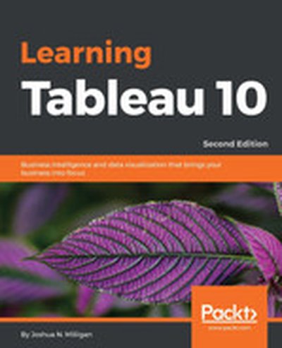
Learning Tableau 10 - Second Edition

In "Learning Tableau 10: Business Intelligence and data visualization that brings your business into focus", you will master data visualization and storytelling using Tableau 10. From foundational concepts to advanced features, this book will enable you to create compelling dashboards and conduct powerful data analysis, empowering businesses with actionable insights. What this Book will help me do Master the creation of effective and visually attractive dashboards in Tableau. Learn techniques for preparing and cleaning data for accurate visualizations. Build advanced visualizations that clarify and communicate complex ideas. Explore data clustering and distribution modeling to identify trends and make forecasts. Share your Tableau creations to promote a culture of evidence-based decision making. Author(s) The authors of 'Learning Tableau 10' are seasoned professionals with extensive experience in business intelligence and data visualization. They bring practical industry insights and a passion for empowering readers through clear instructional design. Their goal is to enable businesses to harness the full potential of Tableau for data-driven success. Who is it for? This book is ideal for data analysts, business professionals, or newcomers to data visualization who want to learn Tableau 10 from scratch or upgrade their skills. It is perfectly suited for beginners striving to bring professional insights and advanced users seeking to leverage Tableau's latest features effectively.

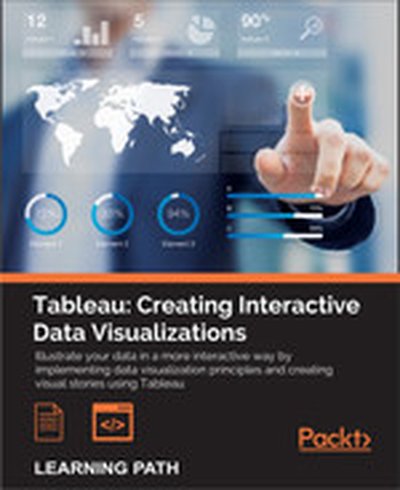
Tableau: Creating Interactive Data Visualizations

Illustrate your data in a more interactive way by implementing data visualization principles and creating visual stories using Tableau About This Book Use data visualization principles to help you to design dashboards that enlighten and support business decisions Integrate your data to provide mashed-up dashboards Connect to various data sources and understand what data is appropriate for Tableau Public Understand chart types and when to use specific chart types with different types of data Who This Book Is For Data scientists who have just started using Tableau and want to build on the skills using practical examples. Familiarity with previous versions of Tableau will be helpful, but not necessary. What You Will Learn Customize your designs to meet the needs of your business using Tableau Use Tableau to prototype, develop, and deploy the final dashboard Create filled maps and use any shape file Discover features of Tableau Public, from basic to advanced Build geographic maps to bring context to data Create filters and actions to allow greater interactivity to Tableau Public visualizations and dashboards Publish and embed Tableau visualizations and dashboards in articles In Detail With increasing interest for data visualization in the media, businesses are looking to create effective dashboards that engage as well as communicate the truth of data. Tableau makes data accessible to everyone, and is a great way of sharing enterprise dashboards across the business. Tableau is a revolutionary toolkit that lets you simply and effectively create high-quality data visualizations. This course starts with making you familiar with its features and enable you to develop and enhance your dashboard skills, starting with an overview of what dashboard is, followed by how you can collect data using various mathematical formulas. Next, you'll learn to filter and group data, as well as how to use various functions to present the data in an appealing and accurate way. In the first module, you will learn how to use the key advanced string functions to play with data and images. You will be walked through the various features of Tableau including dual axes, scatterplot matrices, heat maps, and sizing.In the second module, you'll start with getting your data into Tableau, move onto generating progressively complex graphics, and end with the finishing touches and packaging your work for distribution. This module is filled with practical examples to help you create filled maps, use custom markers, add slider selectors, and create dashboards. You will learn how to manipulate data in various ways by applying various filters, logic, and calculating various aggregate measures. Finally, in the third module, you learn about Tableau Public using which allows readers to explore data associations in multiple-sourced public data, and uses state-of-the-art dashboard and chart graphics to immerse the users in an interactive experience. In this module, the readers can quickly gain confidence in understanding and expanding their visualization, creation knowledge, and quickly create interesting, interactive data visualizations to bring a richness and vibrancy to complex articles. The course provides a great overview for beginner to intermediate Tableau users, and covers the creation of data visualizations of varying complexities. Style and approach The approach will be a combined perspective, wherein we start by performing some basic recipes and move on to some advanced ones. Finally, we perform some advanced analytics and create appealing and insightful data stories using Tableau Public in a step-by-step manner.

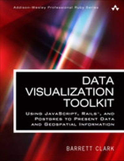
Data Visualization Toolkit: Using JavaScript, Rails™, and Postgres to Present Data and Geospatial Information

Create Beautiful Visualizations that Free Your Data to Tell Powerful Truths “The depth of Barrett Clark’s knowledge shines through in his writing: clear, concise, and confident. Barrett has been practicing all of this stuff in his day job for many years–Postgres, D3, GIS, all of it. The knowledge in this book is real-world and hard-earned!” –From the Foreword by Obie Fernandez is your hands-on, practical, and holistic guide to the art of visualizing data. You’ll learn how to use Rails, jQuery, D3, Leaflet, PostgreSQL, and PostGIS together, creating beautiful visualizations and maps that give your data a voice and to make it “dance.” Data Visualization Toolkit Barrett Clark teaches through real-world problems and examples developed specifically to illuminate every technique you need to generate stunningly effective visualizations. You’ll move from the absolute basics toward deep dives, mastering diverse visualizations and discovering when to use each. Along the way, you’ll build three start-to-finish visualization applications, using actual real estate, weather, and travel datasets. Clark addresses every component of data visualization: your data, database, application server, visualization libraries, and more. He explains data transformations; presents expert techniques in JavaScript, Ruby, and SQL; and illuminates key concepts associated with both descriptive statistics and geospatial data. Throughout, everything is aimed at one goal: to help you cut through the clutter and let your data tell all it can. This guide will help you Explore and understand the data visualization technology stack Master the thought process and steps involved in importing data Extract, transform, and load data in usable, reliable form Handle spotty data, or data that doesn’t line up with what your chart expects Use D3 to build pie and bar charts, scatter and box plots, and more Work effectively with time-series data Tweak Ruby and SQL to optimize performance with large datasets Use raw SQL in Rails: window functions, subqueries, and common table expressions Build chord diagrams and time-series aggregates Use separate databases or schema for reporting databases Integrate geographical data via geospatial SQL queries Construct maps with Leaflet and Rails Query geospatial data the “Rails way” and the “raw SQL way”

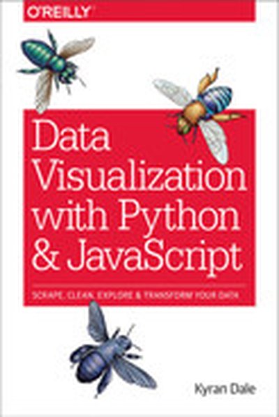
Data Visualization with Python and JavaScript

Learn how to turn raw data into rich, interactive web visualizations with the powerful combination of Python and JavaScript. With this hands-on guide, author Kyran Dale teaches you how build a basic dataviz toolchain with best-of-breed Python and JavaScript libraries—including Scrapy, Matplotlib, Pandas, Flask, and D3—for crafting engaging, browser-based visualizations. As a working example, throughout the book Dale walks you through transforming Wikipedia’s table-based list of Nobel Prize winners into an interactive visualization. You’ll examine steps along the entire toolchain, from scraping, cleaning, exploring, and delivering data to building the visualization with JavaScript’s D3 library. If you’re ready to create your own web-based data visualizations—and know either Python or JavaScript— this is the book for you. Learn how to manipulate data with Python Understand the commonalities between Python and JavaScript Extract information from websites by using Python’s web-scraping tools, BeautifulSoup and Scrapy Clean and explore data with Python’s Pandas, Matplotlib, and Numpy libraries Serve data and create RESTful web APIs with Python’s Flask framework Create engaging, interactive web visualizations with JavaScript’s D3 library

Practical D3.js

Your indispensable guide to mastering the efficient use of D3.js in professional-standard data visualization projects. You will learn what data visualization is, how to work with it, and how to think like a D3.js expert, both practically and theoretically. Practical D3.js does not just show you how to use D3.js, it teaches you how to think like a data scientist and work with the data in the real world. In Part One, you will learn about theories behind data visualization. In Part Two, you will learn how to use D3.js to create the best charts and layouts. Uniquely, this book intertwines the technical details of D3.js with practical topics such as data journalism and the use of open government data. Written by leading data scientists Tarek Amr and Rayna Stamboliyska, this book is your guide to using D3.js in the real world -- add it to your library today. You Will Learn: How to think like a data scientist and present data in the best way What structure and design strategies you can use for compelling data visualization How to use data binding, animations and events, scales, and color pickers How to use shapes, path generators, arcs and polygons Who This Book is For: This book is for anyone who wants to learn to master the use of D3.js in a practical manner, while still learning the important theoretical aspects needed to enable them to work with their data in the best possible way.