talk-data.com talk-data.com

Topic

DataViz

Data Visualization

bi charts dashboards

434

tagged

Activity Trend

43 peak/qtr
2020-Q1 2026-Q1

Activities

434 activities · Newest first

Doing Data Science

Now that people are aware that data can make the difference in an election or a business model, data science as an occupation is gaining ground. But how can you get started working in a wide-ranging, interdisciplinary field that’s so clouded in hype? This insightful book, based on Columbia University’s Introduction to Data Science class, tells you what you need to know. In many of these chapter-long lectures, data scientists from companies such as Google, Microsoft, and eBay share new algorithms, methods, and models by presenting case studies and the code they use. If you’re familiar with linear algebra, probability, and statistics, and have programming experience, this book is an ideal introduction to data science. Topics include: Statistical inference, exploratory data analysis, and the data science process Algorithms Spam filters, Naive Bayes, and data wrangling Logistic regression Financial modeling Recommendation engines and causality Data visualization Social networks and data journalism Data engineering, MapReduce, Pregel, and Hadoop Doing Data Science is collaboration between course instructor Rachel Schutt, Senior VP of Data Science at News Corp, and data science consultant Cathy O’Neil, a senior data scientist at Johnson Research Labs, who attended and blogged about the course.

Modeling Techniques in Predictive Analytics: Business Problems and Solutions with R

Today, successful firms compete and win based on analytics. Modeling Techniques in brings together all the concepts, techniques, and R code you need to excel in any role involving analytics. Thomas W. Miller’s unique balanced approach combines business context Predictive Analytics and quantitative tools, appealing to managers, analysts, programmers, and students alike. Miller addresses multiple business challenges and business cases, including segmentation, brand positioning, product choice modeling, pricing research, finance, sports, text analytics, sentiment analysis, and social network analysis. He illuminates the use of cross-sectional data, time series, spatial, and even spatio-temporal data. For each problem, Miller explains why the problem matters, what data is relevant, how to explore your data once you’ve identified it, and then how to successfully model that data. You’ll learn how to model data conceptually, with words and figures; and then how to model it with realistic R programs that deliver actionable insights and knowledge. Miller walks you through model construction, explanatory variable subset selection, and validation, demonstrating best practices for improving out-of-sample predictive performance. He employs data visualization and statistical graphics in exploring data, presenting models, and evaluating performance. All example code is presented in R, today’s #1 system for applied statistics, statistical research, and predictive modeling; code is set apart from other text so it’s easy to find for those who want it (and easy to skip for those who don’t).

Developing Business Intelligence Apps for SharePoint

Create dynamic business intelligence (BI) solutions for SharePoint faster and with more capabilities than previously possible. With this book, you’ll learn the entire process—from high-level concepts to development and deployment—for building data-rich BI applications with Visual Studio LightSwitch, SQL Server 2012, and a host of related Microsoft technologies. You’ll learn practical techniques and patterns necessary to use all of these technologies together as you build an example application through the course of the book, step by step. Discover how to solve real problems, using BI solutions that will evolve to meet future needs. Learn the fundamentals of SharePoint, LightSwitch, and SQL Server 2012 Get a solid grounding in BI application basics and database design principles Use LightSwitch to build a help desk app, including data model design and SharePoint data integration Build a tabular cube with Microsoft’s Business Intelligence Semantic Model (BISM) Dive into the data visualization stack, including Excel and SQL Server Reporting Services Create reports with Excel Services, Report Builder, and PowerView Use tips and tricks for setting up your BI application development environment

Pro Data Visualization using R and JavaScript

Pro Data Visualization using R and JavaScript makes the R language approachable, and promotes the idea of data gathering and analysis. You'll see how to use R to interrogate and analyze your data, and then use the D3 JavaScript library to format and display that data in an elegant, informative, and interactive way. You will learn how to gather data effectively, and also how to understand the philosophy and implementation of each type of chart, so as to be able to represent the results visually. With the popularity of the R language, the art and practice of creating data visualizations is no longer the preserve of mathematicians, statisticians, or cartographers. As technology leaders, we can gather metrics around what we do and use data visualizations to communicate that information. Pro Data Visualization using R and JavaScript combines the power of the R language with the simplicity and familiarity of JavaScript to display clear and informative data visualizations. Gathering and analyzing empirical data is the key to truly understanding anything. We can track operational metrics to quantify the health of our products in production. We can track quality metrics of our projects, and even use our data to identify bad code. Visualizing this data allows anyone to read our analysis and easily get a deep understanding of the story the data tells. What you'll learn A rich understanding of how to gather, and analyze empirical data How to tell a story with data using data visualizations What types of data visualizations are best to use for the story that you want to tell with your data A comprehensive introduction to the R language, covering all the essentials Exploration of how to construct interactive data visualizations using JavaScript and JavaScript libraries Who this book is for Developers at all levels interested in data visualization, beginning to intermediate engineering managers, statisticians, mathematicians, economists and any others interested in data visualization.

Data Warehousing in the Age of Big Data

Data Warehousing in the Age of the Big Data will help you and your organization make the most of unstructured data with your existing data warehouse. As Big Data continues to revolutionize how we use data, it doesn't have to create more confusion. Expert author Krish Krishnan helps you make sense of how Big Data fits into the world of data warehousing in clear and concise detail. The book is presented in three distinct parts. Part 1 discusses Big Data, its technologies and use cases from early adopters. Part 2 addresses data warehousing, its shortcomings, and new architecture options, workloads, and integration techniques for Big Data and the data warehouse. Part 3 deals with data governance, data visualization, information life-cycle management, data scientists, and implementing a Big Data–ready data warehouse. Extensive appendixes include case studies from vendor implementations and a special segment on how we can build a healthcare information factory. Ultimately, this book will help you navigate through the complex layers of Big Data and data warehousing while providing you information on how to effectively think about using all these technologies and the architectures to design the next-generation data warehouse. Learn how to leverage Big Data by effectively integrating it into your data warehouse. Includes real-world examples and use cases that clearly demonstrate Hadoop, NoSQL, HBASE, Hive, and other Big Data technologies Understand how to optimize and tune your current data warehouse infrastructure and integrate newer infrastructure matching data processing workloads and requirements

Visual Intelligence: Microsoft Tools and Techniques for Visualizing Data

Go beyond design concepts and learn to build state-of-the-art visualizations The visualization experts at Microsoft's Pragmatic Works have created a full-color, step-by-step guide to building specific types of visualizations. The book thoroughly covers the Microsoft toolset for data analysis and visualization, including Excel, and explores best practices for choosing a data visualization design, selecting tools from the Microsoft stack, and building a dynamic data visualization from start to finish. You'll examine different types of visualizations, their strengths and weaknesses, and when to use each one. Data visualization tools unlock the stories within the data, enabling you to present it in a way that is useful for making business decisions This full-color guide introduces data visualization design concepts, then explains the various Microsoft tools used to store and display data Features a detailed discussion of various classes of visualizations, their uses, and the appropriate tools for each Includes practical implementations of various visualizations and best practices for using them Covers out-of-the-box Microsoft tools, custom-developed illustrations and implementations, and code examples Visual Intelligence: Microsoft Tools and Techniques for Visualizing Data arms you with best practices and the knowledge to choose and build dynamic data visualizations.

Microsoft SQL Server 2012 Reporting Services

Use your SQL Server skills to create and manage key data reports Deliver interactive business intelligence reports using SQL Server 2012 Reporting Services, and help facilitate real-time decision making throughout the enterprise. SQL Server expert Stacia Misner shows you in detail how to design, manage, and access custom reports that capture data from multiple sources. This book is ideal for experienced SQL Server developers, whether you’re new to Reporting Services or upgrading from an earlier version. Discover how to: Use the latest features, including the Power View ad hoc reporting tool Design reports by understanding how your audience accesses and uses data Add interactive features to help end users sort and filter data Create rich data visualization with charts, gauges, indictors, and data maps Configure your report server, provide security, and monitor report contents Use SharePoint or Report Manager to search and access reports online Create a library of report parts that clients can use for ad hoc reporting Build and manage reports using Reporting Services as a development platform

Interactive Data Visualization for the Web

Create and publish your own interactive data visualization projects on the Web—even if you have little or no experience with data visualization or web development. It’s easy and fun with this practical, hands-on introduction. Author Scott Murray teaches you the fundamental concepts and methods of D3, a JavaScript library that lets you express data visually in a web browser. Along the way, you’ll expand your web programming skills, using tools such as HTML and JavaScript. This step-by-step guide is ideal whether you’re a designer or visual artist with no programming experience, a reporter exploring the new frontier of data journalism, or anyone who wants to visualize and share data. Learn HTML, CSS, JavaScript, and SVG basics Dynamically generate web page elements from your data—and choose visual encoding rules to style them Create bar charts, scatter plots, pie charts, stacked bar charts, and force-directed layouts Use smooth, animated transitions to show changes in your data Introduce interactivity to help users explore data through different views Create customized geographic maps with data Explore hands-on with downloadable code and over 100 examples

Big Data, Big Analytics: Emerging Business Intelligence and Analytic Trends for Today's Businesses

Unique prospective on the big data analytics phenomenon for both business and IT professionals The availability of Big Data, low-cost commodity hardware and new information management and analytics software has produced a unique moment in the history of business. The convergence of these trends means that we have the capabilities required to analyze astonishing data sets quickly and cost-effectively for the first time in history. These capabilities are neither theoretical nor trivial. They represent a genuine leap forward and a clear opportunity to realize enormous gains in terms of efficiency, productivity, revenue and profitability. The Age of Big Data is here, and these are truly revolutionary times. This timely book looks at cutting-edge companies supporting an exciting new generation of business analytics. Learn more about the trends in big data and how they are impacting the business world (Risk, Marketing, Healthcare, Financial Services, etc.) Explains this new technology and how companies can use them effectively to gather the data that they need and glean critical insights Explores relevant topics such as data privacy, data visualization, unstructured data, crowd sourcing data scientists, cloud computing for big data, and much more.

Data Visualization: a successful design process

Dive into the world of data visualization with 'Data Visualization: a Successful Design Process'. Learn to convert complex datasets into vivid, insightful visuals using proven design methodologies and tools. This resource equips you to craft visuals that not only engage your audience but also uncover critical trends and narratives hidden in data. What this Book will help me do Master the fundamentals of visualization taxonomy to choose the ideal design for your data. Develop analytical questions and identify key narratives to structure your data representation. Understand the human visual system and how it impacts effective visual communication. Apply critical thinking to select visualization techniques suited to different data types. Gain an in-depth knowledge of data visualization tools and contemporary practices. Author(s) The author of this book is a seasoned expert in the field of data visualization, known for their innovative approach to transforming data into impactful visuals. With years of experience navigating the intersection of data science and design, their method focuses on empowering professionals to communicate insights effectively. Their writing combines a deep understanding of technical skills with actionable, inspiring guidance. Who is it for? This book is perfect for professionals, analysts, and designers who aim to improve their data visualization skills. Whether you are a beginner or an experienced individual seeking to refine your approach, this book caters to all skill levels. If your goal includes communicating data insights clearly and effectively to varied audiences, this book is for you.

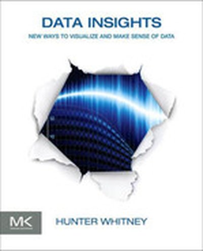
Data Insights

Data Insights: New Ways to Visualize and Make Sense of Data offers thought-provoking insights into how visualization can foster a clearer and more comprehensive understanding of data. The book offers perspectives from people with different backgrounds, including data scientists, statisticians, painters, and writers. It argues that all data is useless, or misleading, if we do not know what it means.Organized into seven chapters, the book explores some of the ways that data visualization and other emerging approaches can make data meaningful and therefore useful. It also discusses some fundamental ideas and basic questions in the data lifecycle; the process of interactions between people, data, and displays that lead to better questions and more useful answers; and the fundamentals, origins, and purposes of the basic building blocks that are used in data visualization. The reader is introduced to tried and true approaches to understanding users in the context of user interface design, how communications can get distorted, and how data visualization is related to thinking machines. Finally, the book looks at the future of data visualization by assessing its strengths and weaknesses. Case studies from business analytics, healthcare, network monitoring, security, and games, among others, as well as illustrations, thought-provoking quotes, and real-world examples are included.This book will prove useful to computer professionals, technical marketing professionals, content strategists, Web and product designers, and researchers. Demonstrates, with a variety of case studies, how visualizations can foster a clearer and more comprehensive understanding of data Answers the question, "How can data visualization help me?" with discussions of how it fits into a wide array of purposes and situations Makes the case that data visualization is not just about technology; it also involves a deeply human process

QlikView 11 for Developers

In 'QlikView 11 for Developers', you will learn how to leverage QlikView to create robust, insightful business intelligence applications. By following the case study of HighCloud Airlines, this book offers a practical, step-by-step guide to developing and mastering QlikView to address real-world data analysis needs. What this Book will help me do Build comprehensive QlikView dashboards with advanced techniques. Understand how to create associative data models by integrating different data sources. Design interactive user interfaces to enable insightful analysis. Apply best practices in QlikView scripting to transform and prepare data. Master QlikView's built-in functions for calculations and analyses. Author(s) The authors of 'QlikView 11 for Developers' bring extensive experience in business intelligence and QlikView application development. With backgrounds in software engineering and data visualization, they combine technical rigor with practical insights. Their teaching approach ensures concepts are accessible and actionable for a wide range of learners. Who is it for? This book is ideal for software developers and data analysts who want to harness QlikView to build business intelligence applications. It is tailored for those with a basic understanding of business intelligence looking to deepen their expertise in QlikView. The content is also valuable for power users seeking efficiency through advanced features. Readers will gain practical, hands-on knowledge by following this guide.

R in a Nutshell, 2nd Edition

If you’re considering R for statistical computing and data visualization, this book provides a quick and practical guide to just about everything you can do with the open source R language and software environment. You’ll learn how to write R functions and use R packages to help you prepare, visualize, and analyze data. Author Joseph Adler illustrates each process with a wealth of examples from medicine, business, and sports. Updated for R 2.14 and 2.15, this second edition includes new and expanded chapters on R performance, the ggplot2 data visualization package, and parallel R computing with Hadoop. Get started quickly with an R tutorial and hundreds of examples Explore R syntax, objects, and other language details Find thousands of user-contributed R packages online, including Bioconductor Learn how to use R to prepare data for analysis Visualize your data with R’s graphics, lattice, and ggplot2 packages Use R to calculate statistical fests, fit models, and compute probability distributions Speed up intensive computations by writing parallel R programs for Hadoop Get a complete desktop reference to R

Infographics: The Power of Visual Storytelling

Transform your marketing efforts through the power of visual content In today's fast-paced environment, you must communicate your message in a concise and engaging way that sets it apart from the noise. Visual content—such as infographics and data visualization—can accomplish this. With DIY functionality, Infographics: The Power of Visual Storytelling will teach you how to find stories in your data, and how to visually communicate and share them with your audience for maximum impact. Infographics will show you the vast potential to using the communication medium as a marketing tool by creating informative and shareable infographic content. Learn how to explain an object, idea, or process using strong illustration that captures interest and provides instant clarity Discover how to unlock interesting stories (in previously buried or boring data) and turn them into visual communications that will help build brands and increase sales Use the power of visual content to communicate with and engage your audience, capture attention, and expand your market.

Designing Data Visualizations

Data visualization is an efficient and effective medium for communicating large amounts of information, but the design process can often seem like an unexplainable creative endeavor. This concise book aims to demystify the design process by showing you how to use a linear decision-making process to encode your information visually. Delve into different kinds of visualization, including infographics and visual art, and explore the influences at work in each one. Then learn how to apply these concepts to your design process. Learn data visualization classifications, including explanatory, exploratory, and hybrid Discover how three fundamental influences—the designer, the reader, and the data—shape what you create Learn how to describe the specific goal of your visualization and identify the supporting data Decide the spatial position of your visual entities with axes Encode the various dimensions of your data with appropriate visual properties, such as shape and color See visualization best practices and suggestions for encoding various specific data types

Visualize This: The FlowingData Guide to Design, Visualization, and Statistics

Practical data design tips from a data visualization expert of the modern age Data doesn't decrease; it is ever-increasing and can be overwhelming to organize in a way that makes sense to its intended audience. Wouldn't it be wonderful if we could actually visualize data in such a way that we could maximize its potential and tell a story in a clear, concise manner? Thanks to the creative genius of Nathan Yau, we can. With this full-color book, data visualization guru and author Nathan Yau uses step-by-step tutorials to show you how to visualize and tell stories with data. He explains how to gather, parse, and format data and then design high quality graphics that help you explore and present patterns, outliers, and relationships. Presents a unique approach to visualizing and telling stories with data, from a data visualization expert and the creator of flowingdata.com, Nathan Yau Offers step-by-step tutorials and practical design tips for creating statistical graphics, geographical maps, and information design to find meaning in the numbers Details tools that can be used to visualize data-native graphics for the Web, such as ActionScript, Flash libraries, PHP, and JavaScript and tools to design graphics for print, such as R and Illustrator Contains numerous examples and descriptions of patterns and outliers and explains how to show them Visualize This demonstrates how to explain data visually so that you can present your information in a way that is easy to understand and appealing.

SAP BusinessObjects Dashboards 4.0 Cookbook

Discover how to create compelling, interactive dashboards efficiently using SAP BusinessObjects Dashboards 4.0 (formerly Xcelsius). In this comprehensive cookbook, learn step-by-step recipes that guide you through practical tasks leveraging the tool's advanced features like dynamic visibility and live data connections. What this Book will help me do Master the use of Dashboard Design's spreadsheet and data-driven components to efficiently create professional dashboards. Learn various data visualization techniques to present data clearly and effectively within your dashboards. Implement dynamic interactivity and control logic using features like Dynamic Visibility to enhance dashboard usability. Understand how to connect dashboards to live data sources for up-to-date and real-time business insights. Explore and utilize additional Dashboard Design features and add-ons to customize and extend the capabilities of your dashboards. Author(s) The author(s) of this book are seasoned professionals in SAP BusinessObjects Dashboards and enterprise dashboard design. With years of experience in teaching and applying these tools in practical settings, they aim to demystify complex dashboarding concepts and empower professionals to build impactful visualizations. Who is it for? This book is targeted at developers and business professionals who wish to sharpen their skills in dashboard creation using SAP BusinessObjects Dashboards 4.0. Readers should have a basic understanding of dashboards and some experience with Excel to benefit from this content. It's ideal for those new to SAP Dashboard Design seeking a comprehensive and practical guide.

Data Mashups in R

How do you use R to import, manage, visualize, and analyze real-world data? With this short, hands-on tutorial, you learn how to collect online data, massage it into a reasonable form, and work with it using R facilities to interact with web servers, parse HTML and XML, and more. Rather than use canned sample data, you'll plot and analyze current home foreclosure auctions in Philadelphia. This practical mashup exercise shows you how to access spatial data in several formats locally and over the Web to produce a map of home foreclosures. It's an excellent way to explore how the R environment works with R packages and performs statistical analysis. Parse messy data from public foreclosure auction postings Plot the data using R's PBSmapping package Import US Census data to add context to foreclosure data Use R's lattice and latticeExtra packages for data visualization Create multidimensional correlation graphs with the pairs() scatterplot matrix package

Quick Start Guide to Oracle Fusion Development

Get Started with Oracle Fusion Development Written by a Group Product Manager at Oracle, this Oracle Press guide gets you up and running quickly with your first Oracle Fusion applications. Quick Start Guide to Oracle Fusion Development provides only the essential information you need to build applications in a matter of hours. Rapidly learn the building blocks and functionality you’ll use most of the time. The progression of topics closely matches the application building process, taking you through a typical developer scenario from start to completion. Quick Start Guide to Oracle Fusion Development features Concise and friendly format providing the essentials needed to start building applications right away Chapters that build on each other to illustrate a typical development scenario from start to finish Unique author insights gained from hours of one-on-one meetings with customers and work in Oracle’s usability labs The perfect entry point to Oracle Fusion development Introduction to Fusion and the Fusion Technologies; Introduction to JDeveloper and Oracle ADF; Finding your Way Around JDeveloper; Building Business Services; Introducing ADF Business Components; The Role of the Entity; A View of your Data – The View Object; The Application Module; Implementing Business Service Validation; More View Object Features; Building the User Interface; Introducing ADF Face Rich Client; ADF Model; Building Typical ADF Pages; Building Application Flow; Menus, Toolbars and Buttons; Advanced UI Techniques; Data Visualization and Other Rich UI Components; Application Look and Feel; Common Coding Patterns; Common Business Service Coding Examples; Common View Coding Examples

Microsoft Visio 2010 Business Process Diagramming and Validation

In the book 'Microsoft Visio 2010 Business Process Diagramming and Validation', you'll master the specialized features of Microsoft Visio 2010 Premium. This guide focuses on creating structured diagrams and validation rules, helping you enhance the accuracy and clarity of your business data visualization. What this Book will help me do Gain expertise in leveraging Visio's structured diagram tools for business process mapping. Learn how to build, customize, and apply Validation Rules for ensuring diagram accuracy. Develop skills in using the Visio Object Model and ShapeSheet to create advanced diagramming solutions. Understand and implement enhanced diagramming templates and rules, including BPMN and custom workflows. Acquire techniques for creating add-ins and publishing templates to establish company-wide diagramming standards. Author(s) David Parker, the author of this insightful book, is a seasoned professional with extensive experience in Microsoft Visio. His expertise includes creating complex diagramming solutions and training professionals in maximizing Visio's features. David's hands-on approach and understanding of business process needs make this a practical and enriching guide. Who is it for? This book is for users and developers of Microsoft Visio 2010 Premium Edition who want to master diagram validation and structured diagrams. Beginners with basic Visio knowledge and experienced users aiming to develop advanced applications will both benefit from this resource. It is especially useful for professionals seeking to enforce accuracy and compliance in their diagrams.