Atelier en ligne présentant les bases de la programmation en Python et l’analyse de données avec Jupyter Notebook et Pandas, en utilisant les jeux de données Airbnb. L’atelier couvre les bases de Python, les bases de Pandas, la visualisation de données et comment sourcer et analyser les jeux de données Airbnb. Accès à la plateforme d'apprentissage du Wagon à l’issue du cours.
 talk-data.com
Topic
DataViz
Data Visualization
434
tagged
Activity Trend
Top Events
We don’t think about every decision we make. Some decisions are easy and intuitive, others can be riddled with doubt. In a business setting, decision-making is often crucial, and with that comes pressure to ensure we’re making the right decisions in the best way possible. We can often accompany decision-making with context, providing a narrative for how we might approach a decision, citing what data and insights have had significant input into our choices. But how do we approach storytelling and decision-making to breed success? There’s probably no better person to guide us through the ins and outs of decision-making than the co-author of Business Storytelling For Dummies. Lori L. Silverman is the owner of Partners for Progress, a management consulting firm. As a business strategist, she has consulted with organizations in fifteen industries including financial services, insurance, manufacturing and petroleum companies, government entities, and professional associations. As a keynote speaker, Lori has positively impacted the lives of thousands of people. She has appeared on over fifty radio and television shows to speak about using stories in the workplace and is the co-author of Critical SHIFT and Stories Trainers Tell. She’s a pioneer in the business storytelling field, author of five books, and is known worldwide for her work in collaborative data-informed decision-making. In the episode, Richie and Lori cover common problems in business decision-making, connecting decision-making to business processes, analytics and decision-making, integrating data practitioners and decision-makers, the role of data visualization and narrative storytelling, the SMARTER decision-making methodology, the importance of intuition, challenges faced when applying decision-making methodologies and much more. Links Mentioned in the Show Business Storytelling For Dummies by Karen Dietz and Lori SilvermanConnect with Lori on LinkedinLevel Up with LoriBooks by LoriThe SMARTER Framework for Data-Informed Decision MakingMonetizing Data Through Informed, Collaborative Decision MakingThe Increasingly Vital Role of Business Storytelling in LeadershipPre-Suasion: A Revolutionary Way to Influence and Persuade by Robert Cialdini[Skill Track] Data Storytelling
Join us for a thorough discussion with data visualization expert Nick Desbarats. We will focus on creating charts and visualizing data.
Nick is a well-known instructor in the field of data & has taught many data professionals worldwide about visualizing data and designing dashboards.
In this episode, Nick explains how the choice of chart type affects how we understand data. He also discusses his recently published book, 'Practical Charts.'
Connect with Nick Desbarats :
🤝 Connect with Nick
🎒 Learn About Practical Reporting
📚 Purchase Practical Charts books
👍🏽 Leave your review and download the bonus:
🤖 Talk to AveryGPT for your data job hunt tips
🤝 Ace your data analyst interview with the interview simulator
📩 Get my weekly email with helpful data career tips
📊 Come to my next free “How to Land Your First Data Job” training
🏫 Check out my 10-week data analytics bootcamp
Timestamps: (03:42) - The Importance of Choosing the Right Chart (11:39) - The Ethics of Data Visualization (24:03) - Understanding Less Common Chart Types (33:02) - The Spray and Pray Chart Method
Connect with Avery:
📺 Subscribe on YouTube
🎙Listen to My Podcast
👔 Connect with me on LinkedIn
🎵 TikTok
Mentioned in this episode: Join the last cohort of 2025! The LAST cohort of The Data Analytics Accelerator for 2025 kicks off on Monday, December 8th and enrollment is officially open!
To celebrate the end of the year, we’re running a special End-of-Year Sale, where you’ll get: ✅ A discount on your enrollment 🎁 6 bonus gifts, including job listings, interview prep, AI tools + more
If your goal is to land a data job in 2026, this is your chance to get ahead of the competition and start strong.
👉 Join the December Cohort & Claim Your Bonuses: https://DataCareerJumpstart.com/daa https://www.datacareerjumpstart.com/daa
Your data project doesn't end once you have results. In order to have impact, you need to communicate those results to others. Presentations filled with endless tables and technical jargon can easily become tedious, leading your audience to lose interest or misunderstand your point. Data storytelling provides a solution to this: by creating a narrative around your results you can increase engagement and understanding from your audience. This is an art, and there are so many factors that contribute to visualizing data and creating a compelling story, it can be overwhelming. However, with the right approach, creating data stories can become second nature. In this special episode of DataFramed, we join forces with the Present Beyond Measure podcast to glean the best data presentation practices from one of the leading voices in the space. Lea Pica host of the Founder and Host of the Present Beyond Measure podcast and is a seasoned digital analytics practitioner, social media marketer and blogger with over 11 years of experience building search marketing and digital analytics practices for companies like Scholastic, Victoria’s Secret and Prudential. Present Beyond Measure’s mission is to bring their teachings to the digital marketing and web analytics communities, and empower anyone responsible for presenting data to an audience. In the full episode, Richie and Lea cover the full picture of data presentation, how to understand your audience, leverage hollywood storytelling, data storyboarding and visualization, the use of imagery in presentations, cognitive load management, the use of throughlines in presentations, how to improve your speaking and engagement skills, data visualization techniques in business setting and much more. Links Mentioned in the Show: Present Beyond MeasureLea’s BookConnect with Lea on LinkedinHollywood Storytelling[Course] Data Storytelling Concepts
In "Redis Stack for Application Modernization," you will explore how the Redis Stack extends traditional Redis capabilities, allowing you to innovate in building real-time, scalable, multi-model applications. Through practical examples and hands-on sessions, this book equips you with skills to manage, implement, and optimize data flows and database features. What this Book will help me do Learn how to use Redis Stack for handling real-time data with JSON, hash, and other document types. Discover modern techniques for performing vector similarity searches and hybrid workflows. Become proficient in integrating Redis Stack with programming languages like Java, Python, and Node.js. Gain skills to configure Redis Stack server for scalability, security, and high availability. Master RedisInsight for data visualization, analysis, and efficient database management. Author(s) Luigi Fugaro and None Ortensi are experienced software professionals with deep expertise in database systems and application architecture. They bring years of experience working with Redis and developing real-world applications. Their hands-on approach to teaching and real-world examples make this book a valuable resource for professionals in the field. Who is it for? This book is ideal for database administrators, developers, and architects looking to leverage Redis Stack for real-time multi-model applications. It requires a basic understanding of Redis and any programming language such as Python or Java. If you wish to modernize your applications and efficiently manage databases, this book is for you.
In this episode, Conor and Bryce our joined by Zach Laine for their fourth Holiday Special! Link to Episode 161 on WebsiteDiscuss this episode, leave a comment, or ask a question (on GitHub)Twitter ADSP: The PodcastConor HoekstraBryce Adelstein LelbachAbout the Guest: Zach Laine has been using C++ in industry for 15 years, focusing on data visualization, numeric computing, games, generic programming, and good library design. He finds the process of writing bio blurbs to be a little uncomfortable.
Show Notes
Date Recorded: 2023-12-18 Date Released: 2023-12-22 Previous Zach Laine ADSP EpisodesAlgorithms + Data Structures = ProgramsElements of ProgrammingCppCon 2015: Zach Laine “Writing Great Libraries: 89 Easy Steps”Rust Programming LanguageHylo Programming LanguageReflection for C++26 (Paper)C++ Pattern Matching (Paper)Keynote: C++ Horizons - Bryce Adelstein Lelbach - ACCU 2023Cern Photo of BryceExpression template library Boost.YAPLouis Dionne’s boost::hanaC++17 if constexprADSP Episode 150: Is C++ Dying?C++ Ranges-v3C++20 ConceptsGCC + Clang link to ranges::sort of std::listC++ Weekly - Ep 6 Intro To Variadic TemplatesGQL Data ModelThinking, Fast and SlowDanial KahnemanAmos TverskyIntro Song Info Miss You by Sarah Jansen https://soundcloud.com/sarahjansenmusic Creative Commons — Attribution 3.0 Unported — CC BY 3.0 Free Download / Stream: http://bit.ly/l-miss-you Music promoted by Audio Library https://youtu.be/iYYxnasvfx8
Learn Grafana 10.x is your essential guide to mastering the art of data visualization and monitoring through interactive dashboards. Whether you're starting from scratch or updating your knowledge to Grafana 10.x, this book walks you through installation, implementation, data transformation, and effective visualization techniques. What this Book will help me do Install and configure Grafana 10.x for real-time data visualization and analytics. Create and manage insightful dashboards with Grafana's enhanced features. Integrate Grafana with diverse data sources such as Prometheus, InfluxDB, and Elasticsearch. Set up dynamic templated dashboards and alerting systems for proactive monitoring. Implement Grafana's user authentication mechanisms for enhanced security. Author(s) None Salituro is a seasoned expert in data analytics and observability platforms with extensive experience working with time-series data using Grafana. Their practical teaching approach and passion for sharing insights make this book an invaluable resource for both newcomers and experienced users. Who is it for? This book is perfect for business analysts, data visualization enthusiasts, and developers interested in analyzing and monitoring time-series data. Whether you're a newcomer or have some background knowledge, this book offers accessible guidance and advanced tips suitable for all levels. If you're aiming to efficiently build and utilize Grafana dashboards, this is the book for you.
This book is designed to show readers the concepts of Python 3 programming and the art of data visualization. It also explores cutting-edge techniques using ChatGPT/GPT-4 in harmony with Python for generating visuals that tell more compelling data stories. Chapter 1 introduces the essentials of Python, covering a vast array of topics from basic data types, loops, and functions to more advanced constructs like dictionaries, sets, and matrices. In Chapter 2, the focus shifts to NumPy and its powerful array operations, leading into data visualization using prominent libraries such as Matplotlib. Chapter 6 includes Seaborn's rich visualization tools, offering insights into datasets like Iris and Titanic. Further, the book covers other visualization tools and techniques, including SVG graphics, D3 for dynamic visualizations, and more. Chapter 7 covers information about the main features of ChatGPT and GPT-4, as well as some of their competitors. Chapter 8 contains examples of using ChatGPT in order to perform data visualization, such as charts and graphs that are based on datasets (e.g., the Titanic dataset). Companion files with code, datasets, and figures are available for downloading. From foundational Python concepts to the intricacies of data visualization, this book is ideal for Python practitioners, data scientists, and anyone in the field of data analytics looking to enhance their storytelling with data through visuals. It's also perfect for educators seeking material for teaching advanced data visualization techniques.
This book is your practical and comprehensive guide to learning Google Cloud Platform (GCP) for data science, using only the free tier services offered by the platform. Data science and machine learning are increasingly becoming critical to businesses of all sizes, and the cloud provides a powerful platform for these applications. GCP offers a range of data science services that can be used to store, process, and analyze large datasets, and train and deploy machine learning models. The book is organized into seven chapters covering various topics such as GCP account setup, Google Colaboratory, Big Data and Machine Learning, Data Visualization and Business Intelligence, Data Processing and Transformation, Data Analytics and Storage, and Advanced Topics. Each chapter provides step-by-step instructions and examples illustrating how to use GCP services for data science and big data projects. Readers will learn how to set up a Google Colaboratory account and run Jupyternotebooks, access GCP services and data from Colaboratory, use BigQuery for data analytics, and deploy machine learning models using Vertex AI. The book also covers how to visualize data using Looker Data Studio, run data processing pipelines using Google Cloud Dataflow and Dataprep, and store data using Google Cloud Storage and SQL. What You Will Learn Set up a GCP account and project Explore BigQuery and its use cases, including machine learning Understand Google Cloud AI Platform and its capabilities Use Vertex AI for training and deploying machine learning models Explore Google Cloud Dataproc and its use cases for big data processing Create and share data visualizations and reports with Looker Data Studio Explore Google Cloud Dataflow and its use cases for batch and stream data processing Run data processing pipelines on Cloud Dataflow Explore Google Cloud Storageand its use cases for data storage Get an introduction to Google Cloud SQL and its use cases for relational databases Get an introduction to Google Cloud Pub/Sub and its use cases for real-time data streaming Who This Book Is For Data scientists, machine learning engineers, and analysts who want to learn how to use Google Cloud Platform (GCP) for their data science and big data projects
Join Avery Smith as he chats with data visualization expert Hana M.K. about the importance of presentation skills for data professionals in this engaging episode of the Data Career Podcast.
Discover how Hana helps data professionals improve their presentation abilities and land their dream jobs as she shares valuable insights and resources.
Don't miss out on this episode filled with tips, advice, and inspiration to become a skilled data presenter – tune in now to the Data Career Podcast with Avery Smith and special guest Hana M.K.!
Connect with Hana M.K.:
🤝 Connect on Linkedin 🛣️ Download Data Presentation Roadmap
🎧 The Art of Communicating Data Podcast
🎒 Learn About the Trending Analytics
🤝 Ace your data analyst interview with the interview simulator
📩 Get my weekly email with helpful data career tips
📊 Come to my next free “How to Land Your First Data Job” training
🏫 Check out my 10-week data analytics bootcamp
Timestamps:
(09:33) - Start practicing your presentation NOW
(19:46) - The SECRET of presenting data effectively
(29:05) - No one WANTS to see your code. Show this instead.
Connect with Avery:
📺 Subscribe on YouTube
🎙Listen to My Podcast
👔 Connect with me on LinkedIn
🎵 TikTok
Mentioned in this episode: Join the last cohort of 2025! The LAST cohort of The Data Analytics Accelerator for 2025 kicks off on Monday, December 8th and enrollment is officially open!
To celebrate the end of the year, we’re running a special End-of-Year Sale, where you’ll get: ✅ A discount on your enrollment 🎁 6 bonus gifts, including job listings, interview prep, AI tools + more
If your goal is to land a data job in 2026, this is your chance to get ahead of the competition and start strong.
👉 Join the December Cohort & Claim Your Bonuses: https://DataCareerJumpstart.com/daa https://www.datacareerjumpstart.com/daa
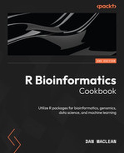
R Bioinformatics Cookbook is your guide to leveraging the power of R for advanced bioinformatics tasks. This updated second edition uses a recipe-based method to teach data analysis, visualization, and machine learning tailored for biological datasets. You'll gain hands-on experience with popular tools like Bioconductor, ggplot2, and tidyverse to solve real-world genomics problems. What this Book will help me do Set up a reproducible bioinformatics analysis environment using R. Clean, analyze, and visualize biological data with R's powerful packages. Apply RNA-seq and ChIP-seq workflows to study genetic information effectively. Incorporate machine learning techniques into bioinformatics pipelines using R. Automate tasks and create professional-grade reports using functional programming and reporting tools. Author(s) The author, None MacLean, brings years of expertise in bioinformatics and computational biology. Known for clear explanations and practical approaches, they ensure the material is accessible yet challenging. With a strong focus on real-world applications, this book reflects their commitment to bridging bioinformatics and modern data science. Who is it for? This book is perfect for bioinformaticians, researchers, and data scientists with prior R experience. It's tailored for those looking to delve deeper into genomics, data visualization, and bioinformatics techniques. Intermediate knowledge of bioinformatics concepts and familiarity with R programming are assumed for readers to fully benefit from the content.
dbt packages are libraries for dbt. Packages can produce information about best practice for your dbt project (ex: dbt project evaluator) and cloud warehouse cost overviews. Unfortunately, all theses KPIs are stored in your data warehouse and it can be painful and expensive to create data visualization dashboards. This application build automatically dashboards from dbt packages that you are using. You just need to parameter your dbt Cloud API key - that's it! In this session, you'll learn how.
Speaker: Adrien Boutreau, Head of Analytics Engineers , Infinite Lambda
Register for Coalesce at https://coalesce.getdbt.com
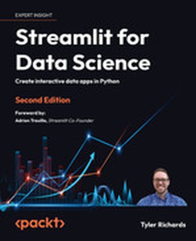
Streamlit for Data Science is your complete guide to mastering the creation of powerful, interactive data-driven applications using Python and Streamlit. With this comprehensive resource, you'll learn everything from foundational Streamlit skills to advanced techniques like integrating machine learning models and deploying apps to cloud platforms, enabling you to significantly enhance your data science toolkit. What this Book will help me do Master building interactive applications using Streamlit, including techniques for user interfaces and integrations. Develop visually appealing and functional data visualizations using Python libraries in Streamlit. Learn to integrate Streamlit applications with machine learning frameworks and tools like Hugging Face and OpenAI. Understand and apply best practices to deploy Streamlit apps to cloud platforms such as Streamlit Community Cloud and Heroku. Improve practical Python skills through implementing end-to-end data applications and prototyping data workflows. Author(s) Tyler Richards, the author of Streamlit for Data Science, is a senior data scientist with in-depth practical experience in building data-driven applications. With a passion for Python and data visualization, Tyler leverages his knowledge to help data professionals craft effective and compelling tools. His teaching approach combines clarity, hands-on exercises, and practical relevance. Who is it for? This book is written for data scientists, engineers, and enthusiasts who use Python and want to create dynamic data-driven applications. With a focus on those who have some familiarity with Python and libraries like Pandas or NumPy, it assists readers in building on their knowledge by offering tailored guidance. Perfect for those looking to prototype data projects or enhance their programming toolkit.
Join me with Tableau expert Andy Kriebel about data visualization tips! 📊
Andy shares his expertise to help you level up your data skills, from creating purposeful dashboards to the power of dot maps.
Tune in now and take your data visualizations to the next level! 🎧
Connect with Andy Kriebel:
🤝 Connect on Linkedin
▶️ Subscribe to Youtube Channel
📔 Buy #MakeoverMonday Book
🎒 Learn About The Data School
🤝 Ace your data analyst interview with the interview simulator
📩 Get my weekly email with helpful data career tips
📊 Come to my next free “How to Land Your First Data Job” training
🏫 Check out my 10-week data analytics bootcamp
Timestamps:
(11:15) - When dealing with time series, your best friend is the versatile line chart 📈
(13:34) - Dive into dot maps for super-detailed visualizations 🌍
(17:30) Want to compare rankings over time? Bump chart!📊📈
(21:10) Keep your graphs simple and spiced up with context📉
(26:45) Dashboards should tell a story; ensure they have a purpose and context to keep folks engaged. 📋💡
(34:27) Prepping for an interview? Be chatty, be prepared with your interviewers. 🗣️🤝
Connect with Avery:
📺 Subscribe on YouTube
🎙Listen to My Podcast
👔 Connect with me on LinkedIn
🎵 TikTok
Mentioned in this episode: Join the last cohort of 2025! The LAST cohort of The Data Analytics Accelerator for 2025 kicks off on Monday, December 8th and enrollment is officially open!
To celebrate the end of the year, we’re running a special End-of-Year Sale, where you’ll get: ✅ A discount on your enrollment 🎁 6 bonus gifts, including job listings, interview prep, AI tools + more
If your goal is to land a data job in 2026, this is your chance to get ahead of the competition and start strong.
👉 Join the December Cohort & Claim Your Bonuses: https://DataCareerJumpstart.com/daa https://www.datacareerjumpstart.com/daa
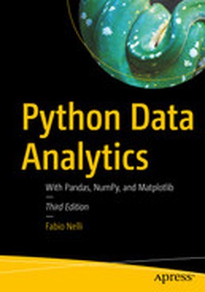
Explore the latest Python tools and techniques to help you tackle the world of data acquisition and analysis. You'll review scientific computing with NumPy, visualization with matplotlib, and machine learning with scikit-learn. This third edition is fully updated for the latest version of Python and its related libraries, and includes coverage of social media data analysis, image analysis with OpenCV, and deep learning libraries. Each chapter includes multiple examples demonstrating how to work with each library. At its heart lies the coverage of pandas, for high-performance, easy-to-use data structures and tools for data manipulation Author Fabio Nelli expertly demonstrates using Python for data processing, management, and information retrieval. Later chapters apply what you've learned to handwriting recognition and extending graphical capabilities with the JavaScript D3 library. Whether you are dealing with sales data, investment data, medical data, web page usage, or other data sets, Python Data Analytics, Third Edition is an invaluable reference with its examples of storing, accessing, and analyzing data. What You'll Learn Understand the core concepts of data analysis and the Python ecosystem Go in depth with pandas for reading, writing, and processing data Use tools and techniques for data visualization and image analysis Examine popular deep learning libraries Keras, Theano,TensorFlow, and PyTorch Who This Book Is For Experienced Python developers who need to learn about Pythonic tools for data analysis
The ultimate guide to data visualization and information design for business. Making good charts is a must-have skill for managers today. The vast amount of data that drives business isn't useful if you can't communicate the valuable ideas contained in that data—the threats, the opportunities, the hidden trends, the future possibilities. But many think that data visualization is too difficult—a specialist skill that's either the province of data scientists and complex software packages or the domain of professional designers and their visual creativity. Not so. Anyone can learn to produce quality "dataviz" and, more broadly, clear and effective information design. Good Charts will show you how to do it. In this updated and expanded edition, dataviz expert Scott Berinato provides all you need for turning those ordinary charts kicked out of a spreadsheet program into extraordinary visuals that captivate and persuade your audience and for transforming presentations that seem like a mishmash of charts and bullet points into clear, effective, persuasive storytelling experiences. Good Charts shows how anyone who invests a little time getting better at visual communication can create an outsized impact—both in their career and in their organization. You will learn: A framework for getting to better charts in just a few minutes Design techniques that immediately make your visuals clearer and more persuasive The building blocks of storytelling with your data How to build teams to bring visual communication skills into your organization and culture This new edition of Good Charts not only provides new visuals and updated concepts but adds an entirely new chapter on building teams around the visualization part of a data science operation and creating workflows to integrate visualization into everything you do. Graphics that merely present information won't cut it anymore. Make Good Charts your go-to resource for turning plain, uninspiring charts and presentations into smart, effective visualizations and stories that powerfully convey ideas.
This comprehensive book on Tableau 2023 is your practical guide to mastering data visualization and business intelligence techniques. You will explore the latest features of Tableau, learn how to create insightful dashboards, and gain proficiency in integrating analytics and machine learning workflows. By the end, you'll have the skills to address a variety of analytics challenges using Tableau. What this Book will help me do Master the latest Tableau 2023 features and use cases to tackle analytics challenges. Develop and implement ETL workflows using Tableau Prep Builder for optimized data preparation. Integrate Tableau with programming languages such as Python and R to enhance analytics. Create engaging, visually impactful dashboards for effective data storytelling. Understand and apply data governance to ensure data quality and compliance. Author(s) Marleen Meier is an experienced data visualization expert and Tableau consultant with over a decade of experience helping organizations transform data into actionable insights. Her approach integrates her technical expertise and a keen eye for design to make analytics accessible rather than overwhelming. Her passion for teaching others to use visualization tools effectively shines through in her writing. Who is it for? This book is ideal for business analysts, BI professionals, or data analysts looking to enhance their Tableau expertise. It caters to both newcomers seeking to understand the foundations of Tableau and experienced users aiming to refine their skills in advanced analytics and data visualization. If your goal is to leverage Tableau as a strategic tool in your organization's BI projects, this book is for you.
Em um papo empolgante, mergulhamos no universo dos profissionais de dados e suas habilidades essenciais, com um foco especial no poderoso Power BI e demais ferramentas. Descubra, como as ferramentas de analytics, como o Power BI, estão moldando o futuro do campo de dados e análises.
Nste episódio do Data Hackers — a maior comunidade de AI e Data Science do Brasil-, conheçam as apaixonadas pela área de dados e principais referências no assunto: a Karine Lago — especialista em Business Intelligence, Power BI e Excel, premiada pela Microsoft mais de sete vezes e Escritora; e a Letícia Smirelli — Chief Product Officer (CPO), Power BI Specialist, Microsoft Data Analyst Associate e DataViz & Dashboard Design; ambas sócias na Nexos Educação.
Lembrando que você pode encontrar todos os podcasts da comunidade Data Hackers no Spotify, iTunes, Google Podcast, Castbox e muitas outras plataformas. Caso queira, você também pode ouvir o episódio aqui no post mesmo!
Link Medium: https://medium.com/data-hackers/power-bi-dashboards-e-a-carreira-de-analista-de-dados-data-hackers-podcast-72-829986f5f2a1
Falamos no episódio
Conheça nosso convidado:
Karine Lago — especialista em Business Intelligence, Escritora, Power BI e Excel, premiada pela Microsoft mais de sete vezes; Letícia Smirelli — Chief Product Officer (CPO), Power BI Specialist, Microsoft Data Analyst Associate e DataViz & Dashboard Design.
Bancada Data Hackers:
Paulo Vasconcellos Gabriel Lages Monique Femme
Links de referências:
Tech and Cheers — Meetup ed. Data Connect (São Paulo): https://www.sympla.com.br/evento/tech-and-cheers-meetup-ed-data-connect/2110360 https://towardsdatascience.com/whats-the-difference-between-analytics-and-statistics-cd35d457e17
Tech and Cheers — ed. Mulher.ADA (Blumenau):https://www.sympla.com.br/evento/tech-and-cheers-meetup-ed-mulher-ada/2109236
World Economic Forum (The Future of Jobs Report 2023):https://www.weforum.org/reports/the-future-of-jobs-report-2023/ Canal Karine Lago (Youtube):https://www.youtube.com/@KarineLago Pagina Karine Lago: https://keepo.io/karinedolago/?fbclid=PAAaZ32JXyRtPv7wcHcfaxtKA5TOU9VRaCt_F_nb7zhAptO4AtthorxiHWCdg_aem_Ab53sgYj0AXg1wHrOP9-c_K7pwoMqX0psYWAvNMAanqh5pafTHBFb3bnshKB534J9AA Canal Leticia Smirelli (Youtube): https://www.youtube.com/@LeticiaSmirelli Pagina Leticia Smirelli: https://keepo.io/leticia/?fbclid=PAAabu7cvnFTkkFw1UiJrDMIXiMJ45Av6XKlCXIfWAUiRH2c4kiSZzo7FX6TY_aem_Ab7BHn25MaVK22HFw9zXNfsYv5k5Y5o9WLMGZeFB9wSSSAV3d7EDA0JuGjXWSqd_SEs
Spreadsheets have been the unsung heroes of the data world for many decades now. Yet, despite their ubiquity and importance, they've seen little disruption or evolution. The grid of cells we interact with today isn't far removed from the ones our predecessors used in the 1980s. However, the winds of change have started to blow. As we stand on the cusp of a new era in data and AI, the humble spreadsheet is poised for transformation. The coming changes could redefine how we interact with data, derive insights, and how we make decisions. The implications are vast given the popularity and dependence we have on spreadsheets, and the potential impacts could ripple through every corner of the professional world. Hjalmar Gislason is the founder and CEO of GRID, with their main product being a smart spreadsheet with an interactive data visualization layer and integrated AI assistance. Hjalmar previously served as VP of Product Management at Qlik. He was the founder and CEO of DataMarket, founded in 2008 and sold to Qlik in 2014. A career data nerd and entrepreneur, GRID is Hjalmar’s fifth software startup as a founder. In the episode, Richie and Hjalmar explore the integral role of spreadsheets in today's data-driven world, the limitations of traditional Business Intelligence tools, and the transformative potential of generative AI in the realm of spreadsheets.
All You Need to Know, and Nothing You Don't, to Solve Real Problems with Python Python is one of the most popular programming languages in the world, used for everything from shell scripts to web development to data science. As a result, Python is a great language to learn, but you don't need to learn "everything" to get started, just how to use it efficiently to solve real problems. In Learn Enough Python to Be Dangerous, renowned instructor Michael Hartl teaches the specific concepts, skills, and approaches you need to be professionally productive. Even if you've never programmed before, Hartl helps you quickly build technical sophistication and master the lore you need to succeed. Hartl introduces Python both as a general-purpose language and as a specialist tool for web development and data science, presenting focused examples and exercises that help you internalize what matters, without wasting time on details pros don't care about. Soon, it'll be like you were born knowing this stuff--and you'll be suddenly, seriously dangerous. Learn enough about . . . Applying core Python concepts with the interactive interpreter and command line Writing object-oriented code with Python's native objects Developing and publishing self-contained Python packages Using elegant, powerful functional programming techniques, including Python comprehensions Building new objects, and extending them via Test-Driven Development (TDD) Leveraging Python's exceptional shell scripting capabilities Creating and deploying a full web app, using routes, layouts, templates, and forms Getting started with data-science tools for numerical computations, data visualization, data analysis, and machine learning Mastering concrete and informal skills every developer needs Michael Hartl's Learn Enough Series includes books and video courses that focus on the most important parts of each subject, so you don't have to learn everything to get started--you just have to learn enough to be dangerous and solve technical problems yourself. Like this book? Don't miss Michael Hartl's companion video tutorial, Learn Enough Python to Be Dangerous LiveLessons. Register your book for convenient access to downloads, updates, and/or corrections as they become available. See inside book for details.