Driving impact with analytics goes beyond numbers and graphs; it's about telling a story that resonates. In this session, Brent Dykes, author of "Effective Data Storytelling" & the Founder & Chief Data Storyteller at AnalyticsHero, Lea Pica, author of "Present Beyond Measure" & the Founder at Story-driven by Data, and Andy Cotgreave, co-author of "The Big Book of Dashboards" and Senior Data Evangelist at Tableau, will unveil how to transform data into compelling narratives. They shed light on the art of blending analytics with storytelling, a key to making data-driven insights both understandable and influential within any organization.
 talk-data.com
Topic
Tableau
data_visualization
bi
analytics
162
tagged
Activity Trend
11
peak/qtr
2020-Q1
2026-Q2
Top Events
O'Reilly Data Science Books
50
Tableau Conference 2024
15
Databricks DATA + AI Summit 2023
10
Data Career Podcast: Helping You Land a Data Analyst Job FAST
9
O'Reilly Data Visualization Books
9
Data Engineering Podcast
8
O'Reilly Data Engineering Books
7
dbt Coalesce 2022
5
The Analytics Power Hour
5
DataFramed
5
Data + AI Summit 2025
4
gartner-data-analytics-uk-2025
3
With GA4 putting web and behavioural data in a data warehouse into the hands of more analysts than ever before, you may be wondering how to get the best from your data in BigQuery (or any data warehouse), keep costs manageable, and how to give your users the best performance possible. This talk will cover different approaches to data modelling, the trade-offs associated with each approach, and how the dashboard/BI tool you’re using (whether it be Looker or Looker Studio, Tableau, Power BI etc) impacts your data modelling.
In this episode of the Data Career Podcast, we include a variety of listener questions, shedding light on topics like the future of data engineering, requirements for becoming a data analyst, showcasing data cleaning proficiency in Excel, and securing data analyst internships.
Also discusses the significance of storytelling and views on Power BI versus Tableau & the impact of AI on data analysis roles.
Tune in now!
👍 Leave your review and download the bonus!
🤝 Ace your data analyst interview with the interview simulator
📩 Get my weekly email with helpful data career tips
📊 Come to my next free “How to Land Your First Data Job” training
🏫 Check out my 10-week data analytics bootcamp
Timestamps:
(02:10) - What’s the future of data engineering in 2024? (03:06) - Do you need a degree to become a data analyst? (04:57) - How to showcase Excel skills? (07:22) - How to land data analyst internships? (10:10) - What are the main technical skills required to land your first data job? (14:40) - Have you worked with many teachers looking to make a career transition? (16:24) - How to get a data analyst job for people with no work experience? (25:13) - Can you suggest SQL and Excel videos for data analysis? (28:46) - Do you think the data analysis industry is saturated? (28:21) - Do you find data analysts transferring to becoming a data scientist or a data engineer?
Connect with Avery:
📺 Subscribe on YouTube
🎙Listen to My Podcast
👔 Connect with me on LinkedIn
🎵 TikTok
Mentioned in this episode: Join the last cohort of 2025! The LAST cohort of The Data Analytics Accelerator for 2025 kicks off on Monday, December 8th and enrollment is officially open!
To celebrate the end of the year, we’re running a special End-of-Year Sale, where you’ll get: ✅ A discount on your enrollment 🎁 6 bonus gifts, including job listings, interview prep, AI tools + more
If your goal is to land a data job in 2026, this is your chance to get ahead of the competition and start strong.
👉 Join the December Cohort & Claim Your Bonuses: https://DataCareerJumpstart.com/daa https://www.datacareerjumpstart.com/daa
by
Nilton Ueda
(AB-Inbev/Ambev)
,
Monique Femme
(PUCRS)
,
Paulo Vasconcellos
,
Mikaeri Ohana
(CI&T)
,
Gabriel Lages
Se você sonha em mergulhar no mundo dos dados, exploramos as estratégias e habilidades necessárias para trilhar o caminho de se tornar um cientista de dados em 2024. Descubra como se preparar para as oportunidades do futuro e dominar o universo da ciencia de dados!
Neste episódio do Data Hackers — a maior comunidade de AI e Data Science do Brasil-, conheçam essa dupla de especialistas:
Mikaeri Ohana — Líder de AI e ML na CI&T, Criadora de Conteúdo no Explica Mi, premiada pelo Google como Google Developer Expert em ML e pela Microsoft como Microsoft Most Valuable Professional em AI, mestranda na Unicamp e fundadora da Escola Tesseract. Nilton Ueda — Global Data Product Manager at @AB-Inbev/Ambev, Professor MBA FIAP/MACKENZIE/IMPACTA/IBMEC, @LATAM Tableau Ambassador 3x
Lembrando que você pode encontrar todos os podcasts da comunidade Data Hackers no Spotify, iTunes, Google Podcast, Castbox e muitas outras plataformas. Caso queira, você também pode ouvir o episódio aqui no post mesmo!
embed
Conheça nosso convidado:
Mikaeri Ohana Nilton Ueda
Bancada Data Hackers:
Paulo Vasconcellos Monique Femme Gabriel Lages
Falamos no episódioLinks de referências:
Participe e responda a pesquisa State of Data: http://www.stateofdata.com.br/podcast Onde encontrar a Mikaeri Http://Instagram.com/explicami https://medium.com/@mikaeriohana https://www.linkedin.com/in/mikaeriohana Onde encontrar o Nilton: https://www.linkedin.com/in/niltonkazuyukiueda/

The self-serve revolution remains unrealized despite BI tools from Business Objects to Tableau and Looker all aiming for that holy grail. What went wrong? This talk argues that for self-serve to work, it has to work the way humans already work.
Speaker: Paul Blankley, CTO / Co-founder, Zenlytic
Register for Coalesce at https://coalesce.getdbt.com
Join me with Tableau expert Andy Kriebel about data visualization tips! 📊
Andy shares his expertise to help you level up your data skills, from creating purposeful dashboards to the power of dot maps.
Tune in now and take your data visualizations to the next level! 🎧
Connect with Andy Kriebel:
🤝 Connect on Linkedin
▶️ Subscribe to Youtube Channel
📔 Buy #MakeoverMonday Book
🎒 Learn About The Data School
🤝 Ace your data analyst interview with the interview simulator
📩 Get my weekly email with helpful data career tips
📊 Come to my next free “How to Land Your First Data Job” training
🏫 Check out my 10-week data analytics bootcamp
Timestamps:
(11:15) - When dealing with time series, your best friend is the versatile line chart 📈
(13:34) - Dive into dot maps for super-detailed visualizations 🌍
(17:30) Want to compare rankings over time? Bump chart!📊📈
(21:10) Keep your graphs simple and spiced up with context📉
(26:45) Dashboards should tell a story; ensure they have a purpose and context to keep folks engaged. 📋💡
(34:27) Prepping for an interview? Be chatty, be prepared with your interviewers. 🗣️🤝
Connect with Avery:
📺 Subscribe on YouTube
🎙Listen to My Podcast
👔 Connect with me on LinkedIn
🎵 TikTok
Mentioned in this episode: Join the last cohort of 2025! The LAST cohort of The Data Analytics Accelerator for 2025 kicks off on Monday, December 8th and enrollment is officially open!
To celebrate the end of the year, we’re running a special End-of-Year Sale, where you’ll get: ✅ A discount on your enrollment 🎁 6 bonus gifts, including job listings, interview prep, AI tools + more
If your goal is to land a data job in 2026, this is your chance to get ahead of the competition and start strong.
👉 Join the December Cohort & Claim Your Bonuses: https://DataCareerJumpstart.com/daa https://www.datacareerjumpstart.com/daa
This comprehensive book on Tableau 2023 is your practical guide to mastering data visualization and business intelligence techniques. You will explore the latest features of Tableau, learn how to create insightful dashboards, and gain proficiency in integrating analytics and machine learning workflows. By the end, you'll have the skills to address a variety of analytics challenges using Tableau. What this Book will help me do Master the latest Tableau 2023 features and use cases to tackle analytics challenges. Develop and implement ETL workflows using Tableau Prep Builder for optimized data preparation. Integrate Tableau with programming languages such as Python and R to enhance analytics. Create engaging, visually impactful dashboards for effective data storytelling. Understand and apply data governance to ensure data quality and compliance. Author(s) Marleen Meier is an experienced data visualization expert and Tableau consultant with over a decade of experience helping organizations transform data into actionable insights. Her approach integrates her technical expertise and a keen eye for design to make analytics accessible rather than overwhelming. Her passion for teaching others to use visualization tools effectively shines through in her writing. Who is it for? This book is ideal for business analysts, BI professionals, or data analysts looking to enhance their Tableau expertise. It caters to both newcomers seeking to understand the foundations of Tableau and experienced users aiming to refine their skills in advanced analytics and data visualization. If your goal is to leverage Tableau as a strategic tool in your organization's BI projects, this book is for you.
Your company relies on data to succeed—data that traditionally comes from a business's transactional processes, pulled from the transaction systems through an extract-transform-load (ETL) process into a warehouse for reporting purposes. But this data flow is no longer sufficient given the growth of the internet of things (IOT), web commerce, and cybersecurity. How can your company keep up with today's increasing magnitude of data and insights? Organizations that can no longer rely on data generated by business processes are looking outside their workflow for information on customer behavior, retail patterns, and industry trends. In this report, author Christopher Gardner examines the challenges of building a framework that provides universal access to data. You will: Learn the advantages and challenges of universal data access, including data diversity, data volume, and the speed of analytic operations Discover how to build a framework for data diversity and universal access Learn common methods for improving database and performance SLAs Examine the organizational requirements that a fast universal data access platform must meet Explore a case study that demonstrates how components work together to form a multiaccess, high-volume, high-performance interface About the author: Christopher Gardner is the campus Tableau application administrator at the University of Michigan, controlling security, updates, and performance maintenance.
In this session, we will explain the visualizations that serve to shorten the time to insight for our prospects and encourage potential buyers to take the next step and request more information from our commercial team. The S&P Global Marketplace is a discovery and exploration platform that enables prospective buyers and clients to easily search fundamental and alternative datasets from across S&P Global and curated third-party providers. It serves as a digital storefront that provides transparency into data coverage and use cases, reducing the time and effort for clients to find data for their needs. A key feature of Marketplace is our interactive data visualizations that provide insight into the coverage of a dataset and demonstrate how the dataset can be used to make more informed decisions.
The S&P Global Marketplace’s interactive visualizations are displayed in Tableau and are powered by Databricks. The Databricks platform allows for easy integration of S&P Global data and provides a collaborative environment where our team of product managers and data engineers can develop the code to generate each visualization. The team utilizes the web interface to develop the queries that perform the heavy lifting of data transformation instead of performing these tasks in Tableau. The final notebook output is saved into a custom data mart (“golden table”) which is the source for Tableau. We also developed an automated process that refreshes the whole process to ensure Marketplace has up to date visualizations.
Talk by: Onik Kurktchian
Connect with us: Website: https://databricks.com Twitter: https://twitter.com/databricks LinkedIn: https://www.linkedin.com/company/databricks Instagram: https://www.instagram.com/databricksinc Facebook: https://www.facebook.com/databricksinc
Many organizations rely on complex cloud data architectures that create silos between applications, users and data. This fragmentation makes it difficult to access accurate, up-to-date information for analytics, often resulting in the use of outdated data. Enter the lakehouse, a modern data architecture that unifies data, AI, and analytics in a single location.
This session explores why the lakehouse is the best data warehouse, featuring success stories, use cases and best practices from industry experts. You'll discover how to unify and govern business-critical data at scale to build a curated data lake for data warehousing, SQL and BI. Additionally, you'll learn how Databricks SQL can help lower costs and get started in seconds with on-demand, elastic SQL serverless warehouses, and how to empower analytics engineers and analysts to quickly find and share new insights using their preferred BI and SQL tools such as Fivetran, dbt, Tableau, or Power BI.
Talk by: Miranda Luna and Cyrielle Simeone
Connect with us: Website: https://databricks.com Twitter: https://twitter.com/databricks LinkedIn: https://www.linkedin.com/company/databricks Instagram: https://www.instagram.com/databricksinc Facebook: https://www.facebook.com/databricksinc
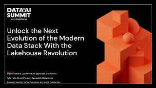
As the data landscape evolves, organizations are seeking innovative solutions that provide enhanced value and scalability without exploding costs. In this session, we will explore the exciting frontier of the Modern Data Stack on Databricks Lakehouse, a game-changing alternative to traditional Data Cloud offerings. Learn how Databricks Lakehouse empowers you to harness the full potential of Fivetran, dbt, and Tableau, while optimizing your data investments and delivering unmatched performance.
We will showcase real-world demos that highlight the seamless integration of these modern data tools on the Databricks Lakehouse platform, enabling you to unlock faster and more efficient insights. Witness firsthand how the synergy of Lakehouse and the Modern Data Stack outperforms traditional solutions, propelling your organization into the future of data-driven innovation. Don't miss this opportunity to revolutionize your data strategy and unleash unparalleled value with the lakehouse revolution.
Talk by: Kyle Hale and Roberto Salcido
Connect with us: Website: https://databricks.com Twitter: https://twitter.com/databricks LinkedIn: https://www.linkedin.com/company/databricks Instagram: https://www.instagram.com/databricksinc Facebook: https://www.facebook.com/databricksinc

Unplanned downtime in manufacturing costs firms up to a trillion dollars annually. Time that materials spend sitting on a production line is lost revenue. Even just 15 hours of downtime a week adds up to over 800 hours of downtime yearly. The use of Internet of Things or IoT devices can cut this time down by providing details of machine metrics. However, IoT predictive maintenance is challenged by the lack of effective, scalable infrastructure and machine learning solutions. IoT data can be the size of multiple terabytes per day and can come in a variety of formats. Furthermore, without any insights and analysis, this data becomes just another table.
The KPMG Databricks IoT Accelerator is a comprehensive solution enabling manufacturing plant operators to have a bird’s eye view of their machines’ health and empowers proactive machine maintenance across their portfolio of IoT devices. The Databricks Accelerator ingests IoT streaming data at scale and implements the Databricks Medallion architecture while leveraging Delta Live Tables to clean and process data. Real time machine learning models are developed from IoT machine measurements and are managed in MLflow. The AI predictions and IoT device readings are compiled in the gold table powering downstream dashboards like Tableau. Dashboards inform machine operators of not only machines’ ailments, but action they can take to mitigate issues before they arise. Operators can see fault history to aid in understanding failure trends, and can filter dashboards by fault type, machine, or specific sensor reading.
Talk by: MacGregor Winegard
Connect with us: Website: https://databricks.com Twitter: https://twitter.com/databricks LinkedIn: https://www.linkedin.com/company/databricks Instagram: https://www.instagram.com/databricksinc Facebook: https://www.facebook.com/databricksin
🕵️♂️ Curious about the mysterious hiring process of a data career? Find out how Megan McGuire narrows down candidates and assesses skills in the podcast. Get insider knowledge on code assessments, interviews, and what it takes to land the dream data role! 💪📈
📊 Come to my next free “How to Land Your First Data Job” training
🏫 Check out my 10-week data analytics bootcamp
Timestamps:
(02:14) - The Value of Junior Analysts
(12:12) - Curiosity and Problem Solving in Data Analytics
(21:46) - Be the perfect candidate for specific company rather than a pretty good candidate
(24:15) - How drive, experience and upskilling set up interviewee success
(28:59) - Show off your skills with your Tableau Public or GitHub Profile
(36:53) - Rejections aren't necessarily your fault
Connect with Avery:
📺 Subscribe on YouTube
🎙Listen to My Podcast
👔 Connect with me on LinkedIn
🎵 TikTok
Mentioned in this episode: Join the last cohort of 2025! The LAST cohort of The Data Analytics Accelerator for 2025 kicks off on Monday, December 8th and enrollment is officially open!
To celebrate the end of the year, we’re running a special End-of-Year Sale, where you’ll get: ✅ A discount on your enrollment 🎁 6 bonus gifts, including job listings, interview prep, AI tools + more
If your goal is to land a data job in 2026, this is your chance to get ahead of the competition and start strong.
👉 Join the December Cohort & Claim Your Bonuses: https://DataCareerJumpstart.com/daa https://www.datacareerjumpstart.com/daa
With millions of orders per day, Gojek needs a data processing solution that can handle a high volume of data. Airflow is a scalable tool that can handle large volumes of data and complex workflows, making it an ideal solution for Gojek’s needs. With Airflow, we can create automated data pipelines to extract data from various sources, transform it, and load it into dashboards such as Tableau for analysis and visualization. This eliminates the need for manual data transfers and reduces the risk of errors. Airflow also can be integrated with other systems such as Google BigQuery. This allows us to easily connect to different data sources and transform the data before loading it into the dashboards. Therefore we can create seamless data pipelines. Using Airflow will also reduce query volume in Google BigQuery, resulting in lower cost of overall data infrastructure.
Master the Fundamentals of Modern Visual Analytics--and Craft Compelling Visual Narratives in Tableau! Do you need to persuade or inform people? Do you have data? Then you need to master visual analytics and visual storytelling. Today, the #1 tool for telling visual stories with data is Tableau, and demand for Tableau skills is soaring. In Visual Analytics Fundamentals, renowned visual storyteller and analytics professor Lindy Ryan introduces all the fundamental visual analytics knowledge, cognitive and perceptual concepts, and hands-on Tableau techniques you'll need. Ryan puts core analytics and visual concepts upfront, so you'll always know exactly what you're trying to accomplish and can apply this knowledge with any tool. Building on this foundation, she presents classroom-proven guided exercises for translating ideas into reality with Tableau 2022. Youll learn how to organize data and structure analysis with stories in mind, embrace exploration and visual discovery, and articulate your findings with rich data, well-curated visualizations, and skillfully crafted narrative frameworks. Ryan's insider tips take you far beyond the basics--and you'll rely on her expert checklists for years to come. Communicate more powerfully by applying scientific knowledge of the human brain Get started with the Tableau platform and Tableau Desktop 2022 Connect data and quickly prepare it for analysis Ask questions that help you keep data firmly in context Choose the right charts, graphs, and maps for each project--and avoid the wrong ones Craft storyboards that reflect your message and audience Direct attention to what matters most Build data dashboards that guide people towards meaningful outcomes Master advanced visualizations, including timelines, Likert scales, and lollipop charts This book has only one prerequisite: your desire to communicate insights from data in ways that are memorable and actionable. It's for executives and professionals sharing important results, students writing reports or presentations, teachers cultivating data literacy, journalists making sense of complex trends. . . . practically everyone! Don't even have Tableau? Download your free trial of Tableau Desktop and let's get started! ...
Discover how visualization turns data into action Tableau gives you the power to understand your data and put it in a format that is appealing and meaningful for everyone who needs to see it. Tableau For Dummies walks you through the steps to turn your data into a story that inspires action. This easy-to-understand guide offers insights from an enterprise data pro on how to transform data into a clear and memorable visual presentation. Navigate the Tableau user interface and connect to data sources Use drag-and-drop features to create stunning visualizations Work with templates, add graphs, and create clear charts Export your visualizations to multiple formats for easy sharing This is the perfect Dummies software guide for business professionals who need to better derive value from that all-important data.
ABOUT THE TALK: Billions spent on data have one goal: better decisions, faster. Yet, with most tools echoing Tableau and Excel, are we really unlocking data's potential? What might a more productive—and playful—data experience look like?
Hunch is crafting an ambitious user interface for data that's more visual, spatial, and fluid—a shared canvas for both analysts and business users to make faster decisions together. Tune in to the discussion about why it’s time to reimagine how we engage with data, and Hunch's journey exploring the ideas that led them to now and why some work better than others.
ABOUT THE SPEAKER: David Wilson has worked with large datasets for companies across Africa and the Middle East.
David co-founded Cape Networks, combining his data and design experience to craft a SaaS tool that helped non-experts make sense of complex networking data. Aruba Networks acquired Cape to be the face of their cloud software portfolio.
Drawing from his experience at Cape, David co-founded Hunch—a data tool he’s dreamed of since his consulting days.
ABOUT DATA COUNCIL: Data Council (https://www.datacouncil.ai/) is a community and conference series that provides data professionals with the learning and networking opportunities they need to grow their careers.
Make sure to subscribe to our channel for the most up-to-date talks from technical professionals on data related topics including data infrastructure, data engineering, ML systems, analytics and AI from top startups and tech companies.
FOLLOW DATA COUNCIL: Twitter: https://twitter.com/DataCouncilAI LinkedIn: https://www.linkedin.com/company/datacouncil-ai/
You just learned SQL or Python, or Tableau. But you don’t know how to build your data science project? In this episode, Avery shares a 3-step guide to building your first data science project.
🌟 Join the data project club!
“25OFF” to get 25% off (first 50 members).
📊 Come to my next free “How to Land Your First Data Job” training
🏫 Check out my 10-week data analytics bootcamp
Timestamps:
(1:28) - Art is theft, and so is the data science project
(4:02) - Find ideas on Towards Data Science Medium
(5:32) - Read a few articles to get inspiration
(6:05) - Avery’s strategy is doing 30 projects in 30 days
(9:08) - How academia finds inspiration to write
(11:01) - Take Avery’s project, replicate and do it
Mentioned Links:
Building 30 Data Science Projects in 30 days: https://youtu.be/kKmA9ihIg20
30 Data Science Projects Resources: https://www.datacareerjumpstart.com/30projectsresourcesignup
I Used Data Science to UNCOVER McDonald’s Healthiest Meal: https://youtu.be/3bbFc1225-4
Connect with Avery:
📺 Subscribe on YouTube: https://www.youtube.com/c/AverySmithDataCareerJumpstart/videos 🎙Listen to My Podcast: https://podcasts.apple.com/us/podcast/data-career-podcast/id1547386535 👔 Connect with me on LinkedIn: https://www.linkedin.com/in/averyjsmith/ 📸 Instagram: https://www.instagram.com/datacareerjumpstart/ 🎵 TikTok: [https://www.tiktok.com/@verydata?]
Mentioned in this episode: Join the last cohort of 2025! The LAST cohort of The Data Analytics Accelerator for 2025 kicks off on Monday, December 8th and enrollment is officially open!
To celebrate the end of the year, we’re running a special End-of-Year Sale, where you’ll get: ✅ A discount on your enrollment 🎁 6 bonus gifts, including job listings, interview prep, AI tools + more
If your goal is to land a data job in 2026, this is your chance to get ahead of the competition and start strong.
👉 Join the December Cohort & Claim Your Bonuses: https://DataCareerJumpstart.com/daa https://www.datacareerjumpstart.com/daa
This book is your comprehensive guide to achieving the Tableau Desktop Specialist certification. By working through its structured content, you'll gain the skills necessary to understand and utilize Tableau for data analysis and visualization, and you'll be confidently prepared to pass the certification exam. What this Book will help me do Master how to load and prepare data in Tableau efficiently for analysis. Design and create visually impactful charts and dashboards tailored to your audience. Learn to utilize calculations, parameters, and advanced functions in Tableau. Develop an understanding of managing dimensions, measures, and their application. Gain confidence in sharing and presenting insights effectively with Tableau. Author(s) Adam Mico, a renowned Tableau ambassador and visionary, has extensive experience in the data visualization field. Having successfully obtained the Tableau Desktop Specialist certification himself, Adam combines practical expertise with an intuitive teaching approach, ensuring readers gain both the knowledge and confidence required to excel. Who is it for? If you're starting your journey in data visualization or looking to formalize your Tableau skills, this book is intended for you. Beginners without prior Tableau experience will find structured guidance, while those with some knowledge will appreciate the detailed preparation tips. Ideal for professionals aiming to pass the Tableau Desktop Specialist certification or improve their data analysis capabilities.

Data is at the core of every business, but it is useless if nobody can access and analyze it. Learn how to generate business value by making your data accessible with advanced table UIs. This definitive guide teaches you how to bring your data to the fingertips of nontechnical users with advanced features like pagination, sorting, filtering, and infinity scrolling. Build reactive and reuseable table components by leveraging Phoenix LiveView, schemaless changesets, and Ecto query composition. Table UIs are the bread and butter for every web developer, so it is time to learn how to build them right. As a web developer, you have to build tables. Lots and lots of tables. With table UIs making up such a significant part of your daily work, you need to know how to build the right table for the task, with all the needed features. Building a simple table is easy, but tables only become really useful with advanced features like pagination, sorting, and filtering. That;s where building a table can quickly become complicated. This book shows you how to implement advanced table features in a clean and reusable way. You'll build fast and interactive table UIs by leveraging Phoenix LiveView. Make vast amounts of data manageable with common but complex features like pagination, sorting, filtering, and inifinity scrolling. Use SOLID coding principles to make your queries reusable with query composition. Compartmentalize your UI with LiveComponents and learn how to handle user input securely with schemaless changesets. Share your view onto the data painlessly by storing your search parameters in the URL. Data is one of the most valuable assets of your business, but you cannot unlock its potential if you don't know how to make it accessible. This book shows you how to deliver that data to your users' fingertips quickly. What You Need: You'll need Elixir 1.12 or later, Erlang/OTP 24 or later, Phoenix 1.6 or later, and PostgreSQL installed on your machine.